Blog – Entries tagged as Stefan Willerstorfer
Acorde/Sindelar Bundles are now available
Sindelar and Acorde complement each other perfectly. Thus many clients are interested in using both type families alongside one another. The Acorde/Sindelar Bundle reflects this demand and merges all 14 styles of Acorde and all 18 styles of Sindelar into an attractive bundle of 32 styles. All styles are fully equipped with a huge character set and numerous OpenType features.
In addition there is also a bundle of the small packages of Acorde and Sindelar available. It consists of four styles of Acorde and four styles of Sindelar. It is more easily affordable than the full bundle but also offers great design possibilities and still decreases the price per style.
Sindelar, a news and media text face, is now available
I am pleased to announce that after a long period of elaborate development, my second type family, Sindelar, is now available. It is the ideal text face choice for newspapers and magazines, comes in 18 styles and was designed between 2009 and 2014. Sindelar is published by Willerstorfer Font Foundry and is available for purchase here.
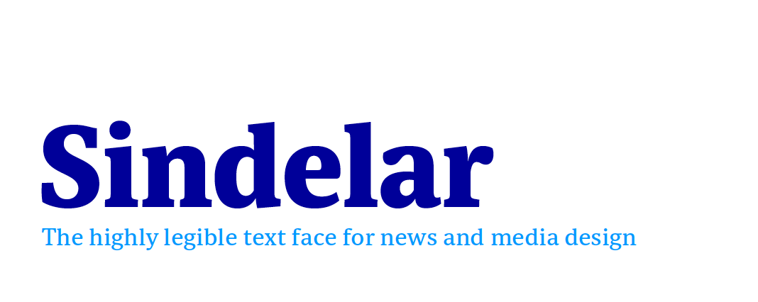 Sindelar, a news and media text face, is now available.
About Sindelar
Sindelar is a capable, contemporary text face addressing today’s news design requirements. Its large x-height, low contrast and robust serifs grant a high legibility in small sizes. The balanced, well chosen proportions make the typeface economic (i.e. space saving) without giving it a too narrow appearance. These characteristics make it the ideal choice for extensive text setting in newspapers and magazines – on paper and on screen (webfonts available soon).
Named after famous Austrian football (soccer) player Matthias Sindelar (1903–1939), one of the best players of his time, the typeface shares two major qualities with its namesake: their technical brilliance and their way of performing aesthetically to the last detail. The football player’s nickname Der Papierene (the Paper-man) elegantly refers to the media too.
Although optimised for small sizes, Sindelar’s low contrast and robust serifs give the typeface a strong impact and an unmistakable personality in larger sizes. Sindelar’s calligraphic influences can be noticed in the Italics best. The italic letters are inclined by slightly different angles, respecting the letters’ shapes and proportions and resulting in a balanced, yet vivid appearance. Sindelar comes in 18 styles – nine weights in Roman and Italic each. Each font is equipped with a huge character set of about 980 glyphs and various OpenType features.
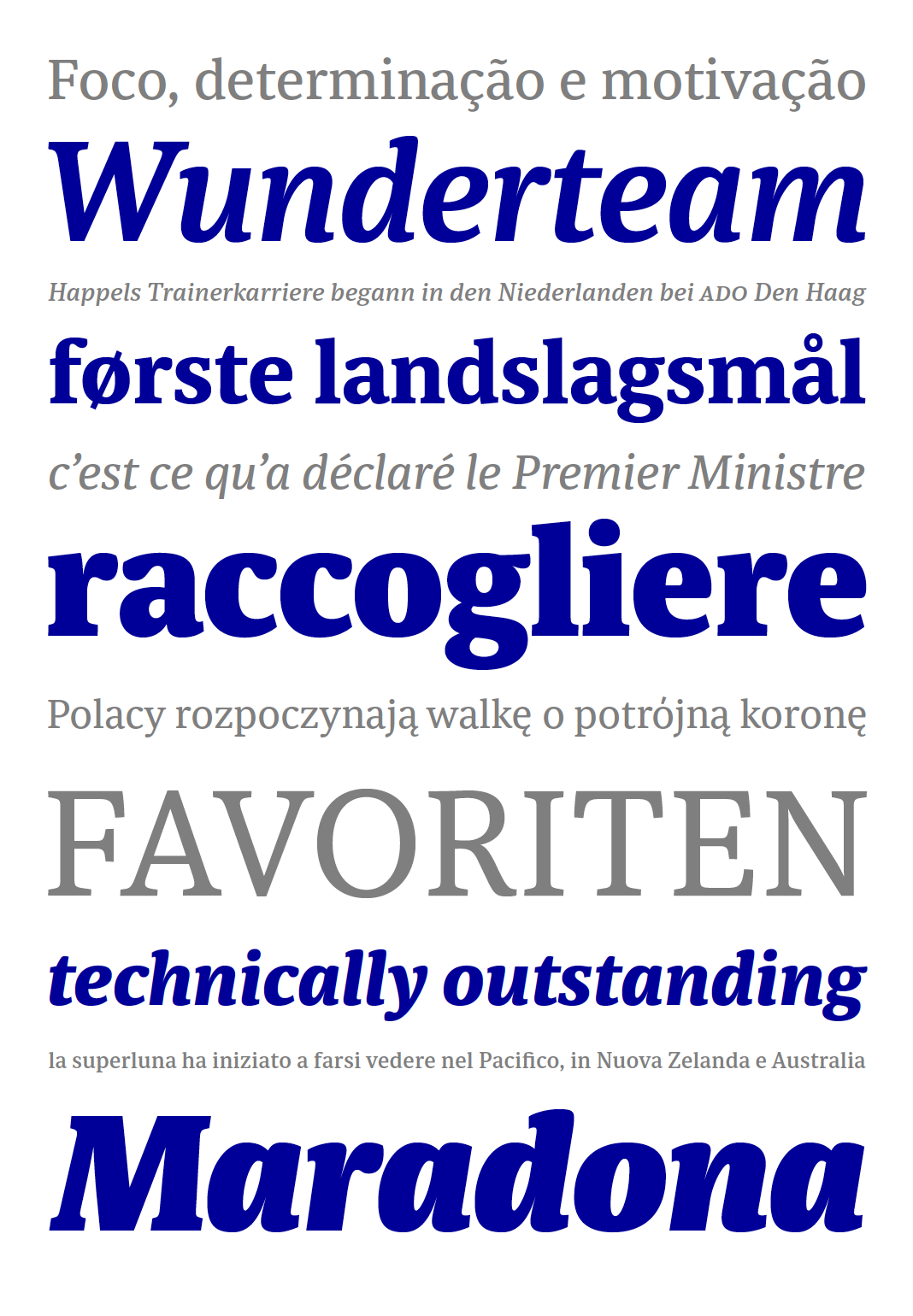 Sindelar is the ideal text face choice for newspapers and magazines.
The comprehensive specimen PDF gives you an excellent overview of the type family Sindelar. It shows various samples of all styles, the full character set, and informs you of all supported OpenType features. Download the Sindelar Specimen PDF here.
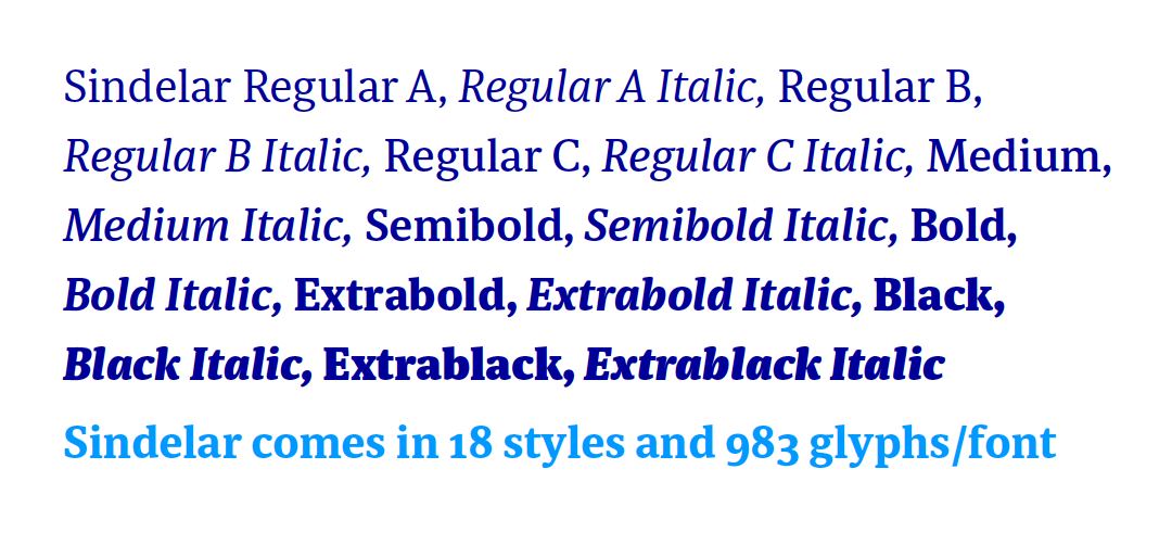 Sindelar comes in 18 styles – nine weights in Roman and Italic each.
Typefaces by Austrian Designers – No. 22: Acorde
Design Austria is the only professional association and service organisation in Austria representing the interests of designers from all creative disciplines. Among many other activities Design Austria publishes a popular series of type specimens called Schriften österreichischer DesignerInnen (Typefaces by Austrian Designers).
Issue No. 22 showcases the type family Acorde, presents all of its styles in various sizes (from small to large), its huge character set as well as the large number of supported OpenType features.
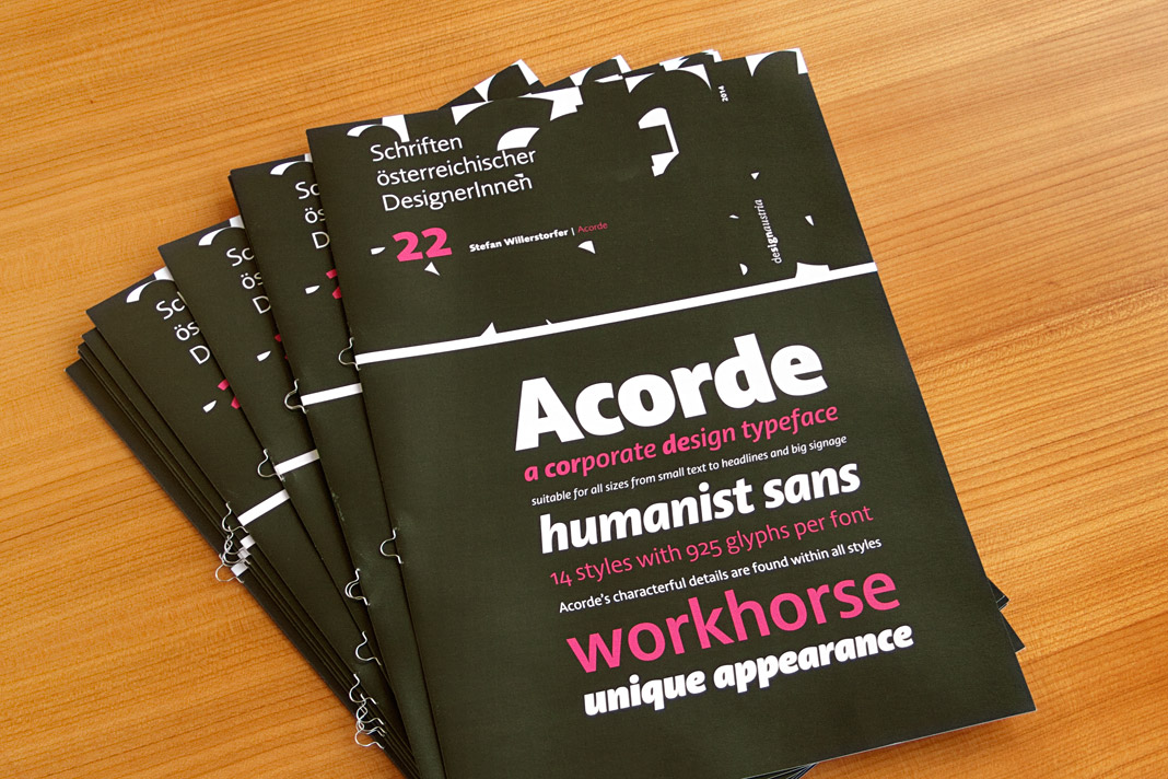 The cover of the 22nd issue of Design Austria’s popular series of type specimens.
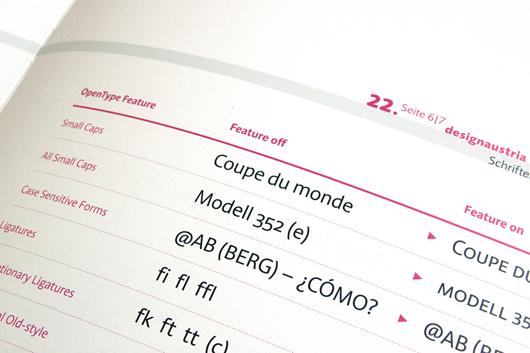
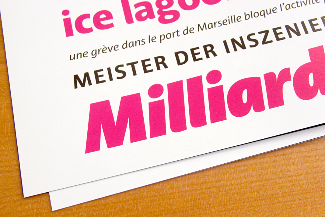
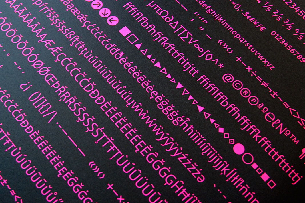
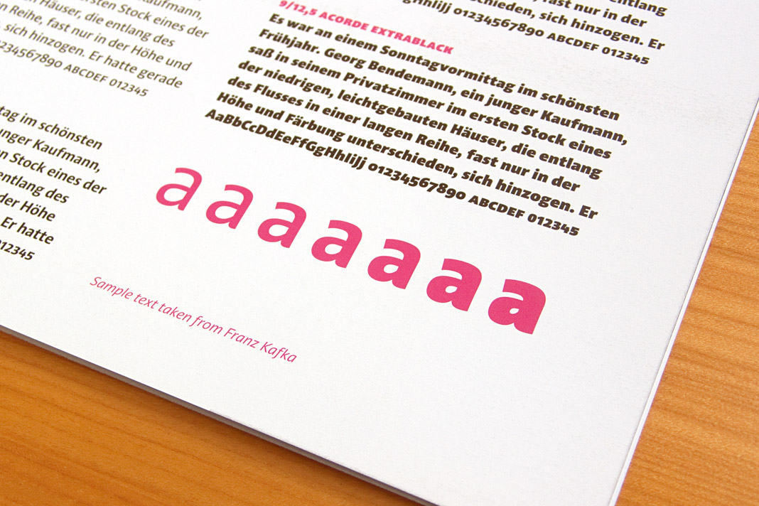 Various impressions of the publication showcasing the type family Acorde.
Typography Referenced refers to Acorde
The book Typography Referenced is a comprehensive visual guide to the language, history and practice of typography. It is co-authored by Allan Haley, Richard Poulin, Jason Tselentis, Tony Seddon, Gerry Leonidas, Ina Saltz, Kathryn Henderson, and Tyler Alterman and published by Rockport Publishers, a member of the Quarto Group.
One chapter of the book presents the work of a selected group of influential type designers of the twenty-first century. It is an honour that my work is included in the book and that Acorde is shown in great detail.
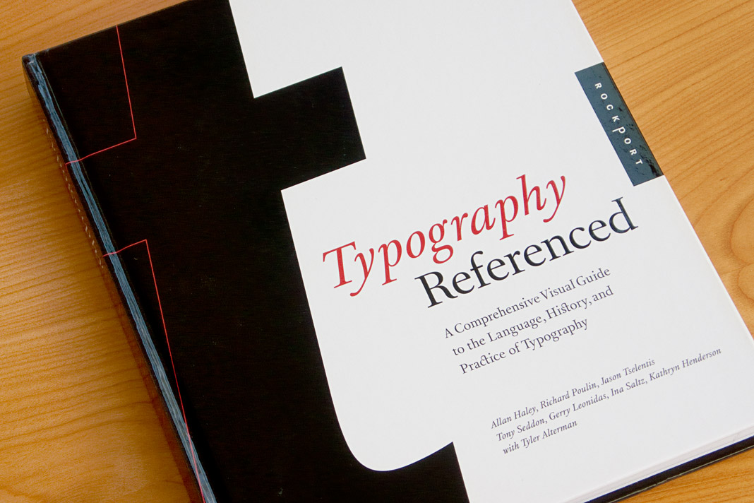 The cover of the new and informative book Typography Referenced.
Acorde is nominated for the German Design Award 2012
The German Design Award (Deutscher Designpreis) is the most prestigious German design competition covering the disciplines of communication design and product design. It is organised by the German Design Council (Rat für Formgebung). Outstanding projects are nominated by an internationally renowned jury to participate in the competition. Only projects which have already won a well-respected design award are eligible for nomination. That is why the German Design Award is subtitled the Champions League of Design.
It is a great honour that Acorde is nominated for the German Design Award 2012 and competing with well-selected international design projects for this prestigious design award.
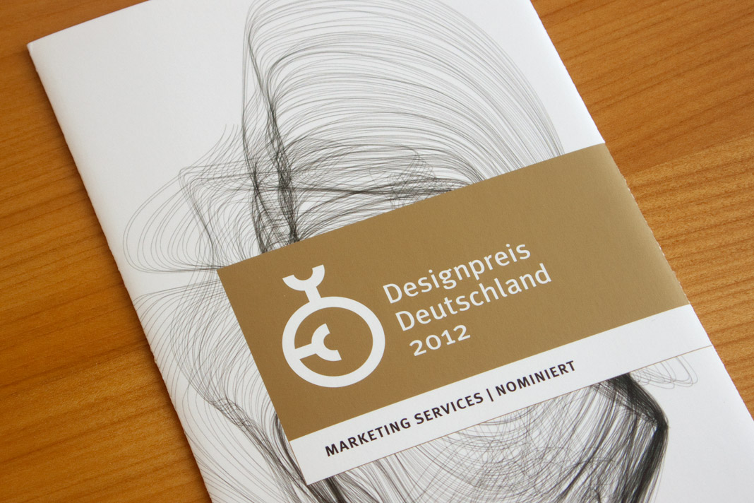 Nomination for the German Design Award 2012.
DA Mitteilungen presents The making of Acorde
Since my article about the making of Acorde raised a lot of interest on the world’s most popular typography blog, I Love Typography (ILT), during autumn last year, I decided to translate the article to German and to make it specially available to Austrian designers with an interest in type and typography as well.
The article was published by Design Austria, Austria’s professional association and service organisation representing the interests of designers from all creative disciplines, appearing in its quarterly published journal DA Mitteilungen (issue No. 2/2011).
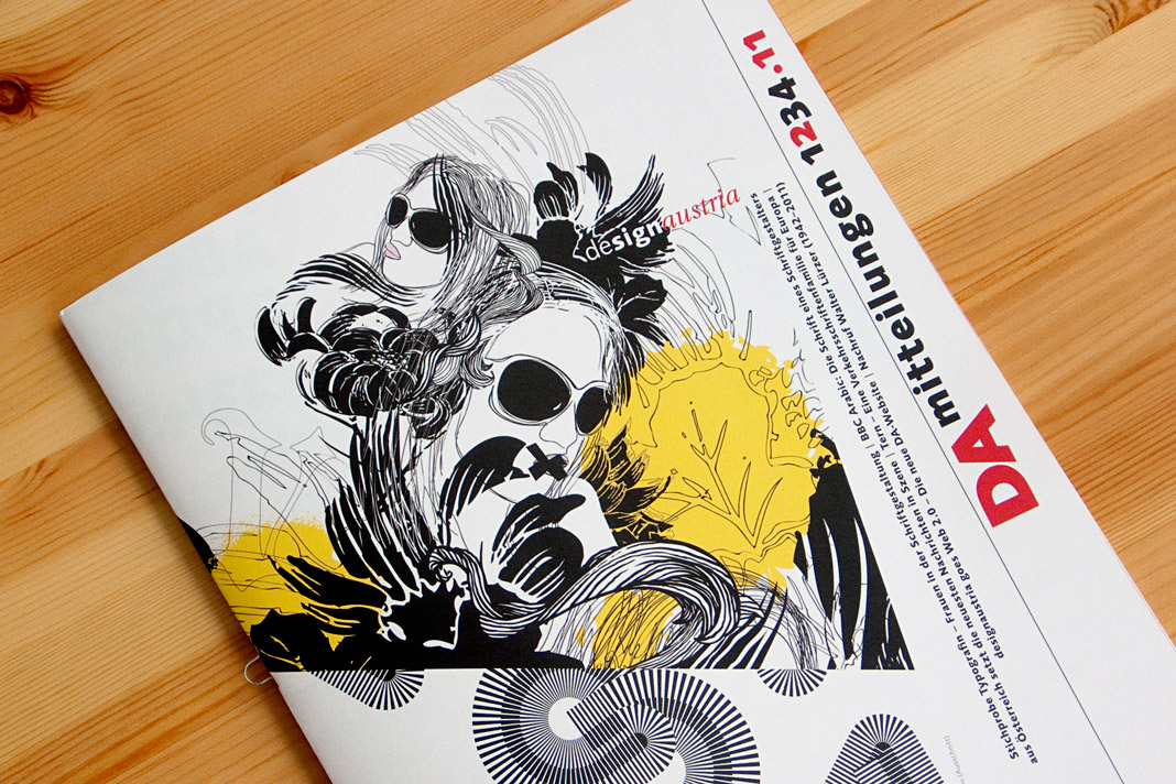 The cover of DA Mitteilungen issue No. 2/2011.
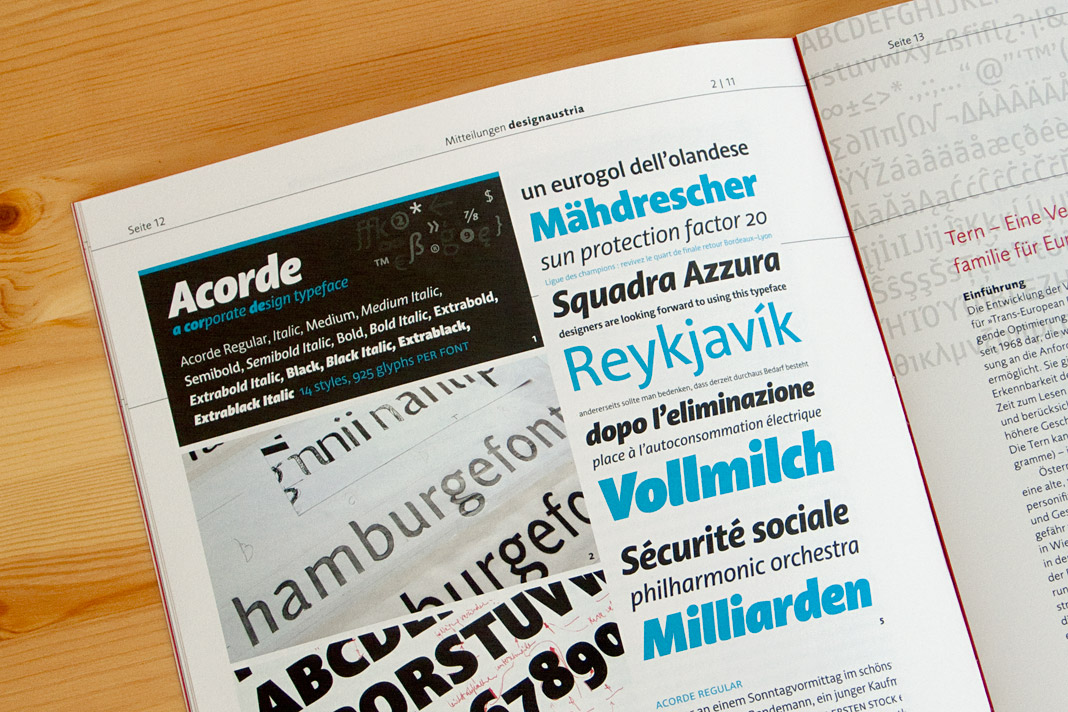 Double page spread showing the article on Acorde.