Blog – Entries tagged as Austria
Our design talk on the Loacker redesign was a great success
Our design talk on the redesign of the well-known Loacker brand at Vienna’s Designforum (MQ) on 27 April was a great success. Christoph Aichner, Loacker’s design manager, spoke about the company’s rich history and the strategic reasons for the redesign process. He also mentioned the great popularity of the company’s products in the Middle East, the US, and Asia.
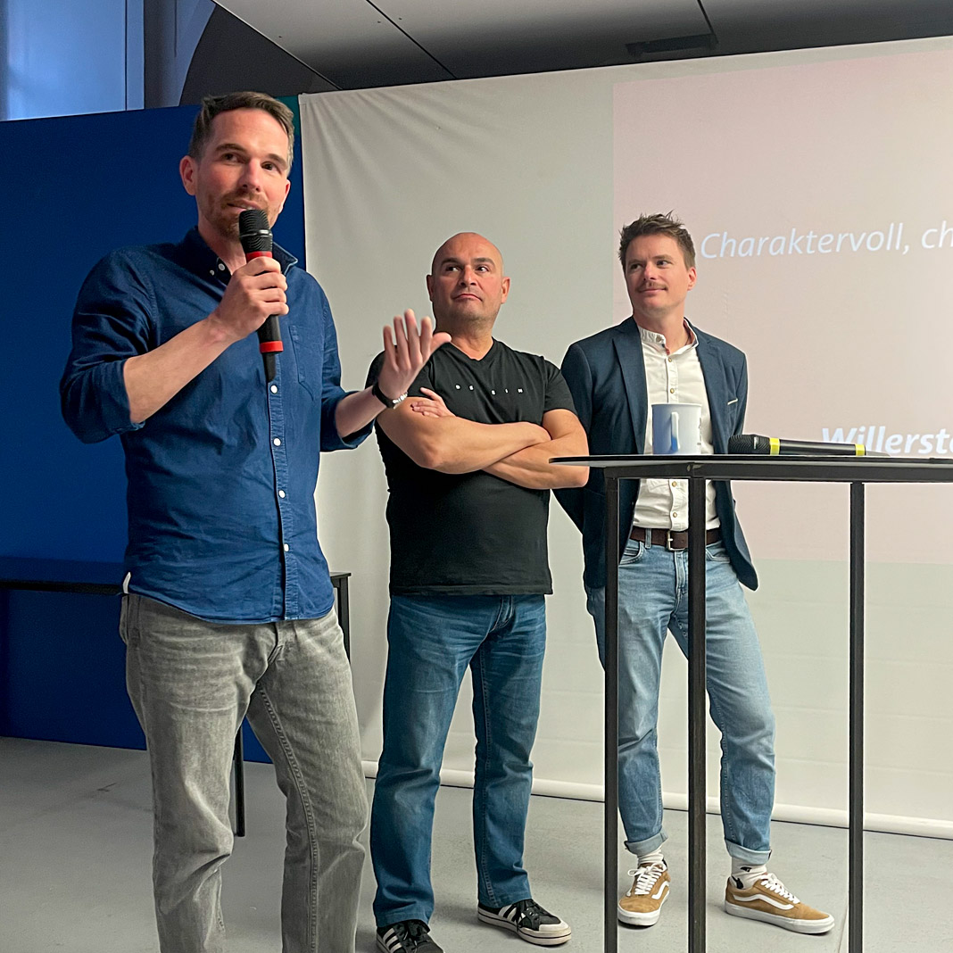 Stefan Willerstorfer (left), Roby Attisano and Loacker’s design manager Christoph Aichner (right).
I had the pleasure of explaining the exciting process of refining and harmonising the logotype and improving its recognisability down to the smallest detail. The presentations were followed by a lively discussion with Roby Attisano, Christian Thomas, and the audience.
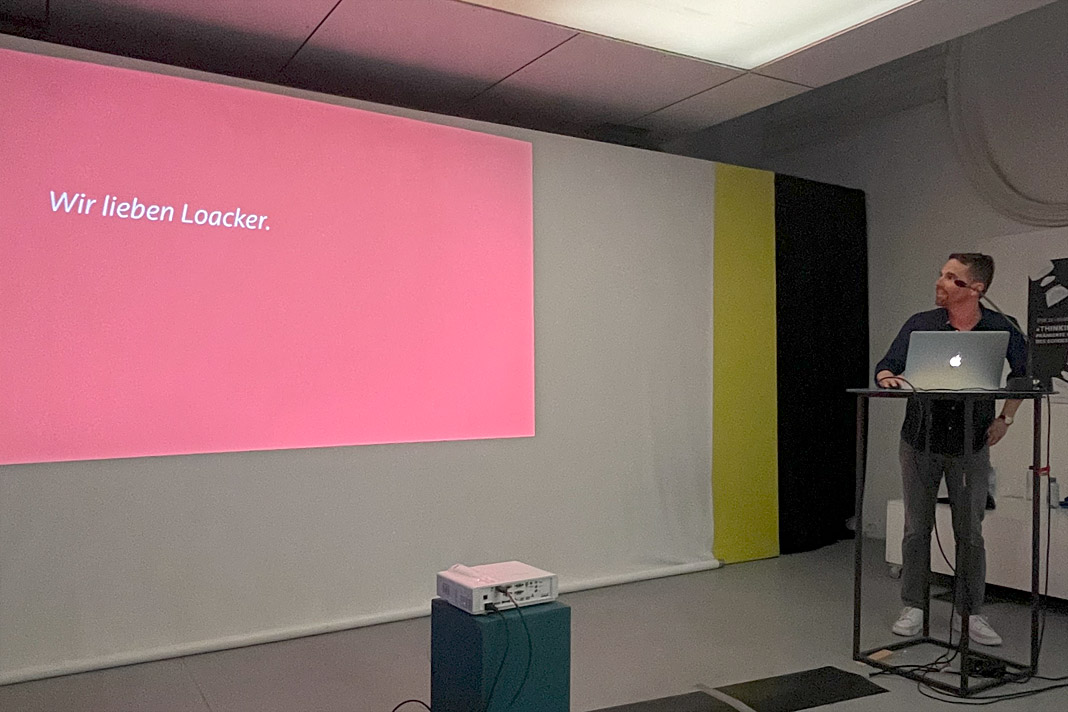 Stefan Willerstorfer guides the audience through the convincing redesign presentation.
As a special treat, each participant received some samples of Loacker’s famous delicious wafers. Yum!
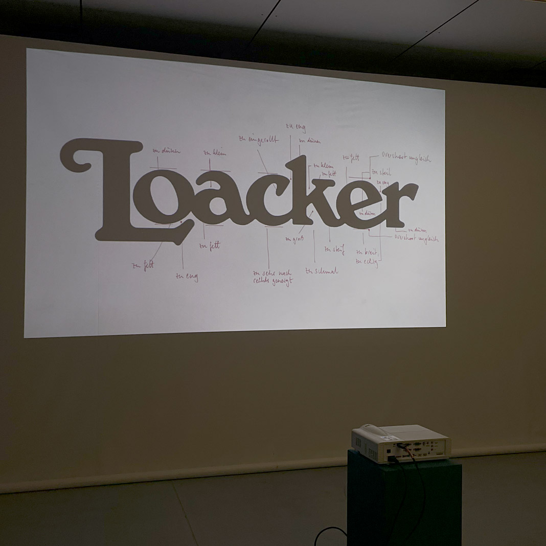
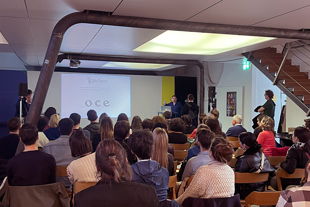
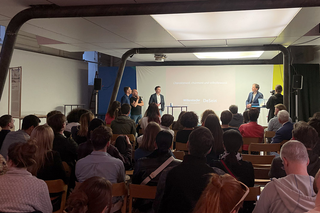 Various impressions of the design talk on the Loacker redesign in Vienna’s Designforum (MQ).
Upcoming lecture in April: Redesigning the famous Loacker brand
Save the date: On 27 April, Roby Attisano and I will be joined by Loacker’s design manager Christoph Aichner to talk about the process of redesigning the famous Loacker brand. The lecture starts at 6:30 pm in Vienna’s Designforum (MQ).
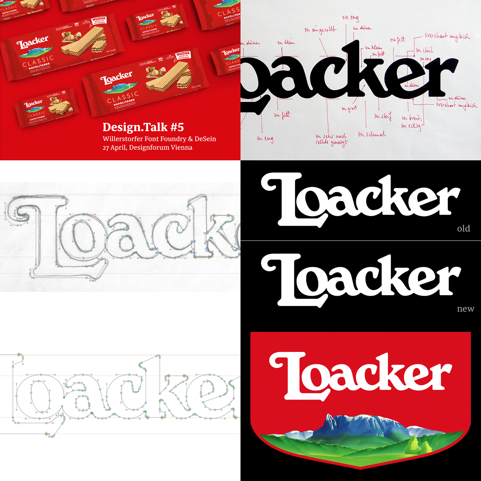 This animation shows various stages in the further development of Loacker’s logotype.
“How can the revision of a famous logotype meet today’s requirements without losing the brand-giving originality? How can the originality even be uncovered and strengthened? And how can we succeed in convincing the client of this courageous step?
The redesign of the well-known Loacker brand is a wonderful example of how the clear and consistent further development of a design idea can lead to an even more convincing result. In their conversation with Loacker, designers Stefan Willerstorfer and Roby Attisano provide exciting and motivating insights into the design process and the successful collaboration with Loacker.”
Sindelar is still in the News
Austrian magazine News switched to Sindelar as their primary text face five years ago. Since then Sindelar has been offering high legibility to the magazine’s readers and is continuing to do so.
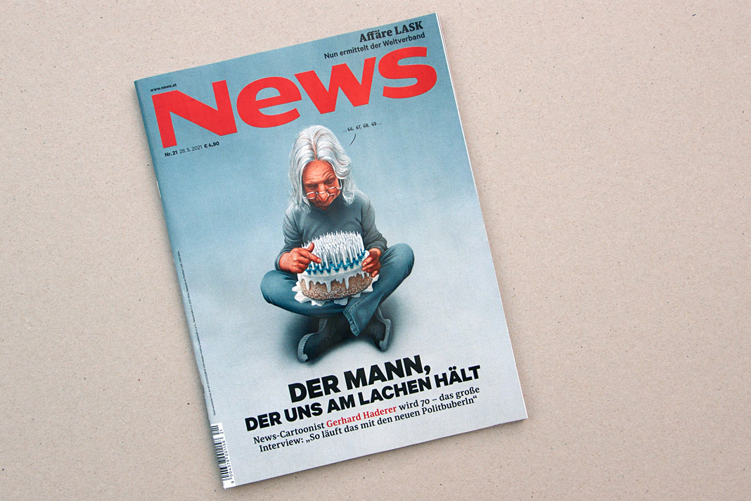 Cover of a recent issue of the magazine News.
News is one of Austria’s biggest weekly magazines and the major news magazine in the country. It has a circulation of about 160,000 copies and covers various topics such as politics, business, culture, and sports.
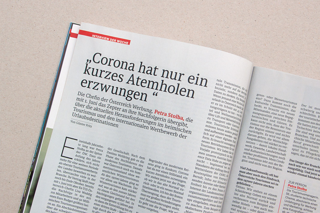
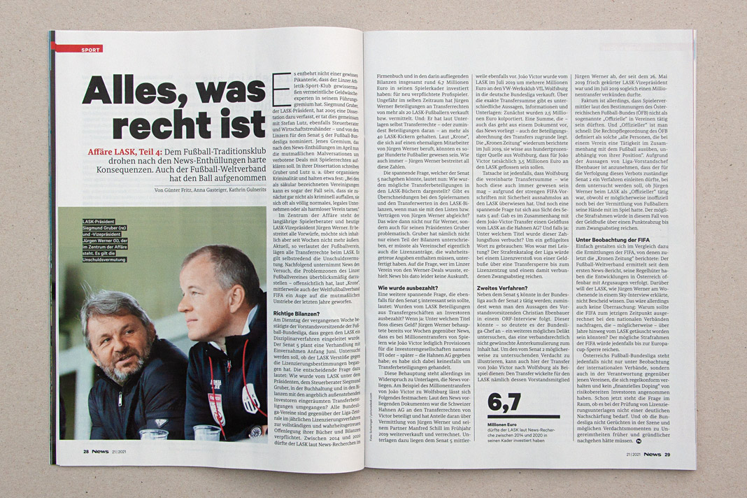
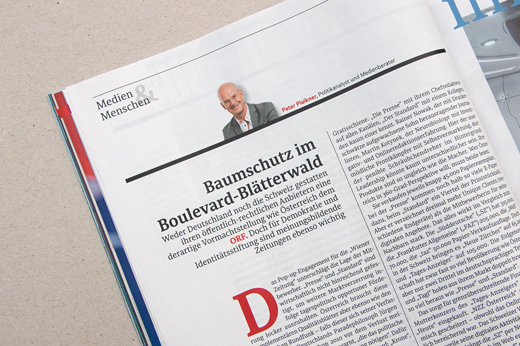 Various impressions of a recent issue of the magazine, mainly set in Sindelar.
Wienerberger’s new logotype: Our bespoke design solution
Wienerberger’s new logotype has been in use for some time now and we are still very proud of it. The logotype exemplarily proves all the advantages of an individual design solution. Since it is not based on an existing typeface but drawn from scratch, all design decisions could be made much more accurately. All letters are optimised for their exact position and sequence within the logotype.
 Wienerberger’s new logotype is a bespoke design solution.
Wienerberger is one of Austria’s largest companies and the world’s largest brick producer. It is a leading supplier of clay roof tiles, concrete pavers, and pipe systems in Europe. The Wienerberger Group operates 195 production sites in 30 countries.
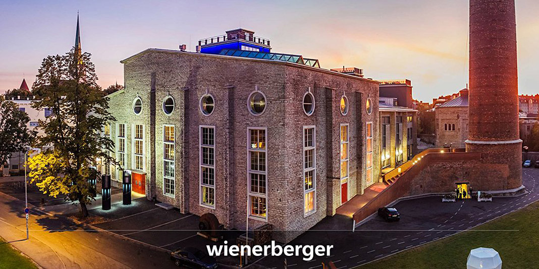
The high demands of this international player are perfectly met by the new logotype which is as individual as the company itself. The development of the logotype was done in close collaboration with the Viennese branding agency Brainds. I really enjoyed the professional collaboration and was very happy to contribute my type design expertise to this interesting project.
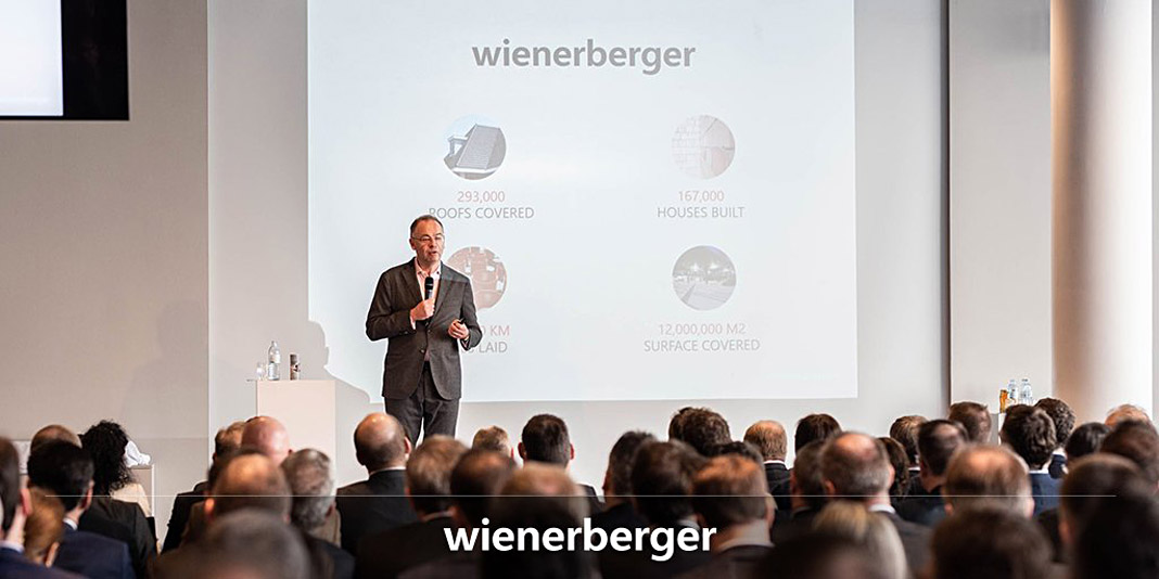
This year Wienerberger celebrates its 200th anniversary. The first half of 2019 was the best half year in Wienerberger’s history. As the logotype’s designer I am willing to believe that the new logotype also contributed its share to this success.

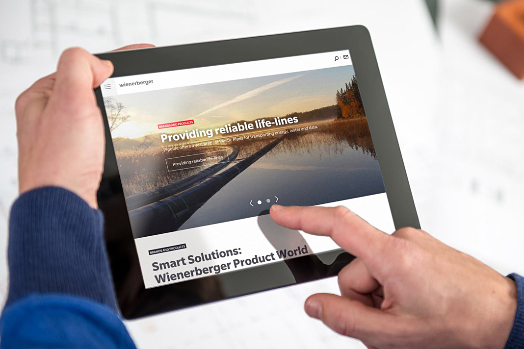 Various applications of Wienerberger’s new logotype.
Gerhard Hanappi book set in Sindelar and Acorde
Now that’s a project we are really happy about. The book about famous Austrian football (soccer) player and architect Gerhard Hanappi is entirely set in Sindelar and Acorde. The book was designed by Austrian designer Peter Duniecki and published by the Swiss publishing house Park Books.
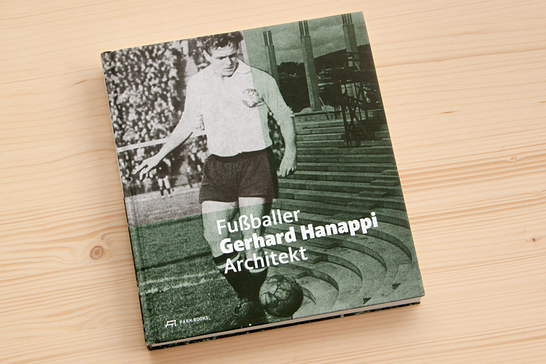 Cover of Fußballer Gerhard Hanappi Architekt, set in Acorde.
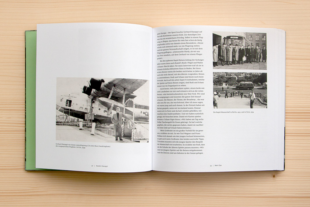
Why are we so happy about it? First, the book is really well designed, and second, we love football. As you may know, the type family Sindelar is named after famous Austrian football player Matthias Sindelar. Interestingly Sindelar and Hanappi played at the two rivalling Viennese Clubs Austria Wien and Rapid Wien (not at the same time though). The book achieves something that is not very likely in real life: One player of Austria Wien supports a project by a player of Rapid Wien. The result of this collaboration is really convincing. Just have a look yourself!
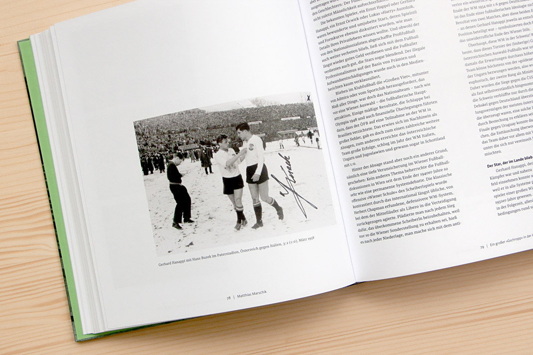

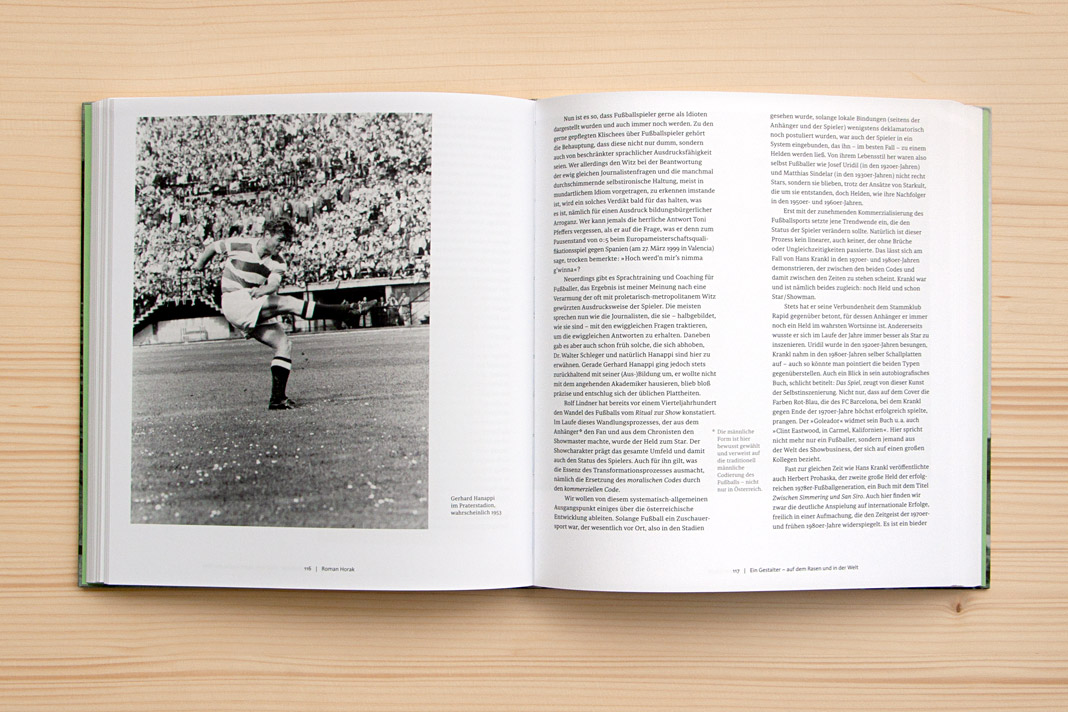
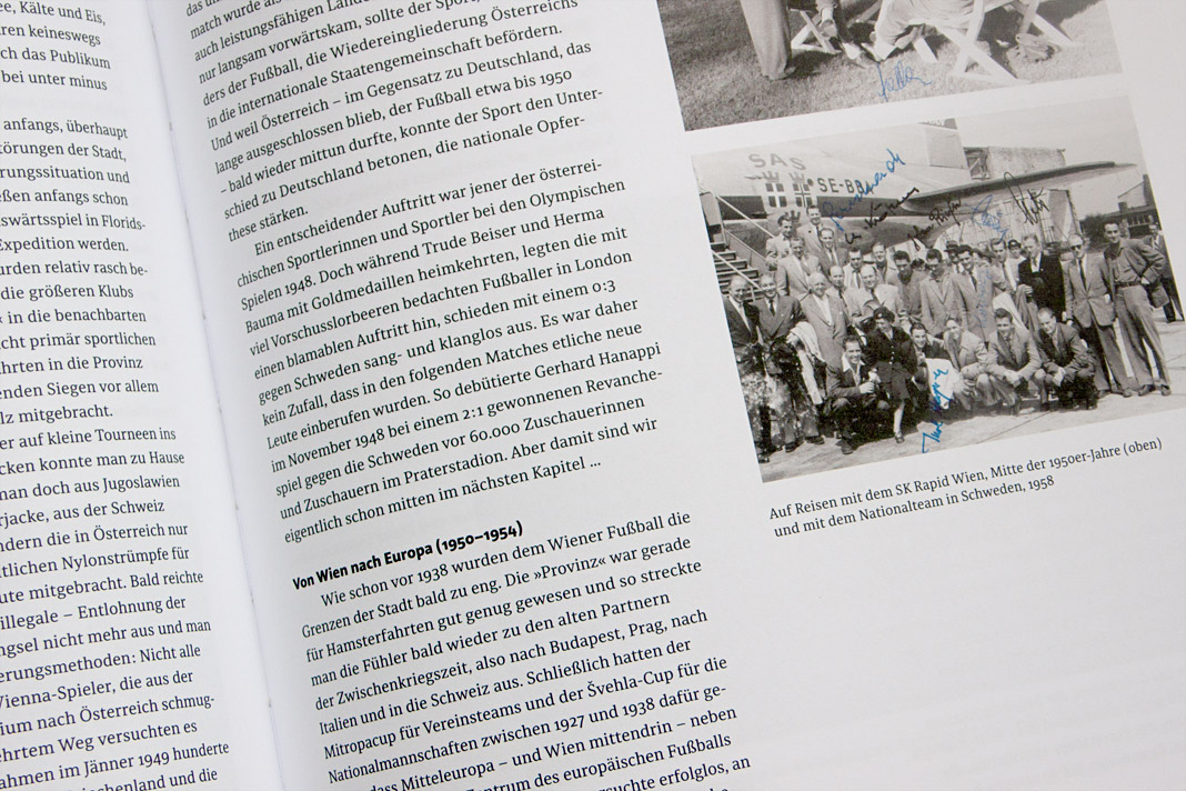
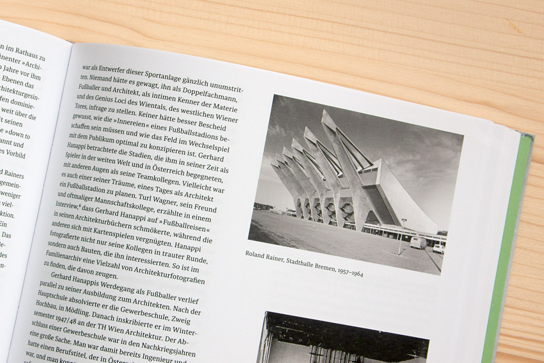 Various impressions of Fußballer Gerhard Hanappi Architekt, entirely set in Sindelar and Acorde.
Puzzling poster for die Graphische features Acorde
As you might know, Acorde was designed to be perfectly suited to all different sizes, from small continuous text to large headlines and big signage. Therefore its large application on this poster is a great example of Acorde’s display qualities. The poster is an advertisement for the renowned graphic design school, die Graphische, in Vienna.
At first sight the poster appears puzzling and you can only read Kryptisch? (Cryptic?) and Dann komm auf die Graphische! (Walk to/join the Graphische!). When you walk a few steps further towards the school (located opposite the poster) and look at the advertisement through a red glass you can suddenly read: Wir haben den Durchblick in der Gestaltung! (We have a clear view on design./We know about design.) The poster was designed by Lydia Körner. Great idea, Lydia!
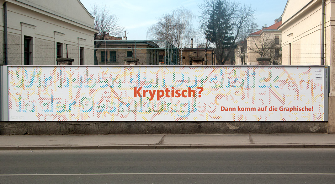 At first sight the poster appears puzzling.
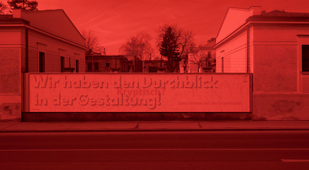 When you look at the advertisement through a red glass you can suddenly read more text.
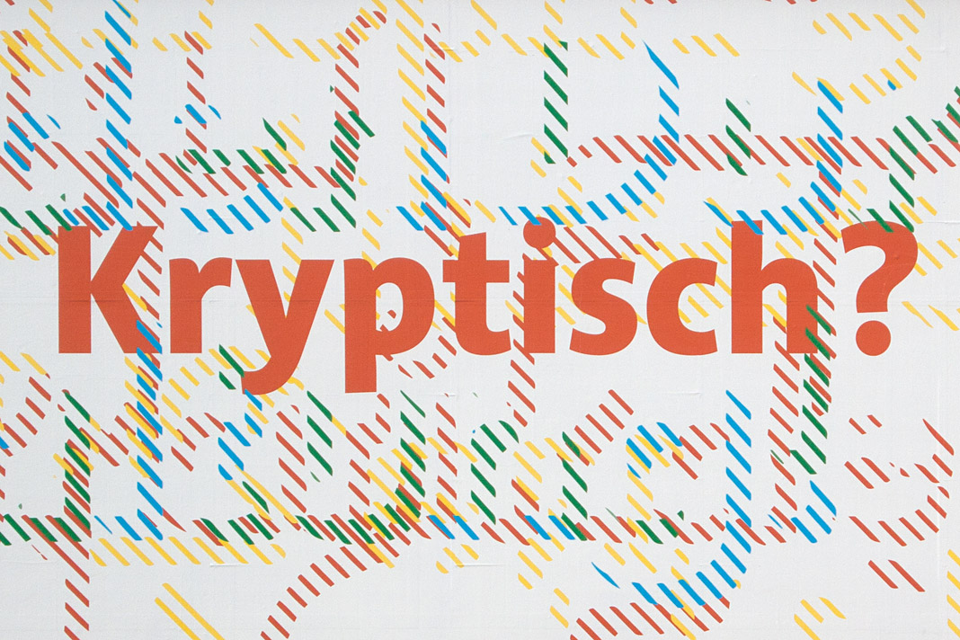 Acorde’s large application on this poster is a great example of its display qualities.