Blog – Entries tagged as Turin
Redesign of the world famous Loacker brand
As you know, we care about details. How much details matter can easily be seen in our redesign of the world famous Loacker brand, a leading producer of wafers and chocolate products. While the old logotype had a lot of character, charm, individuality, and robustness there was still room for improvement.
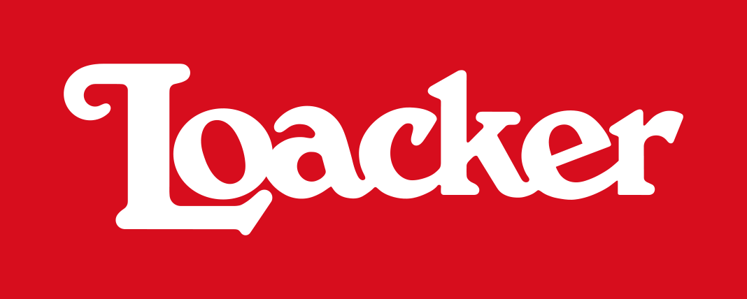 Loacker’s old logotype had a lot of character.
The redesign process was focused on keeping the logotype’s striking, original qualities and resolving its formal and technical weaknesses at the same time. Our work resulted in a logotype that is better suitable for all applications in print and on screen.
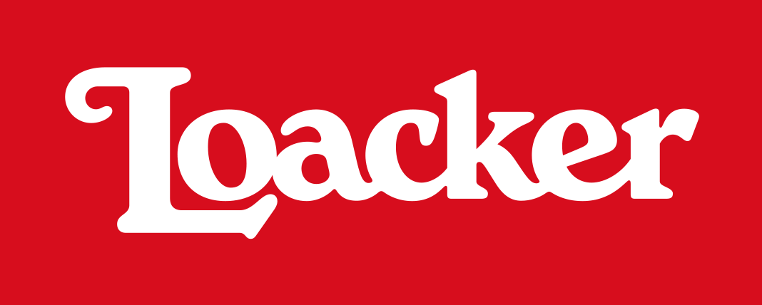 Loacker’s new logotype kept all the character and strongly improved in quality and style.
There are no more formal inconsistencies and technical deficiencies within the new logotype. Letter combinations which used to be too tight were loosened, making the overall spacing between letters more consistent. The shapes of the letters are now better related and the logotype’s overall colour is more even. All these corrections result in a perfectly balanced and rhythmic appearance.
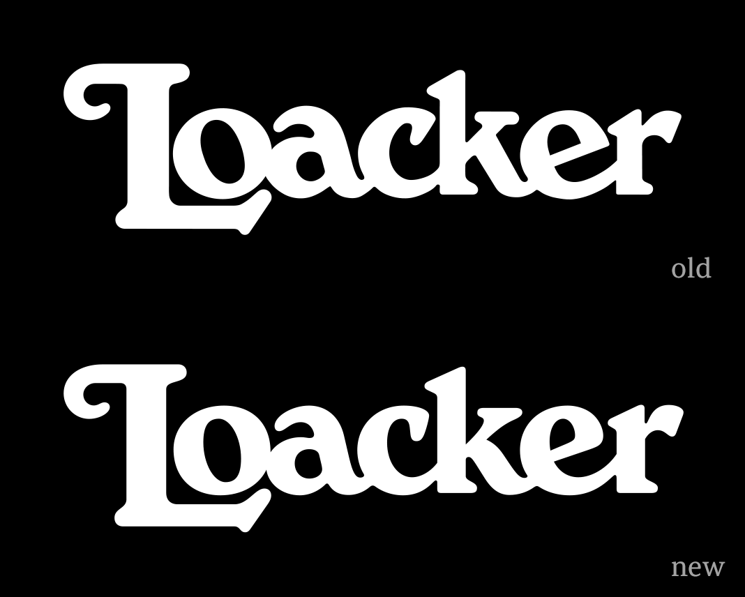 This animation clearly shows all the differences between the old and the new version.
Convince yourself and see how the logotype has improved on various levels. All corrections were made with the requirements of modern packaging and communication in mind. The redesigned logotype proves to be more legible on paper and on screen – especially in small sizes. It was introduced in 2021 and is applied on the packaging and in other applications within the Heritage Shield (a combination of the redesigned logotype and an illustration of the South Tyrolean mountain Schlern).
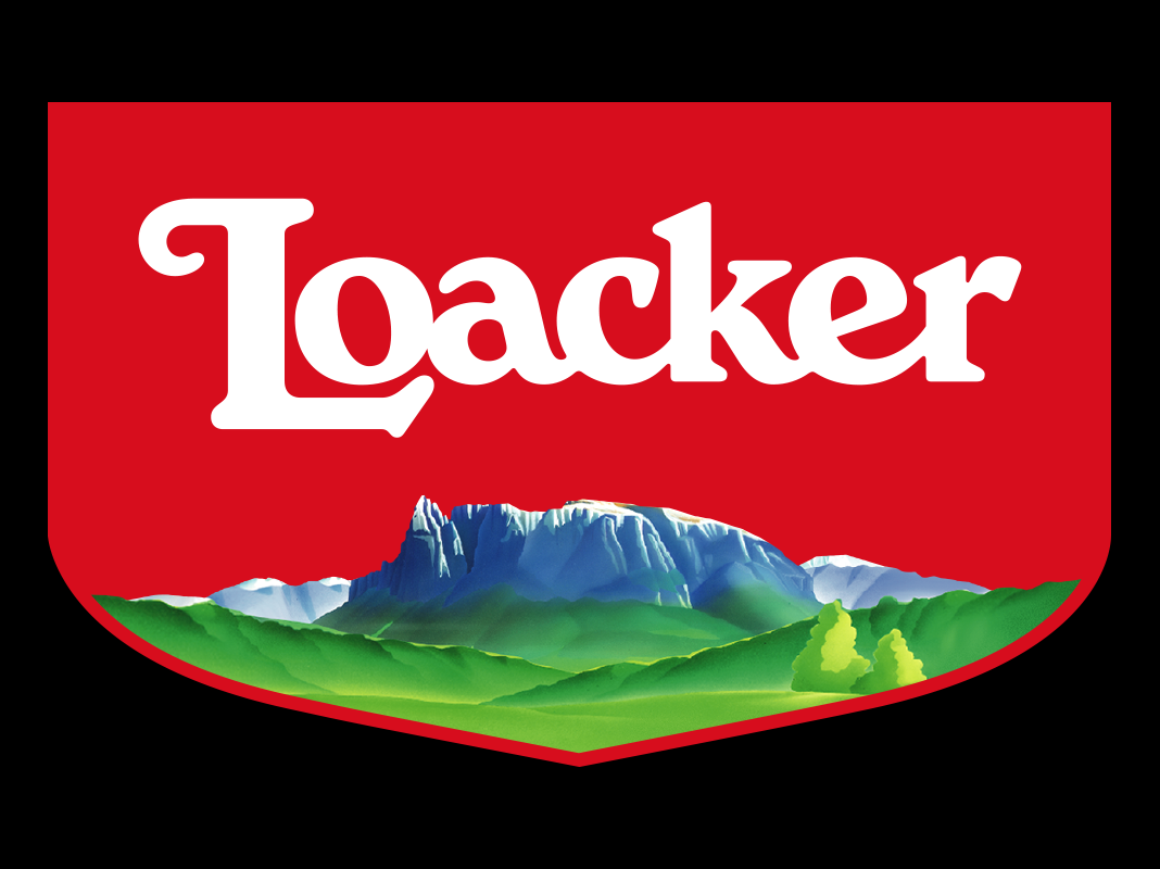 The new logotype within the Heritage Shield. The shield was designed by Torinese agency, Spider.
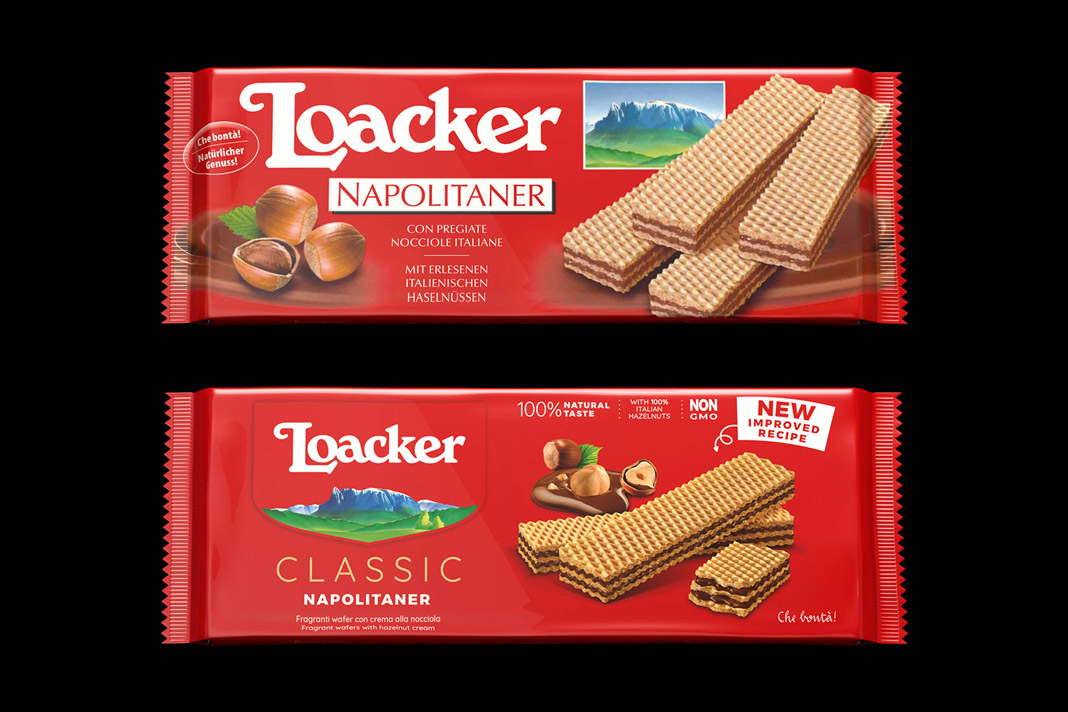 The old and the new packaging of Loacker’s famous Neapolitan wafers.
The new packaging (also introduced in 2021) as well as the Heritage Shield were designed by the Torinese agency, Spider. The logotype’s typographic redesign was carried out in close collaboration with Roby Attisano (Desein, Bolzano). We really enjoyed the great teamwork!
 Another great example of Loacker’s old and new packaging design.
Have you tried Loacker wafers, yet? You should! As you might know, Loacker has been producing wafers and chocolate specialties in South Tyrol (northern Italy) for almost 100 years now. They really know how to do it. Yum yum!
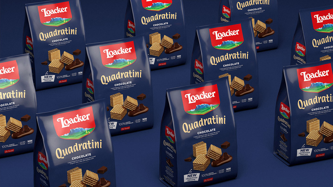 Loacker’s world famous Quadratini cubes.