Blog – Insights by Stefan Willerstorfer
Loacker redesign featured in German design magazine Page
Have you already had a look at the current issue (04/22) of Page, Germany’s most popular design magazine? Yes, you might have guessed, it contains an article we are really happy about.
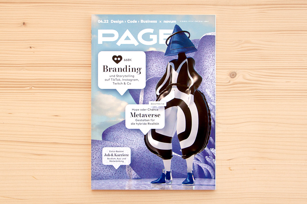 Cover of the current issue (04/22) of Germany’s popular design magazine Page.
The four-page article Detailversessen (detail-obsessed) showcases our redesign of the famous Loacker brand in great detail. As you might know, Loacker is an Italian company based in South Tyrol, producing tasty wafers and chocolate products.
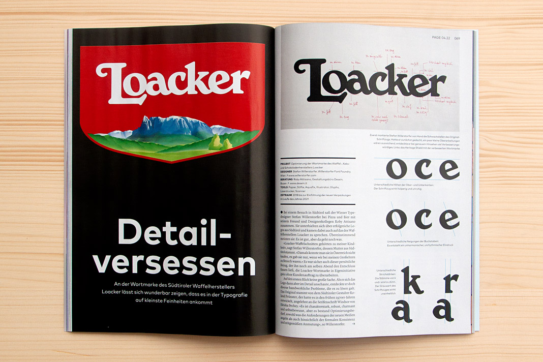 Double page spread showing the new Loacker logotype on the left and the old one on the right.
Interestingly the Loacker redesign did not begin like an ordinary project. There was no order at the beginning of the project. Just an idea – an idea that followed a vivid discussion between two designers while enjoying pizza and beer. Talk about characterful Italian (South Tyrolean) logotypes. At some point we (Roby Attisano and I) agreed that the logotype of Loacker was good but it could get even better. And then I spontaneously decided to do it, to proactively redesign the logotype without an order.
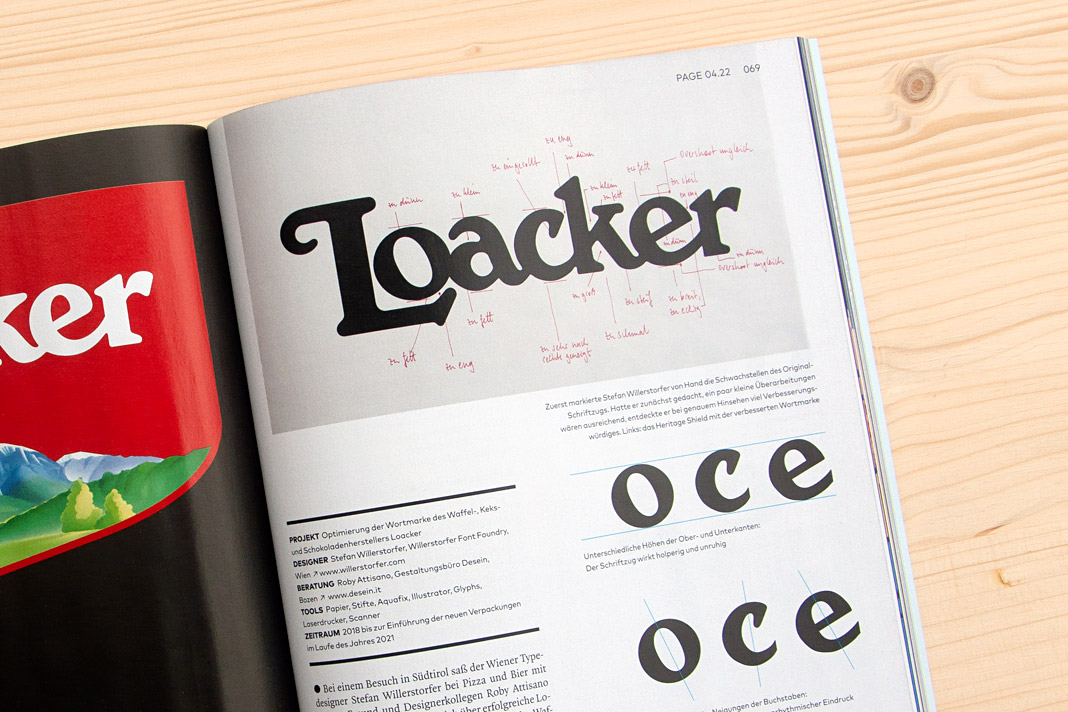 On top you can see written notes for all the corrections to be made to the old Loacker logotype.
The idea of redesigning the Loacker logotype lead to an interesting design process that I really enjoyed. The process was accompanied by Roby Attisano’s valuable feedback. Luckily the Loacker company was so convinced by the redesigned logotype that they decided to buy it and to apply it instead of the old one. We take the company’s decision as a strong compliment and honest praise. It encourages us in our way of paying attention to even small details and providing individual typographic solutions of highest quality.
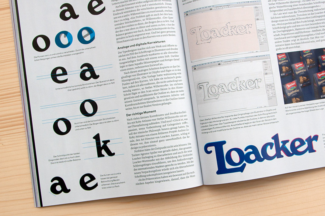 Various inconsistencies of the old logotype on the left. Stages of the design process on the right.
If you want to know more about the story (and are fluent in German) you can read the article in the current issue of Page (04/22). Enjoy the reading.
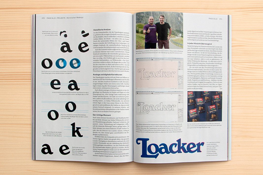 The top of the right page shows Roby Attisano (left) and Stefan Willerstorfer in South Tyrol.
Redesign of the world famous Loacker brand
As you know, we care about details. How much details matter can easily be seen in our redesign of the world famous Loacker brand, a leading producer of wafers and chocolate products. While the old logotype had a lot of character, charm, individuality, and robustness there was still room for improvement.
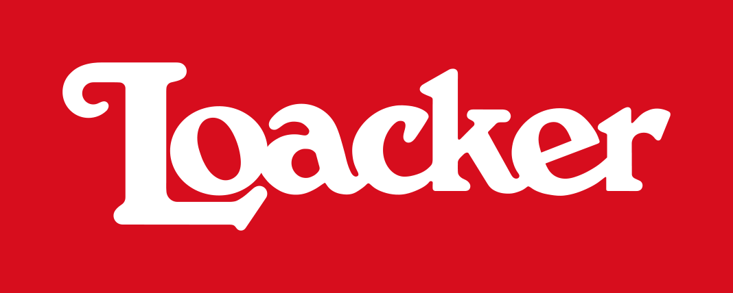 Loacker’s old logotype had a lot of character.
The redesign process was focused on keeping the logotype’s striking, original qualities and resolving its formal and technical weaknesses at the same time. Our work resulted in a logotype that is better suitable for all applications in print and on screen.
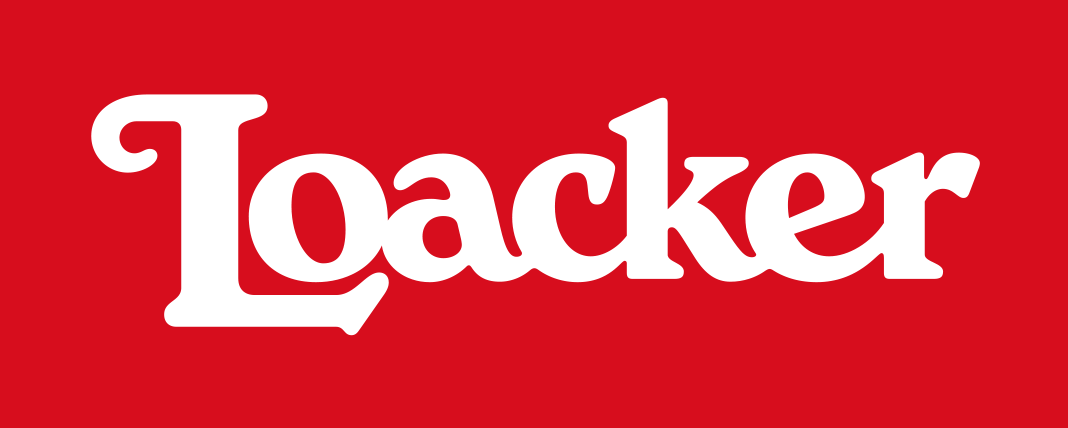 Loacker’s new logotype kept all the character and strongly improved in quality and style.
There are no more formal inconsistencies and technical deficiencies within the new logotype. Letter combinations which used to be too tight were loosened, making the overall spacing between letters more consistent. The shapes of the letters are now better related and the logotype’s overall colour is more even. All these corrections result in a perfectly balanced and rhythmic appearance.
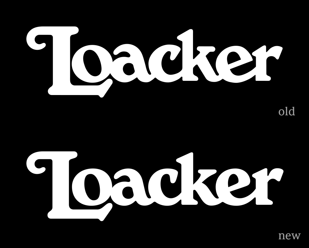 This animation clearly shows all the differences between the old and the new version.
Convince yourself and see how the logotype has improved on various levels. All corrections were made with the requirements of modern packaging and communication in mind. The redesigned logotype proves to be more legible on paper and on screen – especially in small sizes. It was introduced in 2021 and is applied on the packaging and in other applications within the Heritage Shield (a combination of the redesigned logotype and an illustration of the South Tyrolean mountain Schlern).
 The new logotype within the Heritage Shield. The shield was designed by Torinese agency, Spider.
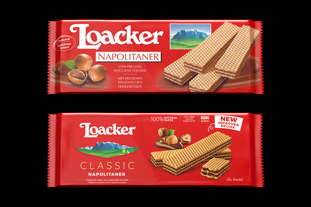 The old and the new packaging of Loacker’s famous Neapolitan wafers.
The new packaging (also introduced in 2021) as well as the Heritage Shield were designed by the Torinese agency, Spider. The logotype’s typographic redesign was carried out in close collaboration with Roby Attisano (Desein, Bolzano). We really enjoyed the great teamwork!
 Another great example of Loacker’s old and new packaging design.
Have you tried Loacker wafers, yet? You should! As you might know, Loacker has been producing wafers and chocolate specialties in South Tyrol (northern Italy) for almost 100 years now. They really know how to do it. Yum yum!
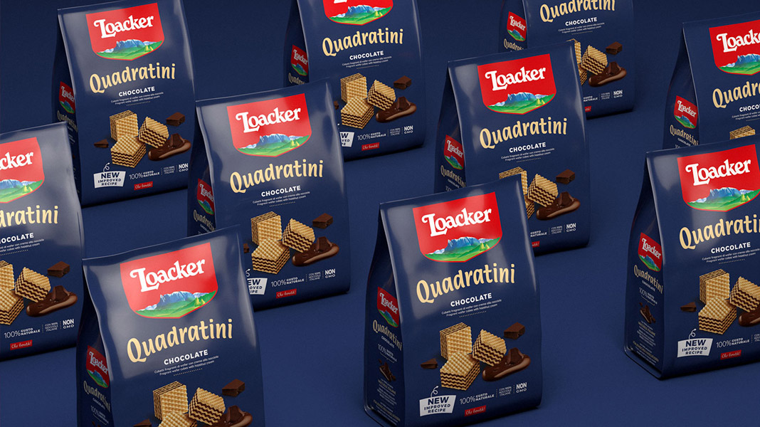 Loacker’s world famous Quadratini cubes.
Where Bézier curves rule
On our summer trip to Andorra we (and probably any type designer) couldn’t resist passing through the French town of Béziers. It didn’t come as a surprise that you enter the town by a perfectly drawn roundabout. Bézier curves rule. Especially here!
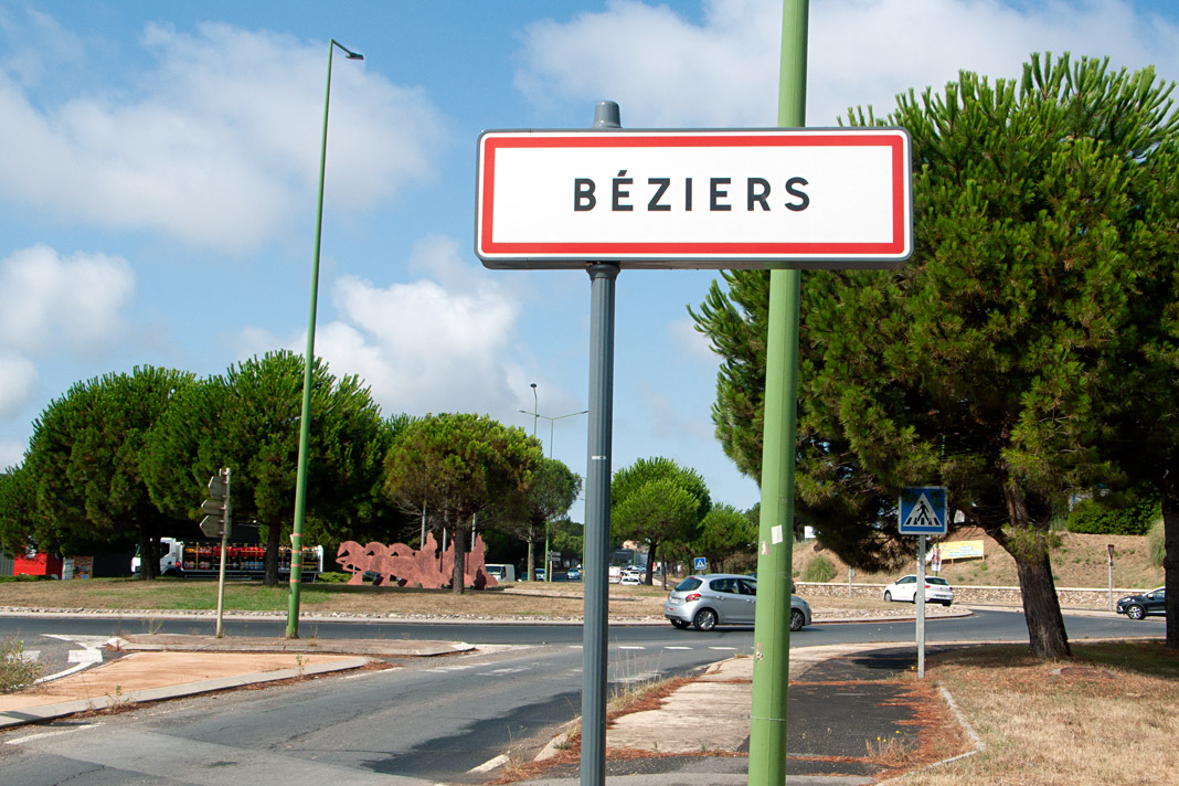


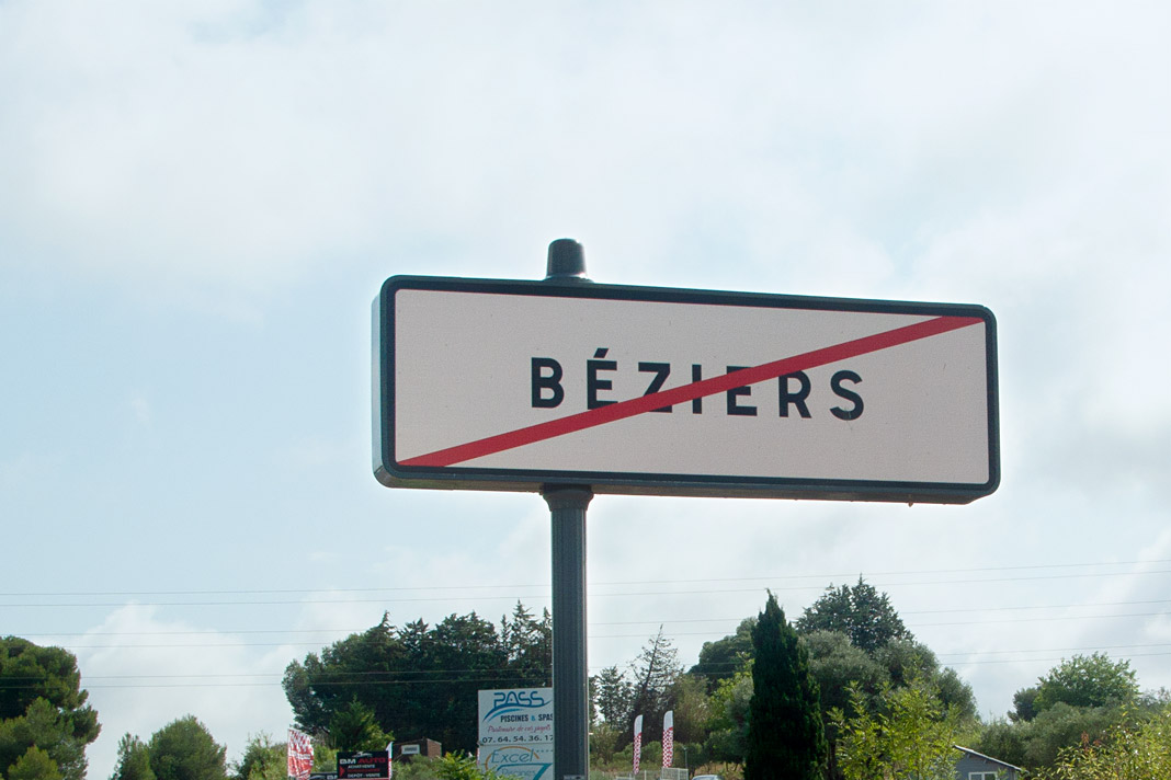 Various impressions of the French town of Béziers.
Sindelar is still in the News
Austrian magazine News switched to Sindelar as their primary text face five years ago. Since then Sindelar has been offering high legibility to the magazine’s readers and is continuing to do so.
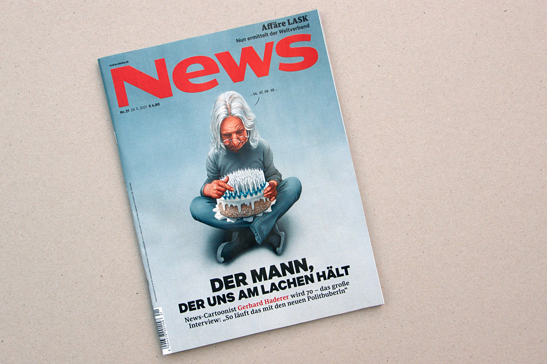 Cover of a recent issue of the magazine News.
News is one of Austria’s biggest weekly magazines and the major news magazine in the country. It has a circulation of about 160,000 copies and covers various topics such as politics, business, culture, and sports.
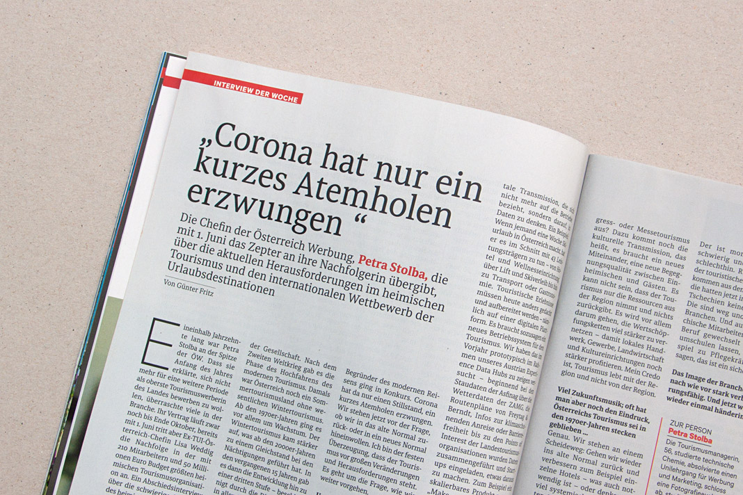
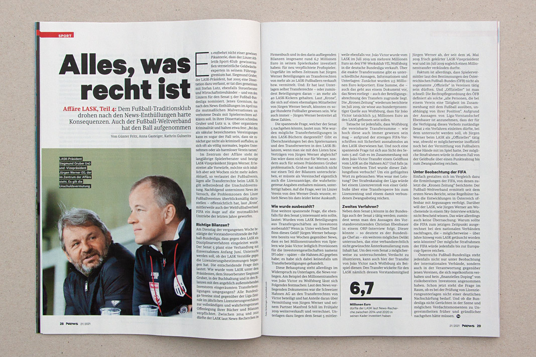
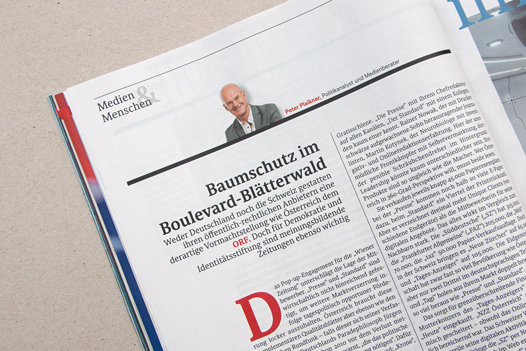 Various impressions of a recent issue of the magazine, mainly set in Sindelar.
Happy birthday, Acorde!
Happy birthday, Acorde! And it’s a significant one indeed. Ten years are really something to celebrate. Acorde has been delighting designers and readers around the globe for a decade now and will continue to do so.
In the past ten years we’ve had customers from six different continents. So there is only one continent missing. As you may have guessed, it’s Antarctica. But who knows, maybe that will change within the next decade. We are confidently looking forward to it!
The new Yearbook of Type features White, Black. Gray!
I am happy to see my article, White, Black. Gray! – Why Sketching Matters, published in the new Yearbook of Type (#4 2019/20). It is part of a comprehensive series of instructive articles focused on various aspects of type design. My article appears at the beginning of the book in order to reflect that sketching happens at the beginning of the design process, and provides the basis for a typeface’s development.
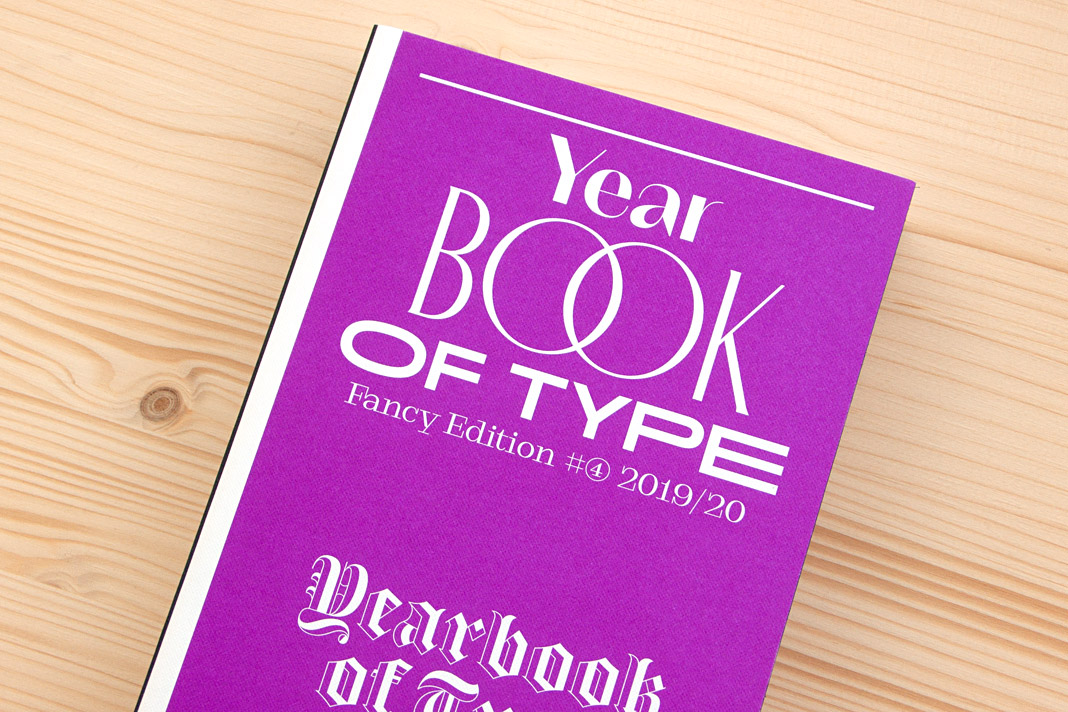 Cover of the Yearbook of Type 2019/20, published by Slanted Publishers.

The Yearbook of Type is a practical guide that helps typeface users stay up to date with the latest type design trends and innovations. It showcases detailed presentations of more than 150 type families from around the globe. Highly recommended!
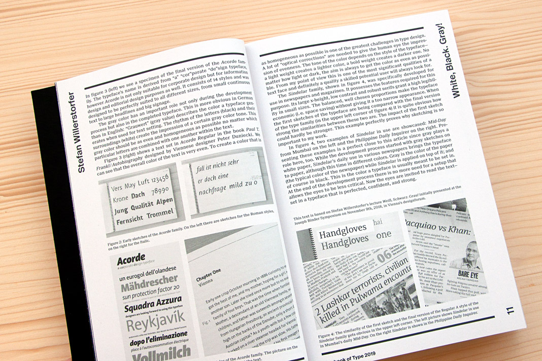 Double page spread presenting the article White, Black. Gray! – Why Sketching Matters.