Blog – Entries tagged as Acorde in Use
Josef Frank’s writings set in Acorde
The bilingual book Josef Frank: Writings is a complete collection of all published writings of Austrian architect Josef Frank, one of the main protagonists of Classical Modernism. It comes in two volumes and consists of nearly 900 pages in total. Since the whole publication is entirely set in Acorde, it is probably amongst the publications where Acorde’s workhorse qualities can be judged most easily.
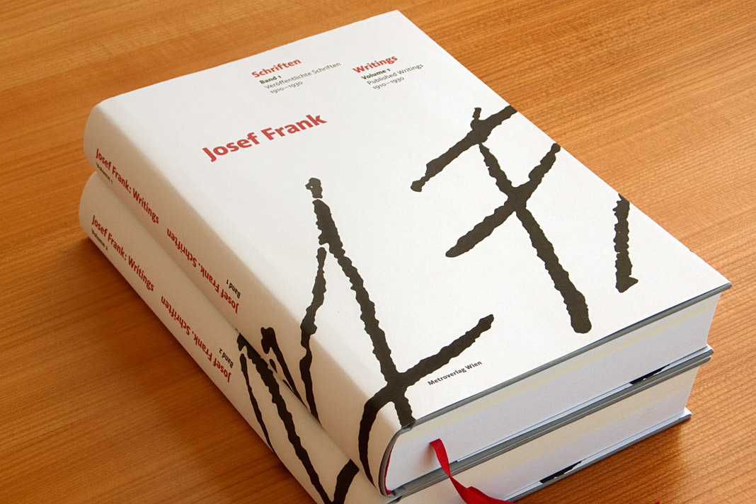 Both covers of the two-volume book show the enlarged signature of Josef Frank.
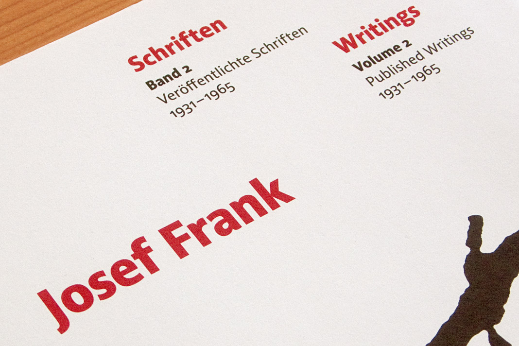
The two-volume book was designed by Austrian book designer Peter Duniecki who explains his choice of Acorde as follows. »Die verwendete Schrift spiegelt die Zeit der Wiener Moderne. Modern, klar, nicht so hart, runder, eben wienerischer als die Internationale Moderne. Ihre hervorragende Lesbarkeit würde Josef Frank zu schätzen wissen.« (The chosen typeface reflects the era of Viennese Modernism. Modern, pure, not so hard, rounder, just more Viennese than the International Modernism. Josef Frank would appreciate its outstanding legibility.)
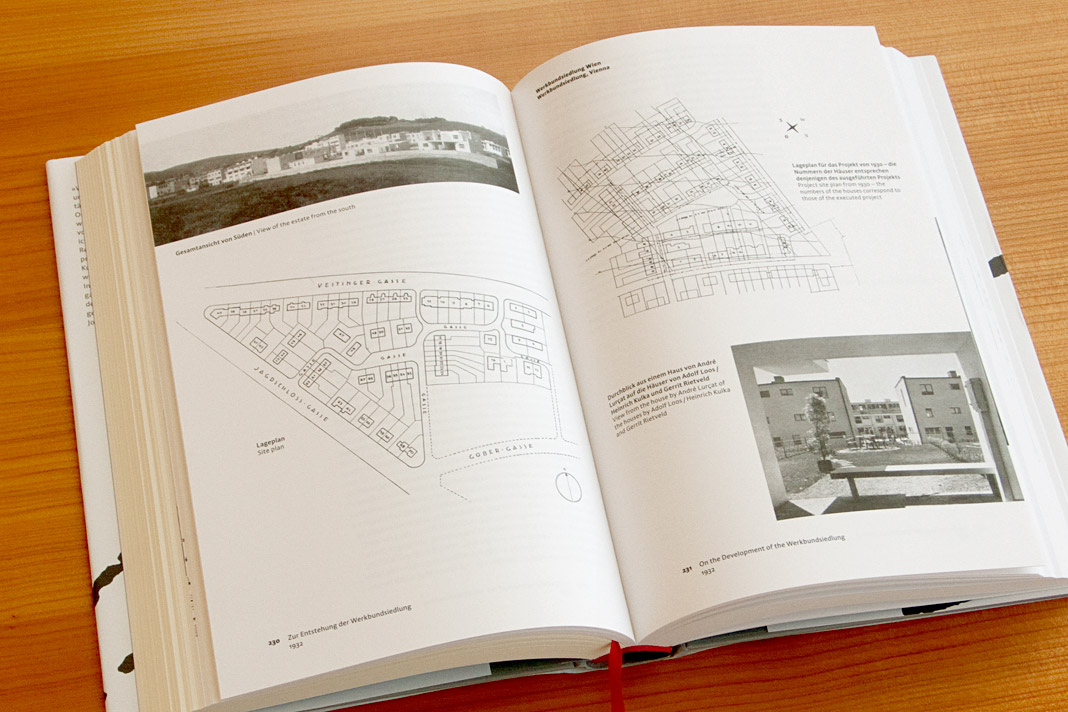
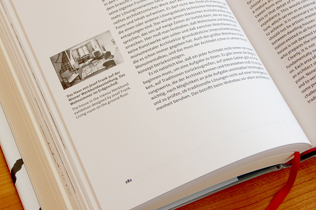
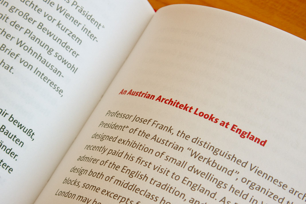 Various impressions of the publication on Josef Frank’s writings, designed by Peter Duniecki.
Publishing house facultas.wuv features Acorde
The Viennese publishing house facultas.wuv uses two italic styles of Acorde as the main dynamic visual element on the cover of one of their newest publications, a reference book of political science. The publication, entitled Theoriearbeit in der Politikwissenschaft (Academic Writing in Political Science) addresses the demands of students in political science doing their master’s studies. The book cover was designed by Austrian designer Martin Tiefenthaler.
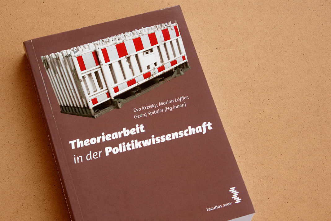 Cover of the book Theoriearbeit in der Politikwissenschaft (Academic Writing in Political Science).
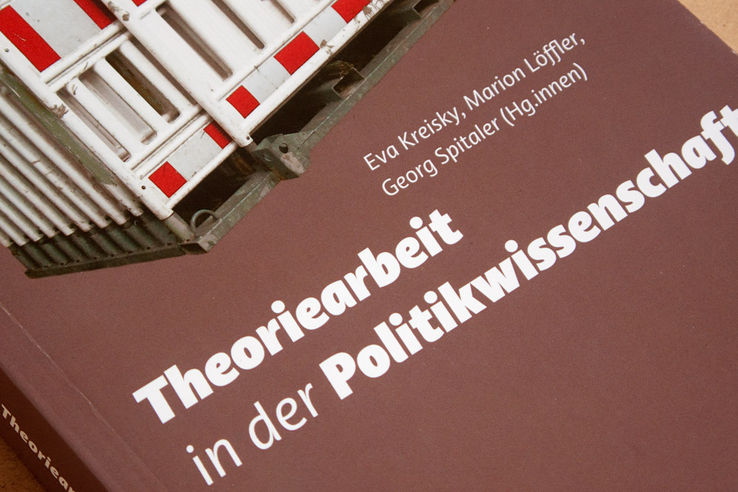 The italic styles of Acorde establish a dynamic contrast to the static photograph.
Typodarium 2013 features Acorde on November 28
Typodarium 2013 is the fifth edition of a series of annual calendars edited by the duo Lars Harmsen and Raban Ruddigkeit and published by Verlag Hermann Schmidt Mainz. It is now available and features 365 typefaces (one per day) designed by more than 212 designers from 33 countries.
The typefaces for the fifth edition were selected by a renowned international jury consisting of Donald Beekman, Indra Kupferschmid, Dan Reynolds, Carlos Segura, and Panos Vassiliou. Acorde is one of the typefaces on display and has been allocated a nice task: It gives Thanksgiving Day (US) on Thursday November 28 a suitable typographic appearance.
 The front side of November 28 shows three different styles of Acorde.
 The back side of November 28 contains a short description of Acorde.
Acorde presents the most beautiful books of A/D/CH/NL
Like every year the Typographic Society Austria (tga – Typographische Gesellschaft Austria) shows the most beautiful books of Austria, Germany, Switzerland, and the Netherlands in cooperation with the Vienna Public Libraries and the Association of Austrian Book Trade.
The most beautiful books of 2010 can be seen in the Central Library in Vienna from December 7, 2011 to February 4, 2012. The exhibition design is entirely set in Acorde. Since Acorde is used for small text (labels, signs, flyers) as well as for large headlines, the exhibition design is a good example of Acorde’s suitability for all different sizes.
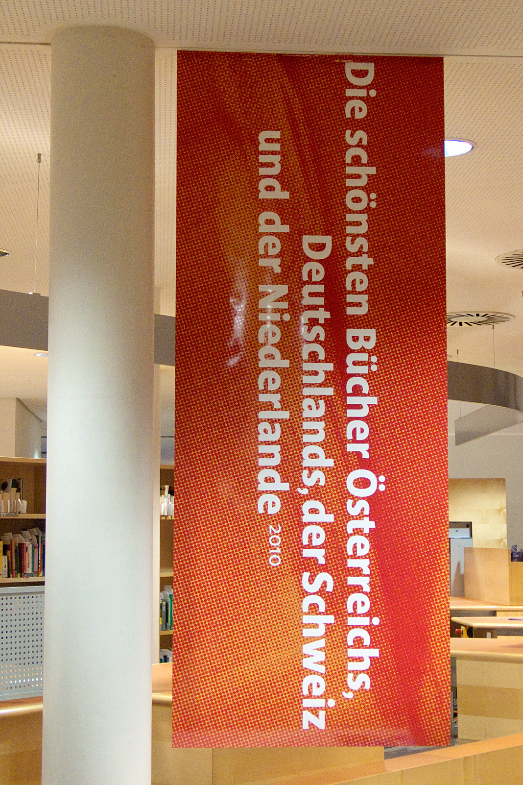
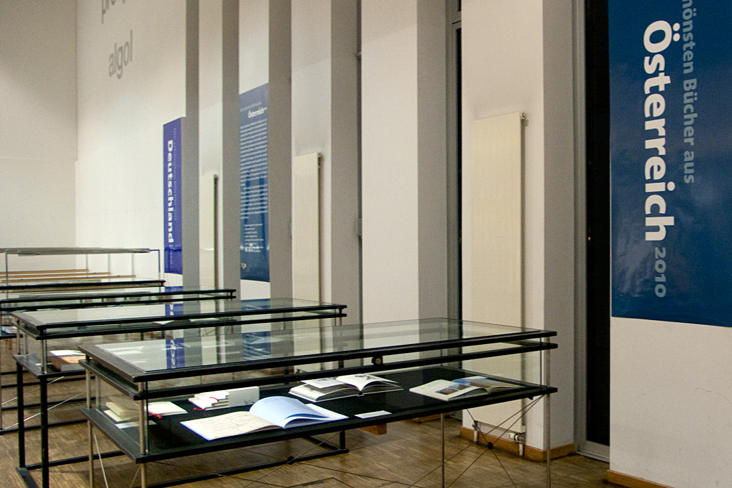
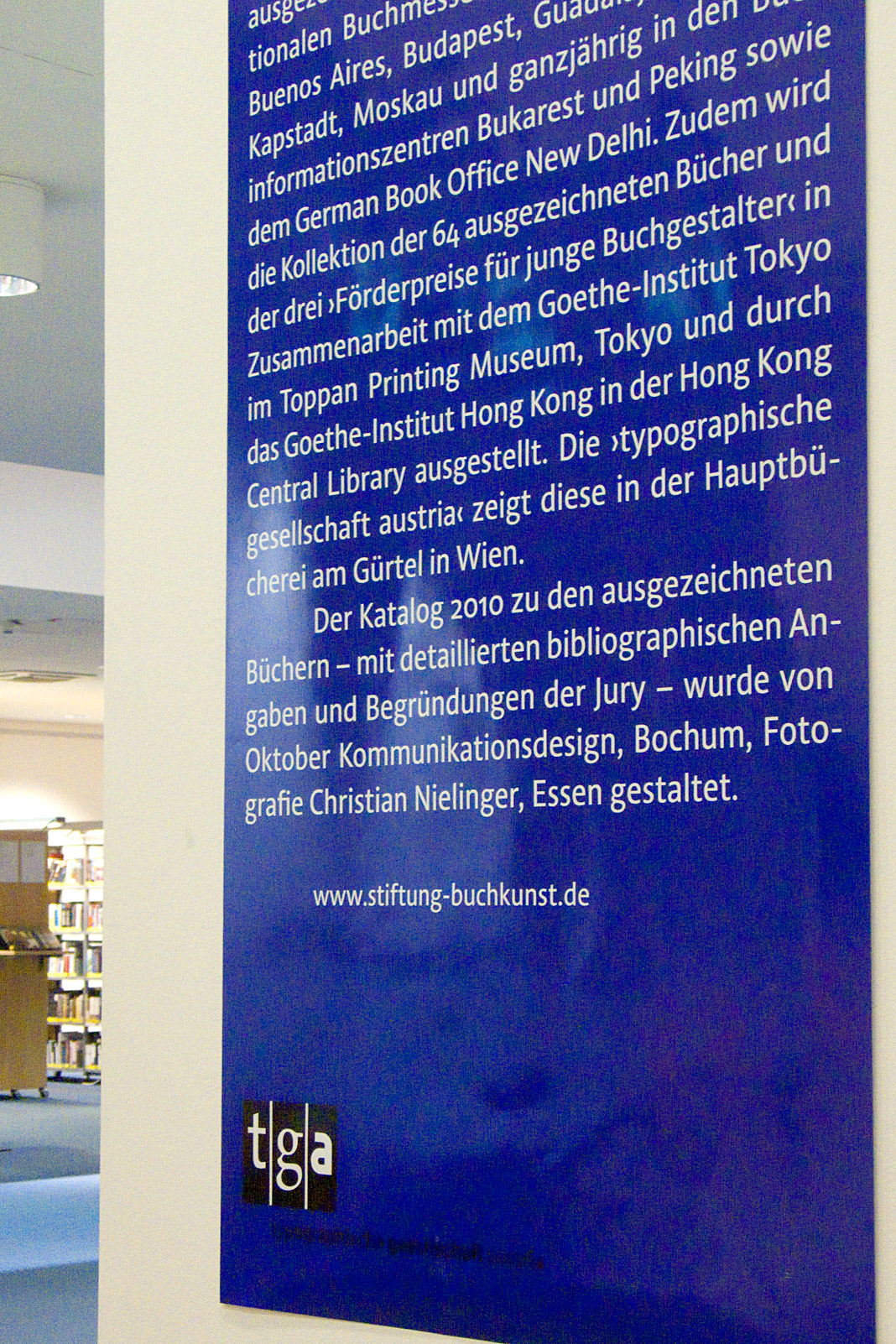
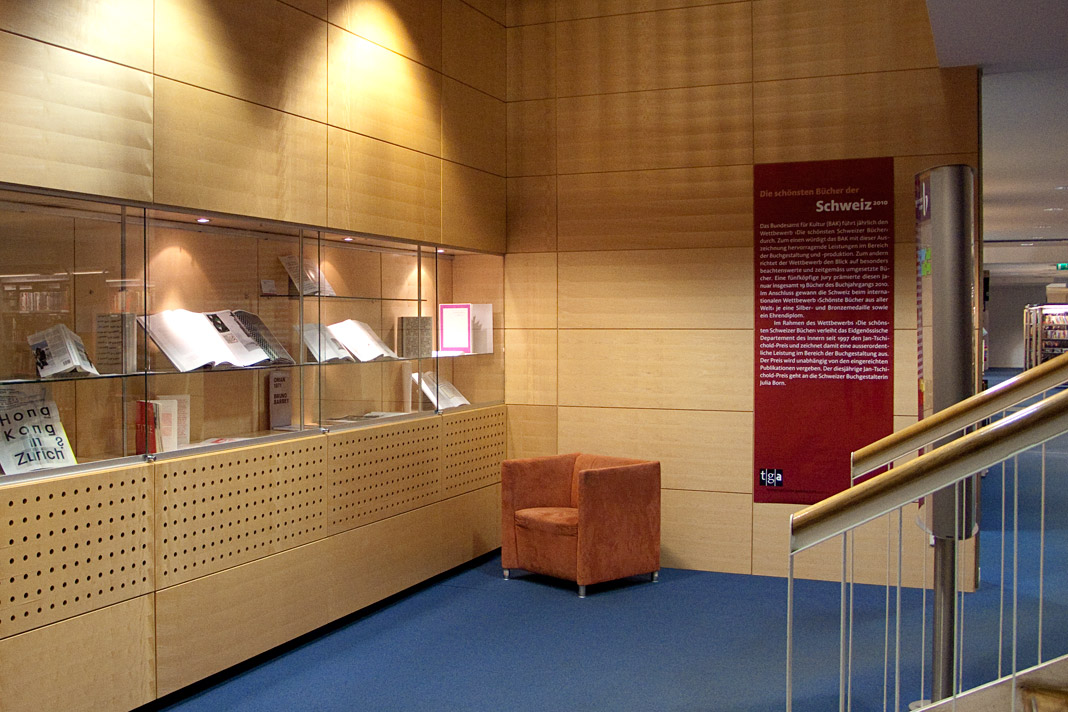
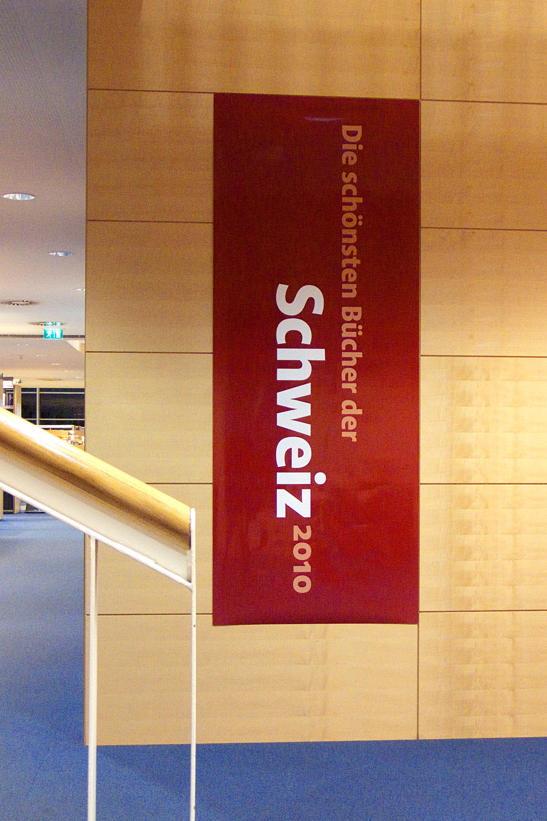 Some impressions from the exhibition of the most beautiful books in Vienna.
Design Journal and Rolf Rehe recommend Acorde
The Design Journal is a bi-annual magazine covering the issues of news design and journalism. It is published by the Society for News Design (SND), an international organisation for news media professionals and visual communicators. SND was founded in 1979 and has about 1000 members worldwide.
In each issue the international newspaper designer Rolf Rehe recommends three typefaces which are appropriate for application in newspaper design. To give the Design Journal’s readers the possibility of judging the qualities of the typefaces themselves, the whole magazine is set in the recommended typefaces.
In the current issue (No. 112) Acorde is used as a secondary typeface for text as well as for headlines and gives proof of its wide applicability in various sizes. »It combines cool, geometric letter elements with the warmth of humanist sans forms. This results in a friendly yet assertive appearance«, states Rolf Rehe.
 Cover of the summer issue of SND’s Design Journal entirely set in Acorde.

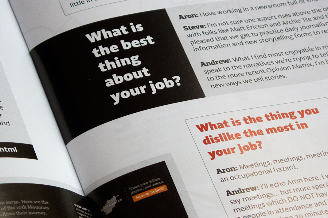

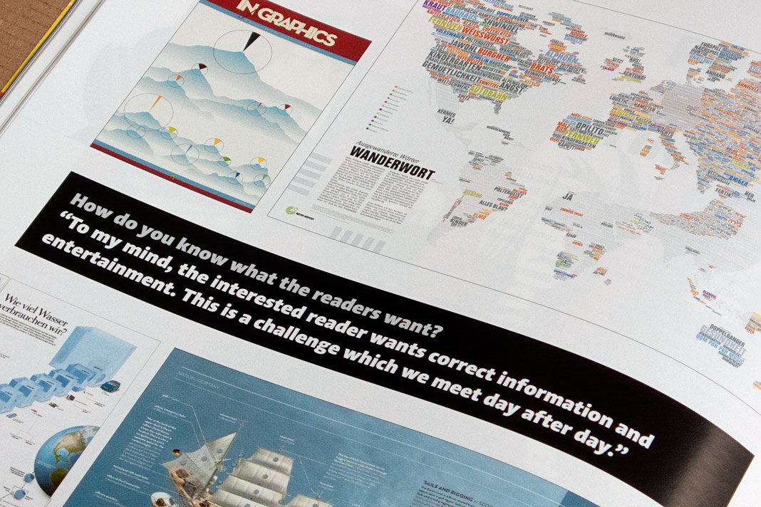
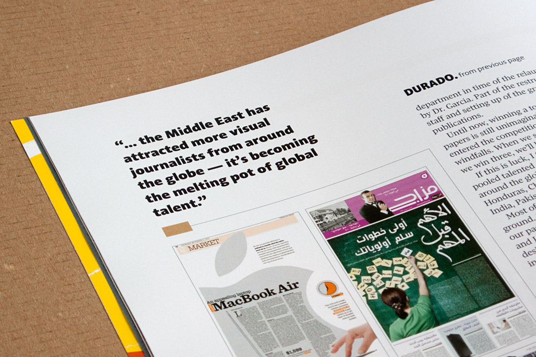
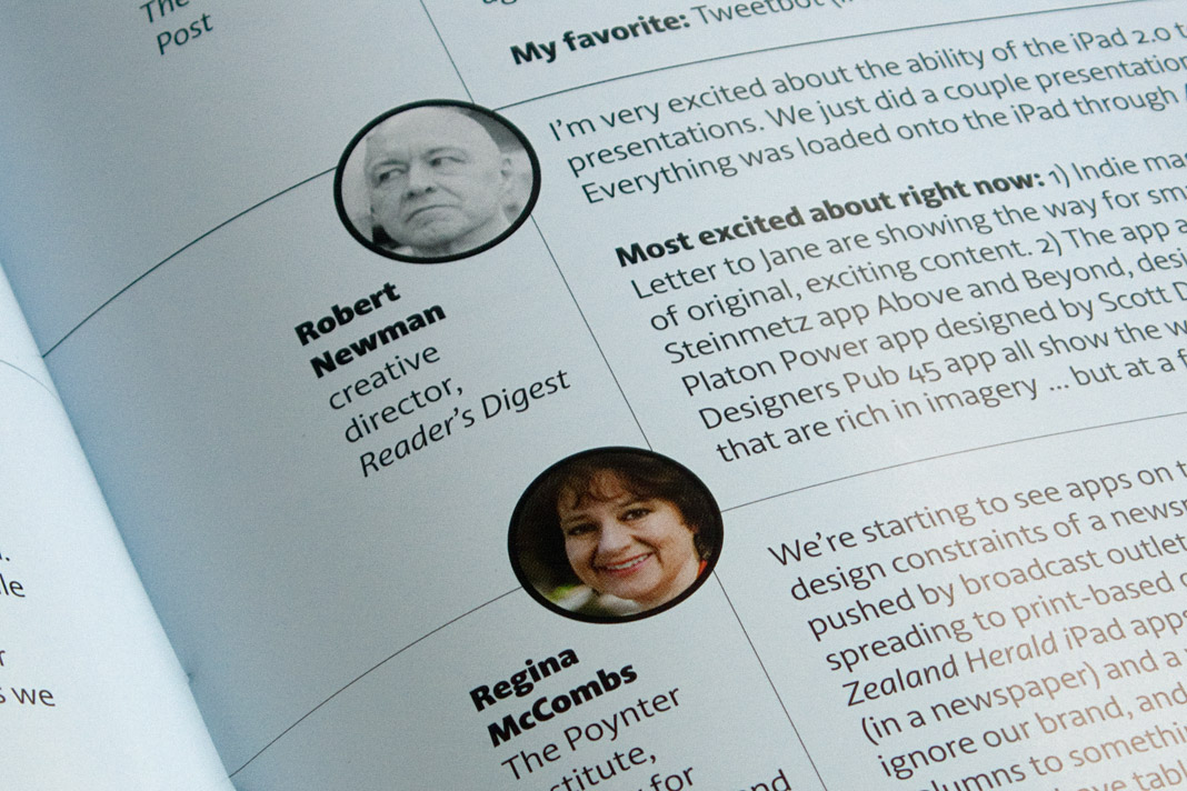

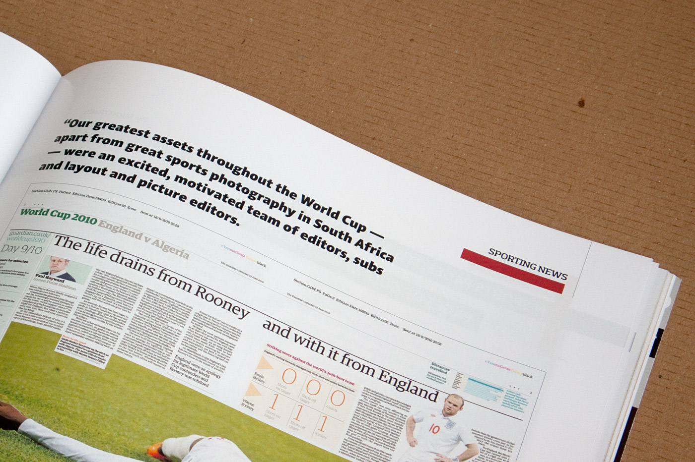 Various impressions of SND’s Design Journal using Acorde.
Typodarium 2012 features Acorde on January 26
The Typodarium 2012, a calendar edited by Lars Harmsen and Raban Ruddigkeit and published by Verlag Hermann Schmidt Mainz is now available and features 366 typefaces (one per day) designed by more than 250 designers from 32 countries.
In order to enhance the typographic quality of this year’s calendar, all entries were chosen by a renowned international jury consisting of Roger Black, Michel Chanaud, Yves Peters, Hubert Jocham, and Christian Schwartz. Acorde is one of the selected typefaces and performs the task of presenting Thursday January 26 with great pleasure.
 The calendar comes with a box for collecting the torn off calendar sheets.
 The cover of the 2012 edition of the Typodarium calendar.
 The front side of January 26 shows three different styles of Acorde.
 The back side of January 26 contains a short description of Acorde.