Blog – Entries tagged as Acorde in Use
Gerhard Hanappi book set in Sindelar and Acorde
Now that’s a project we are really happy about. The book about famous Austrian football (soccer) player and architect Gerhard Hanappi is entirely set in Sindelar and Acorde. The book was designed by Austrian designer Peter Duniecki and published by the Swiss publishing house Park Books.
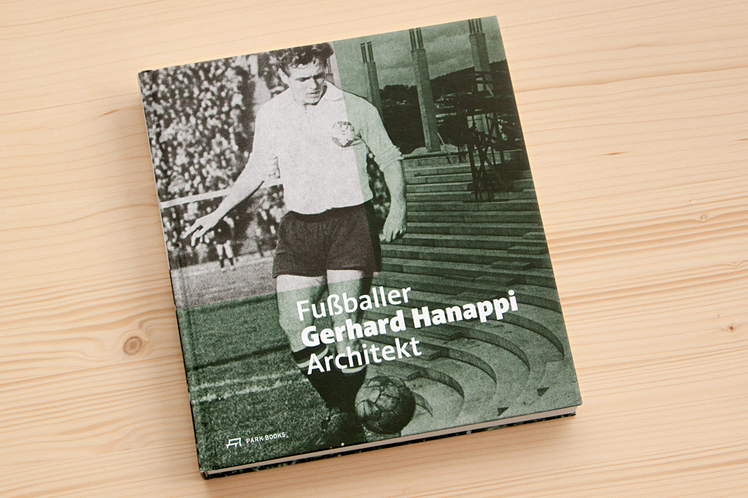 Cover of Fußballer Gerhard Hanappi Architekt, set in Acorde.
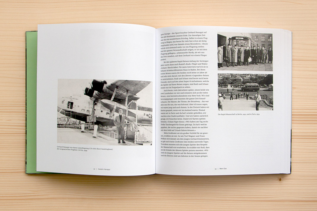
Why are we so happy about it? First, the book is really well designed, and second, we love football. As you may know, the type family Sindelar is named after famous Austrian football player Matthias Sindelar. Interestingly Sindelar and Hanappi played at the two rivalling Viennese Clubs Austria Wien and Rapid Wien (not at the same time though). The book achieves something that is not very likely in real life: One player of Austria Wien supports a project by a player of Rapid Wien. The result of this collaboration is really convincing. Just have a look yourself!
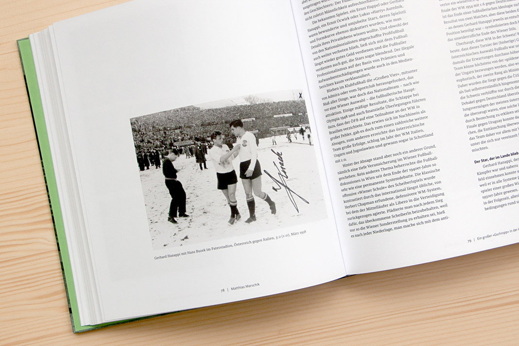

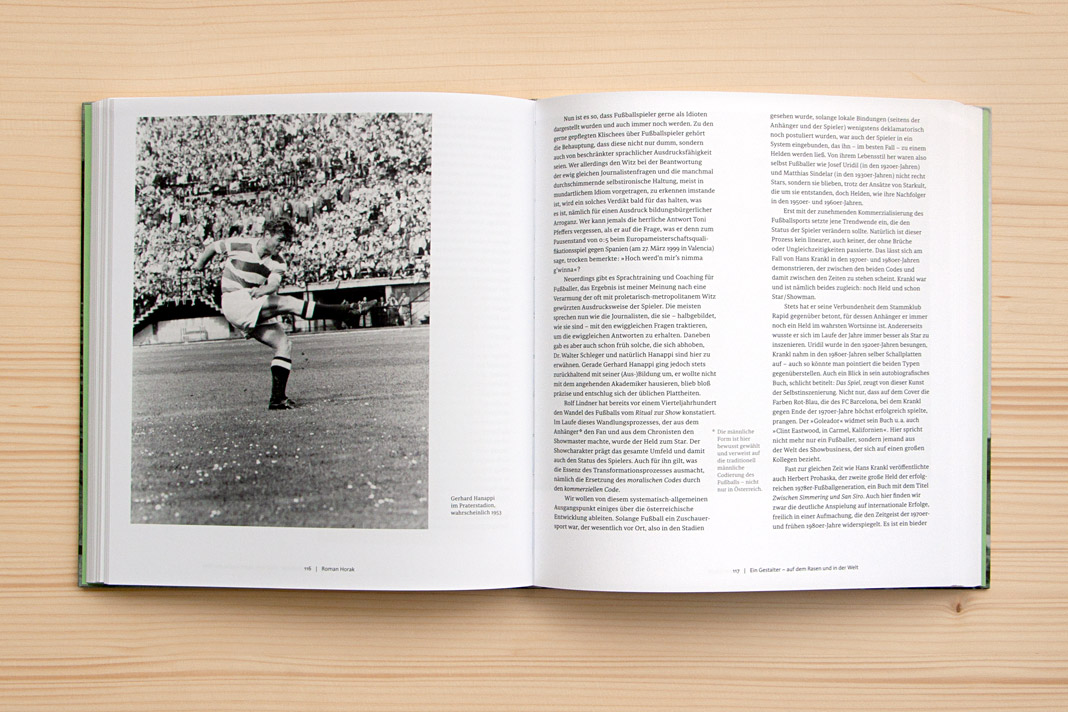
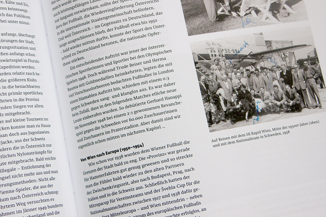
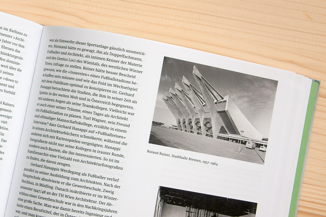 Various impressions of Fußballer Gerhard Hanappi Architekt, entirely set in Sindelar and Acorde.
Puzzling poster for die Graphische features Acorde
As you might know, Acorde was designed to be perfectly suited to all different sizes, from small continuous text to large headlines and big signage. Therefore its large application on this poster is a great example of Acorde’s display qualities. The poster is an advertisement for the renowned graphic design school, die Graphische, in Vienna.
At first sight the poster appears puzzling and you can only read Kryptisch? (Cryptic?) and Dann komm auf die Graphische! (Walk to/join the Graphische!). When you walk a few steps further towards the school (located opposite the poster) and look at the advertisement through a red glass you can suddenly read: Wir haben den Durchblick in der Gestaltung! (We have a clear view on design./We know about design.) The poster was designed by Lydia Körner. Great idea, Lydia!
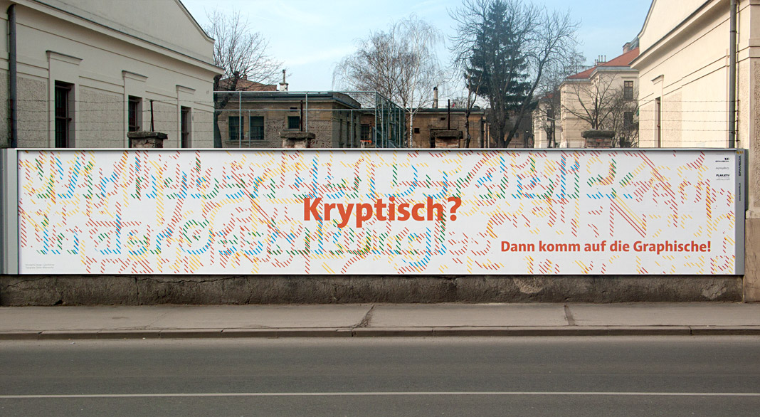 At first sight the poster appears puzzling.
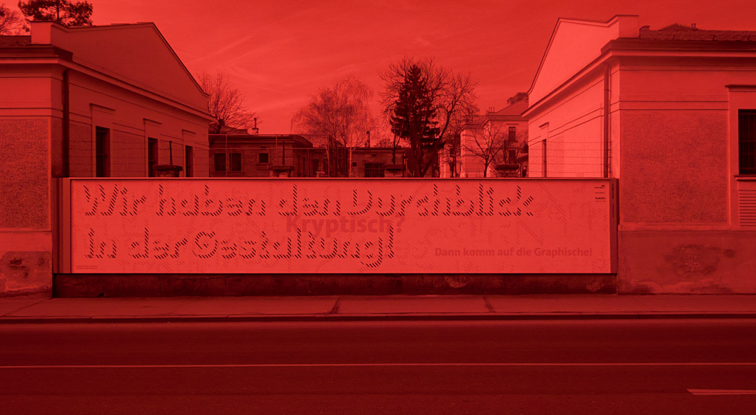 When you look at the advertisement through a red glass you can suddenly read more text.
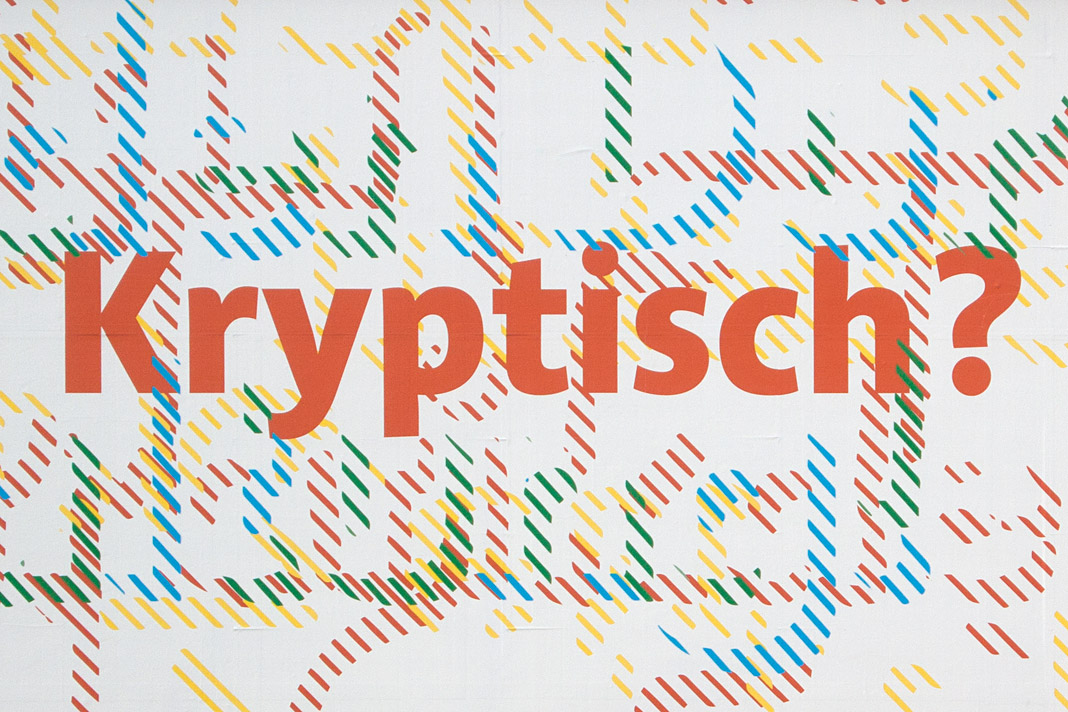 Acorde’s large application on this poster is a great example of its display qualities.
Muntermacher is entirely set in our type families
Muntermacher, that’s what the quarterly journal of the market town of Moosburg in Carinthia (Austria) is called. A Muntermacher is a person or substance that wakes you up. And yes, it does. Great to see a journal from a small market town offering information to its inhabitants in such visual quality.
The magazine was conceived by Austrian architect and journalist Wojciech Czaja and by Austrian graphic designer Helga Innerhofer. As a foundry we are especially proud of this feature: The journal is entirely set in our type families Acorde and Sindelar which complement each other perfectly well.
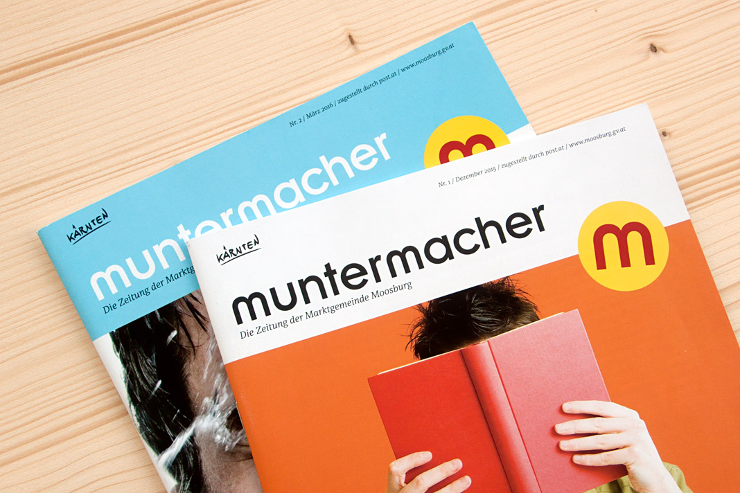 Two covers of the quarterly journal Muntermacher.
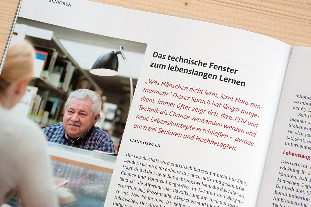
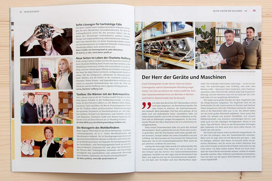
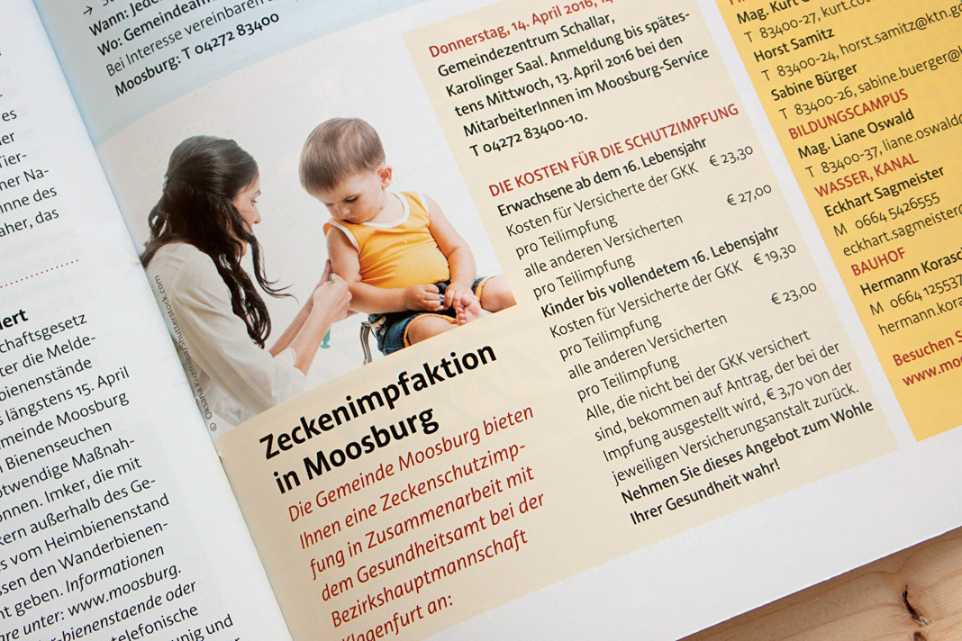
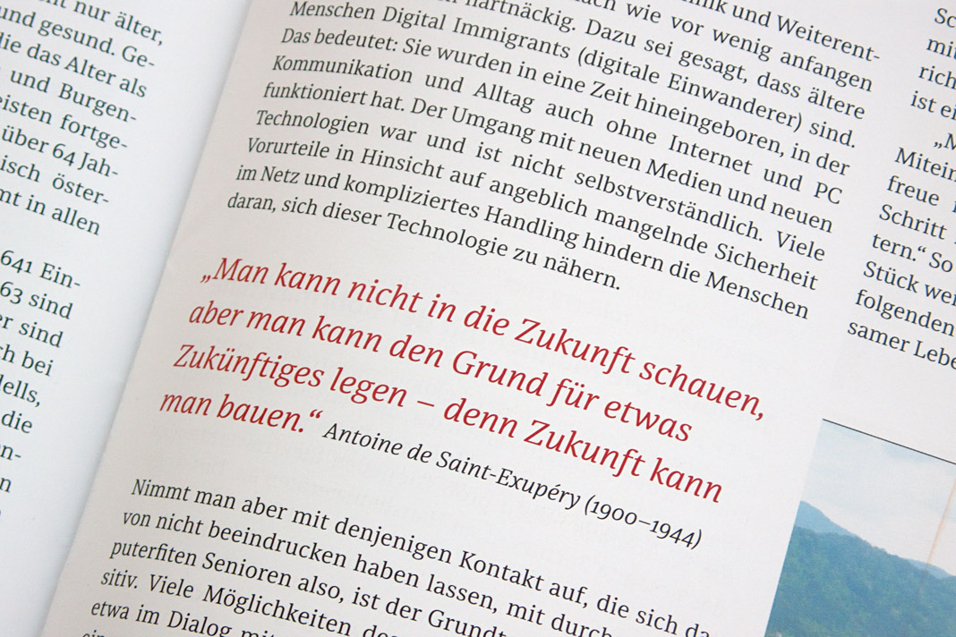
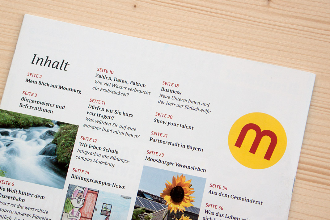 Various impressions of Muntermacher which perfectly show Acorde’s and Sindelar’s excellence.
Paul T. Frankl’s autobiography entirely set in Acorde
Another great example of Acorde in use: Paul T. Frankl’s autobiography offers a unique insight into the rise of American modernism from an insider’s point of view. It sheds light on Paul T. Frankl and his contemporaries as well as on Austrian and American culture in the first half of the twentieth century.
The book was edited by Christopher Long and Aurora McClain and designed by Austrian book designer Peter Duniecki. It is entirely set in Acorde.
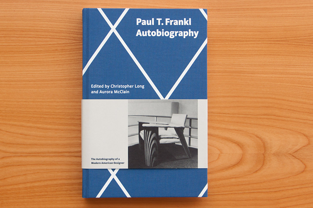 Cover of Paul T. Frankl’s autobiography, set in Acorde.
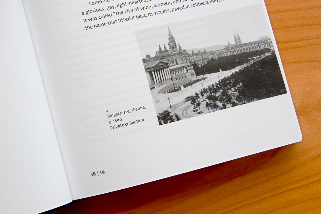
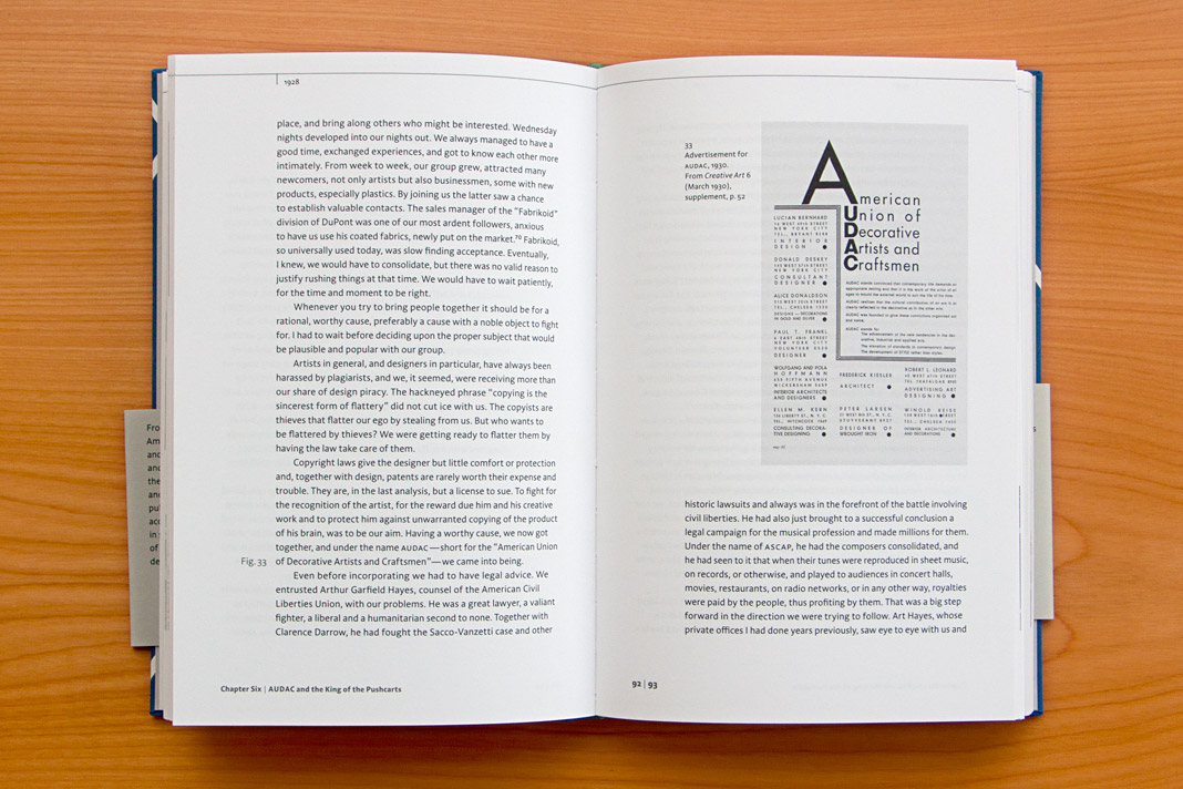
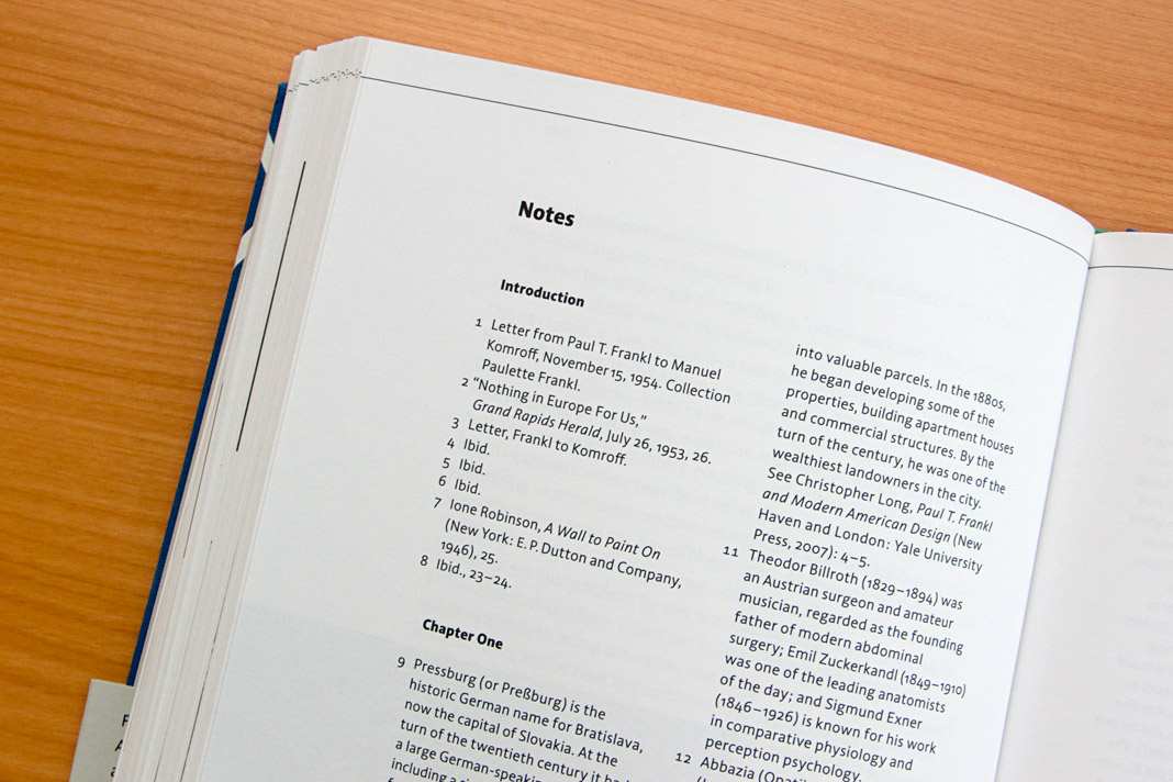
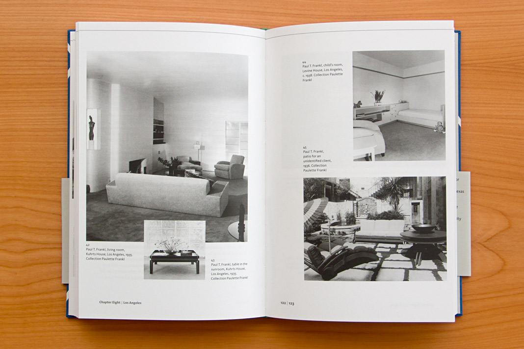
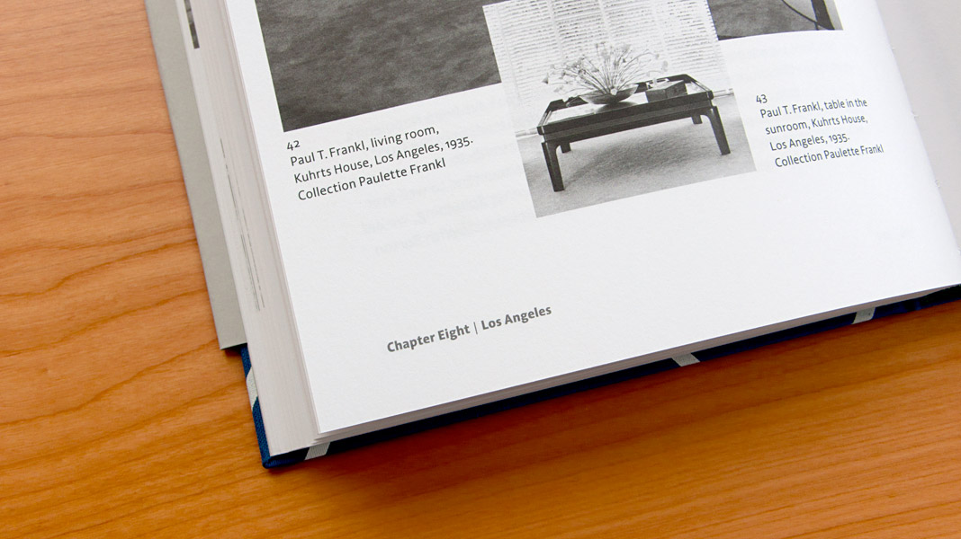
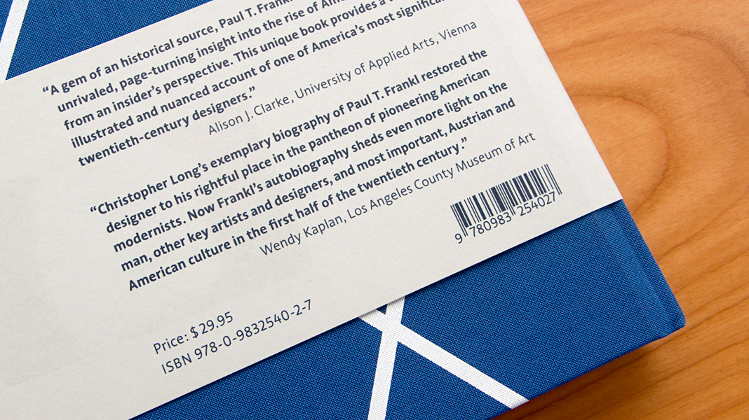 Various impressions of Frankl’s autobiography, designed by Peter Duniecki.
Acorde joyfully celebrates St. Patrick’s Day 2015
As a special ingredient to St. Patrick’s Day 2015, Acorde joins the worldwide celebrations in giving your calendar an appropriate typographic appearance. Take a look at Typodarium 2015 whilst drinking a pint of Guinness or a shot of Irish Whiskey. Feel the Irish vibe and enjoy!
 Ingredients for a perfect St. Patrick’s Day: Irish Whiskey, Guinness and Acorde on your calendar.
Acorde presents the most beautiful books of A/D/CH/NL
Like every year the Typographic Society Austria (tga – Typographische Gesellschaft Austria) shows the most beautiful books of Austria, Germany, Switzerland, and the Netherlands in cooperation with the Vienna Public Libraries and the Association of Austrian Book Trade.
The most beautiful books of 2011 can be seen in the Central Library in Vienna from December 5, 2012 to February 4, 2013. Once again (since its introduction last year) the exhibition design is entirely set in the type family Acorde. Since Acorde is used for small text (labels, signs, flyers) as well as for large headlines, the exhibition design is a good example of Acorde’s suitability for all different sizes.
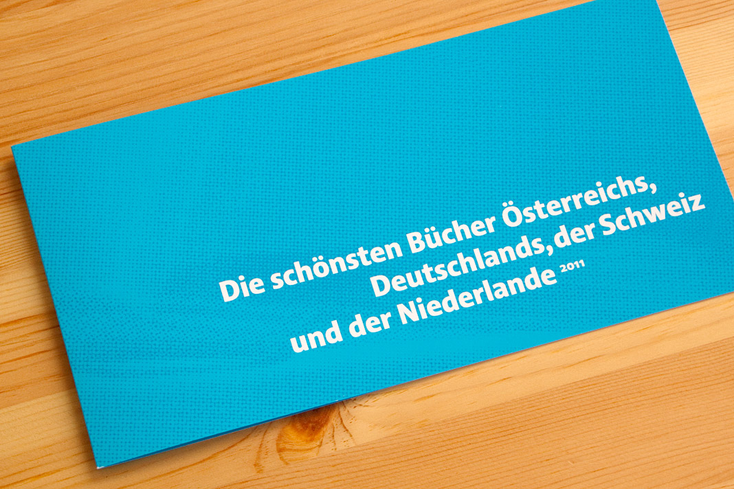
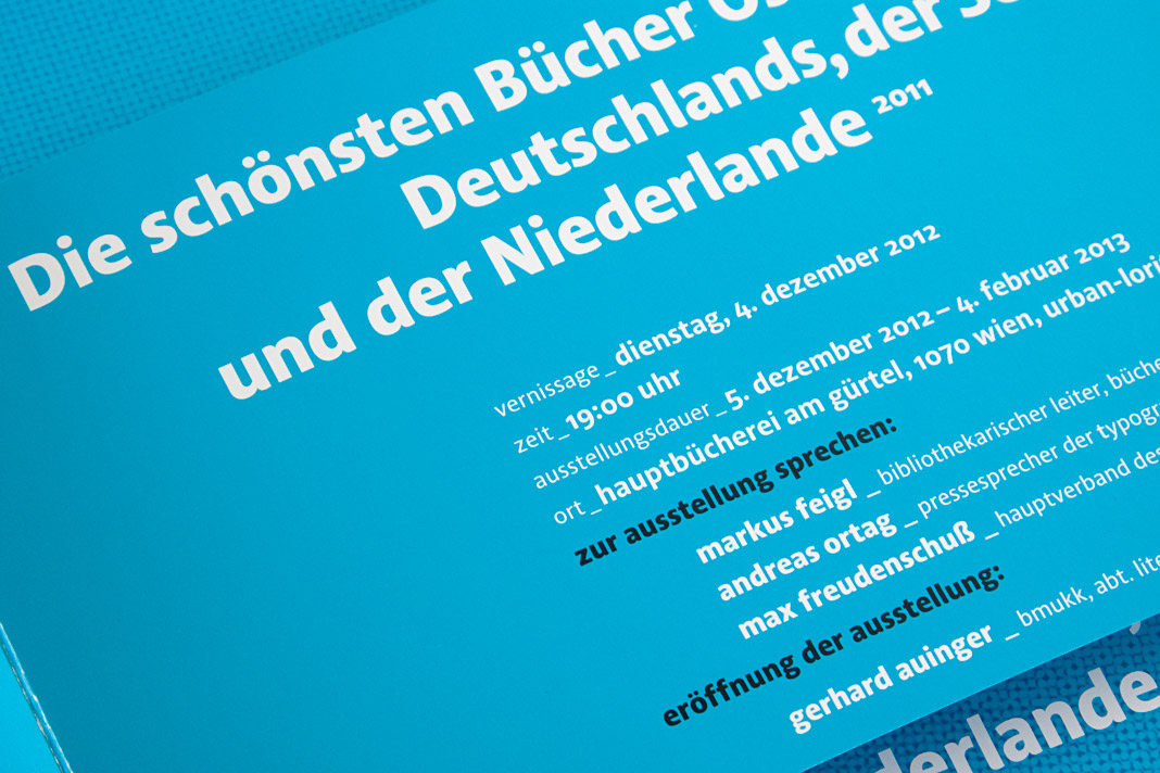 The flyer promoting the exhibition was designed by Austrian designer Erich Monitzer.