Blog – Entries tagged as Book
Sindelar wins Communication Arts Award of Excellence
In case you have not seen it yet: That’s what Sindelar looks like in the Communication Arts Typography Annual 6. Sindelar is presented as a winner of Communication Arts’ Typography Competition 2016. Not only on the double page spread but even on the annual’s cover representing T, Y, A, N, and L.
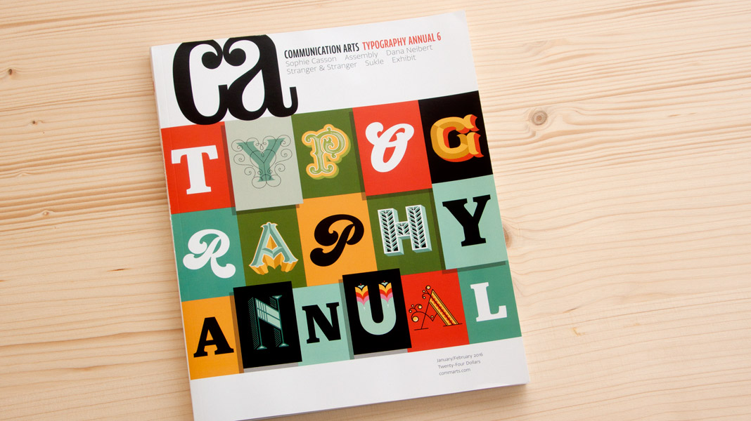
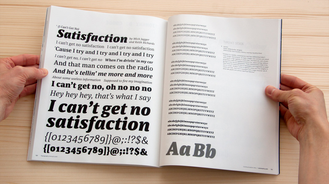 Various impressions of the Communication Arts Typography Annual 6.
German Design Award Yearbook features Sindelar
We are proud to emphasise it once more: We were honoured by winning the German Design Award 2016. Therefore Sindelar is featured in the German Design Award 2016 Yearbook Excellent Communications Design. Great to see it published among the other excellent winning entries.

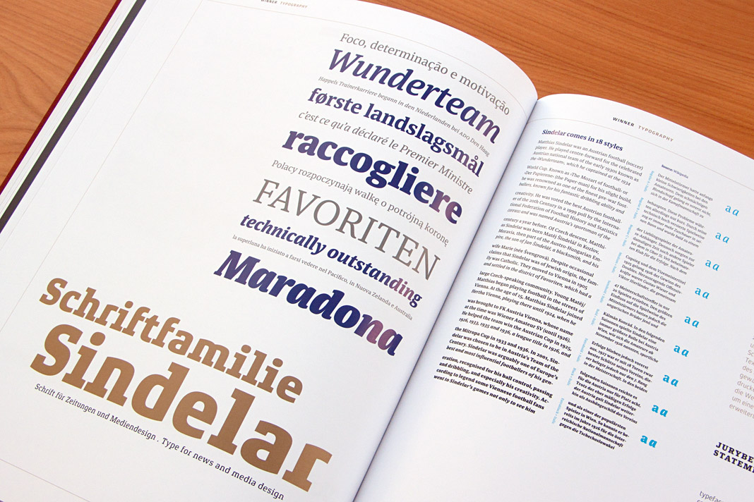

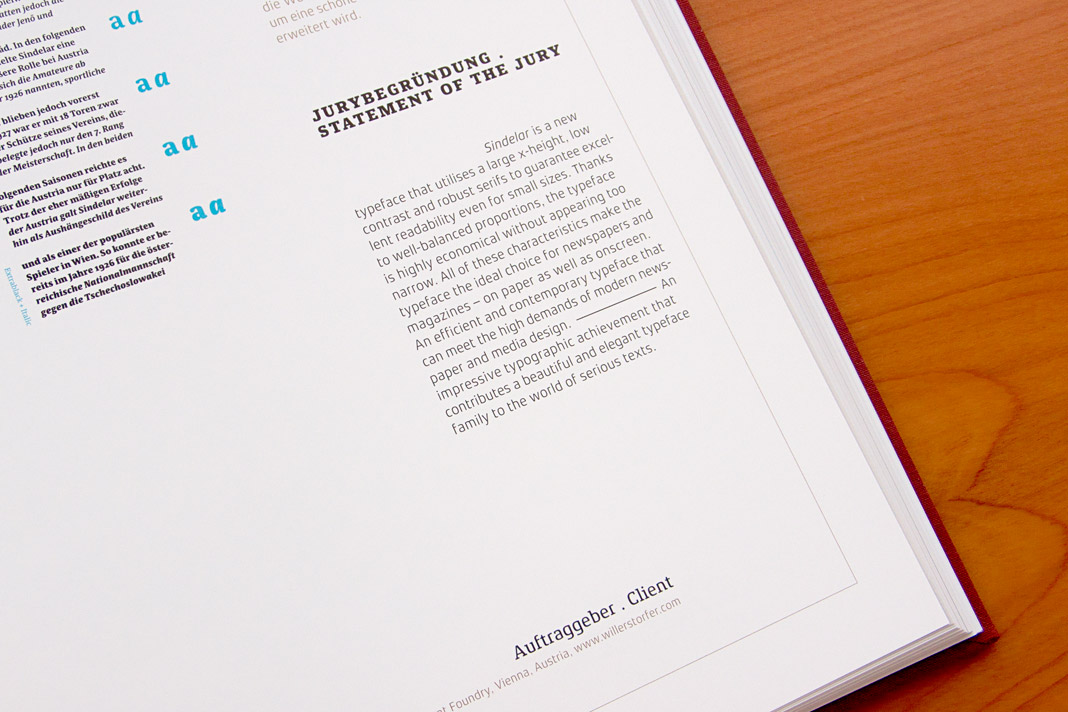 Various impressions of the German Design Award 2016 Yearbook.
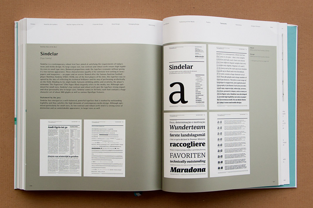
Sindelar is featured in the Red Dot Yearbook 2015/2016
Hot off the press: The International Yearbook Communication Design 2015/2016 shows all winning entries of the Red Dot Award: Communication Design 2015. It comes in two volumes and consists of more than 1,000 pages in total. Great to see Sindelar among the best projects in this comprehensive reference book for contemporary communication design. All designers winning the premium distinction Best of the Best are also featured in the designer portraits section with an interview.
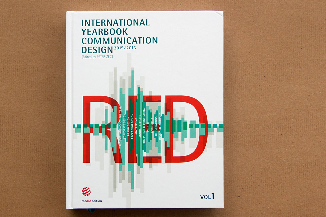 Volume 1 of the International Yearbook Communication Design 2015/2016.

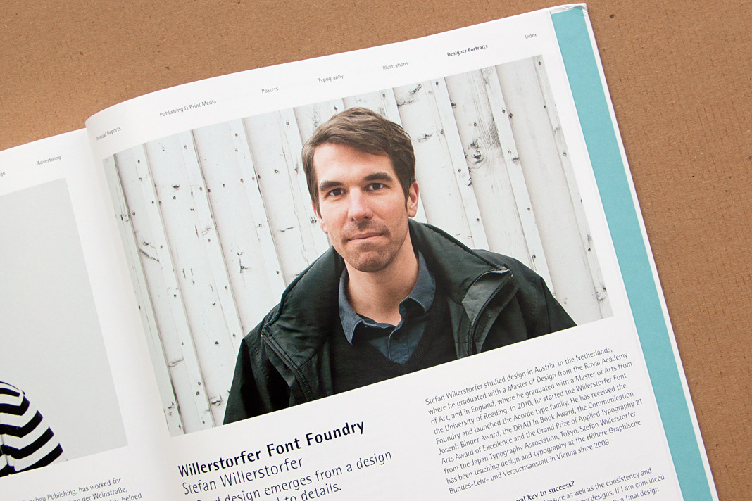 Stefan Willerstorfer is featured with an interview in the designer portraits section.
Yearbook of Type 1 presents Acorde
The Yearbook of Type 1 is an independent compendium of high quality typefaces published by the renowned Swiss publishing house Niggli. It presents a selection of more than 180 of the best contemporary type families on more than 450 pages.
The selected typefaces come from all over the world and were released during the last three years. The type family Acorde is one of the selected typefaces. Due to its name (starting with an A) the double page spread presenting Acorde appears in the front part of the book.
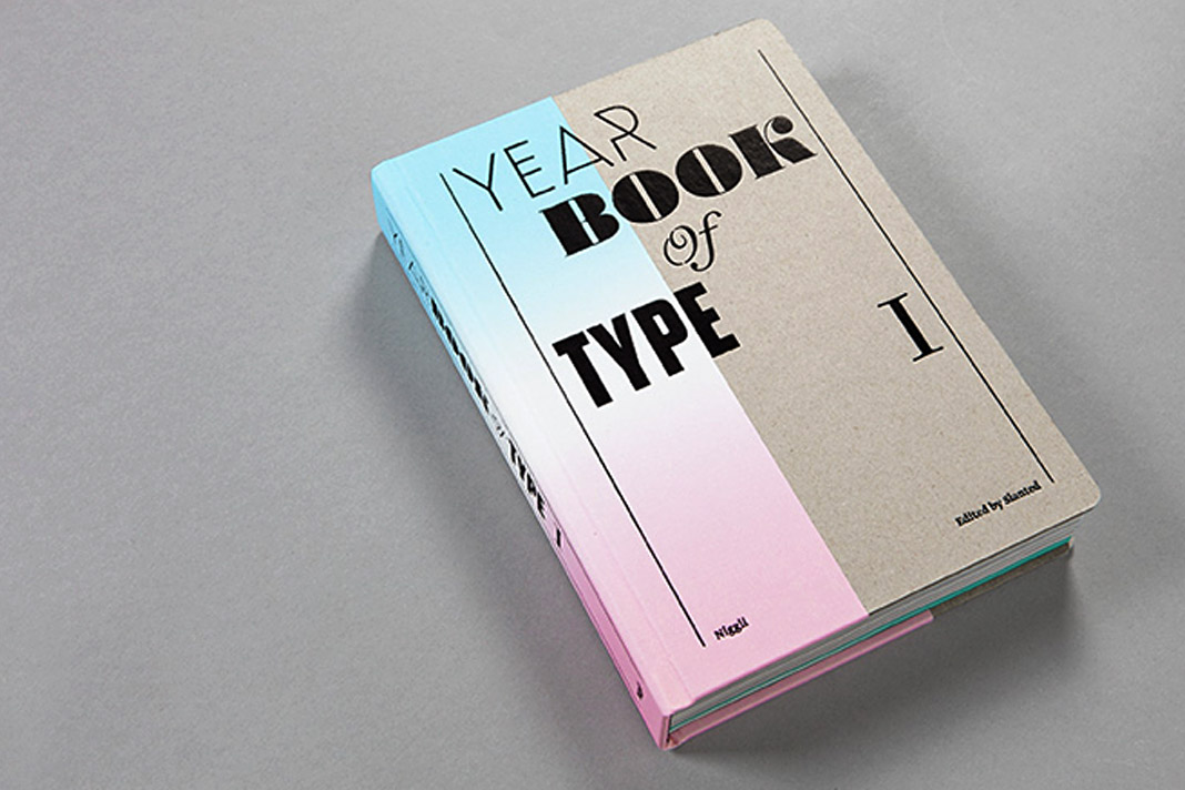 The cover of the first issue of Slanted’s Yearbook of Type.
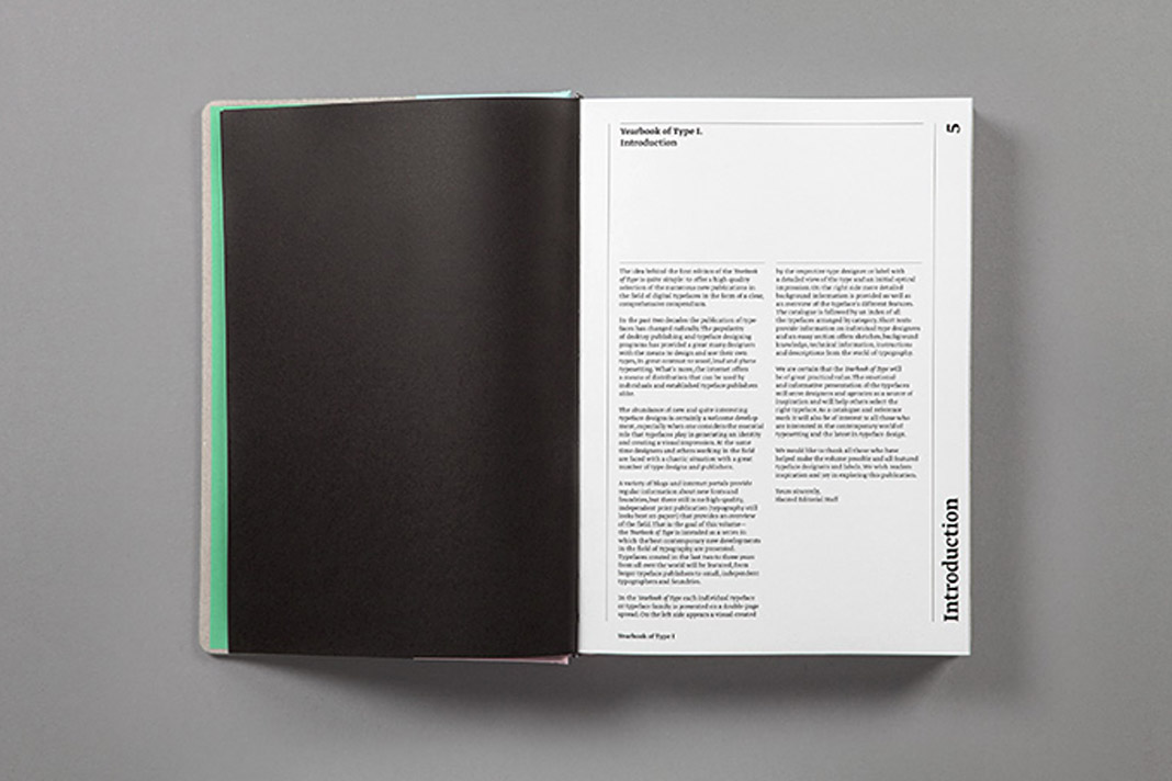
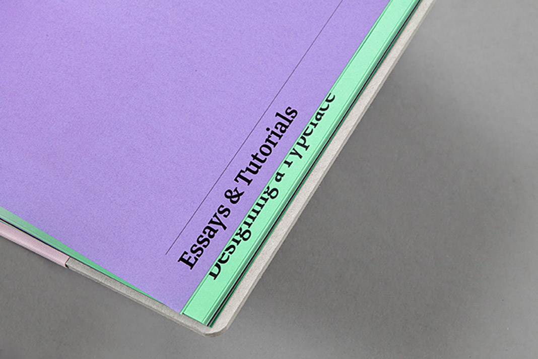
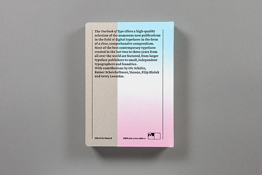 Various impressions of the first Yearbook of Type.
Josef Frank’s writings set in Acorde
The bilingual book Josef Frank: Writings is a complete collection of all published writings of Austrian architect Josef Frank, one of the main protagonists of Classical Modernism. It comes in two volumes and consists of nearly 900 pages in total. Since the whole publication is entirely set in Acorde, it is probably amongst the publications where Acorde’s workhorse qualities can be judged most easily.
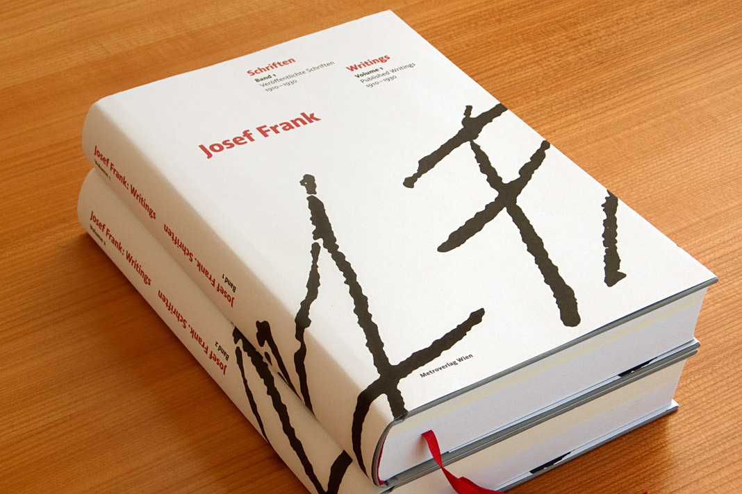 Both covers of the two-volume book show the enlarged signature of Josef Frank.
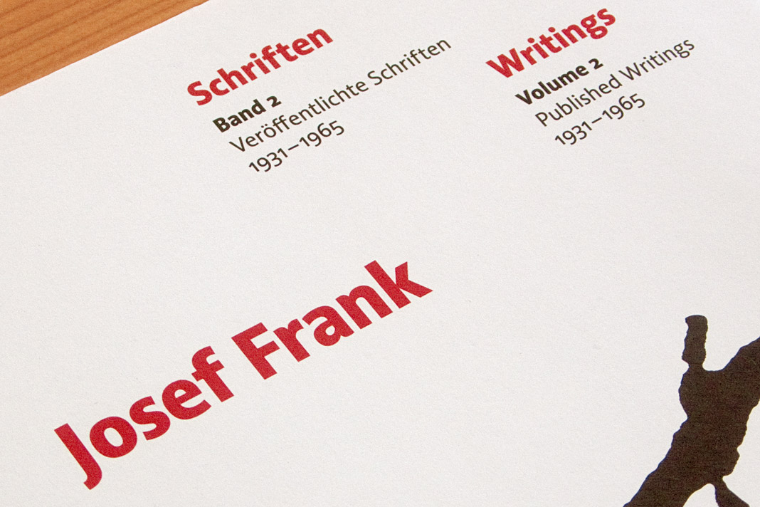
The two-volume book was designed by Austrian book designer Peter Duniecki who explains his choice of Acorde as follows. »Die verwendete Schrift spiegelt die Zeit der Wiener Moderne. Modern, klar, nicht so hart, runder, eben wienerischer als die Internationale Moderne. Ihre hervorragende Lesbarkeit würde Josef Frank zu schätzen wissen.« (The chosen typeface reflects the era of Viennese Modernism. Modern, pure, not so hard, rounder, just more Viennese than the International Modernism. Josef Frank would appreciate its outstanding legibility.)
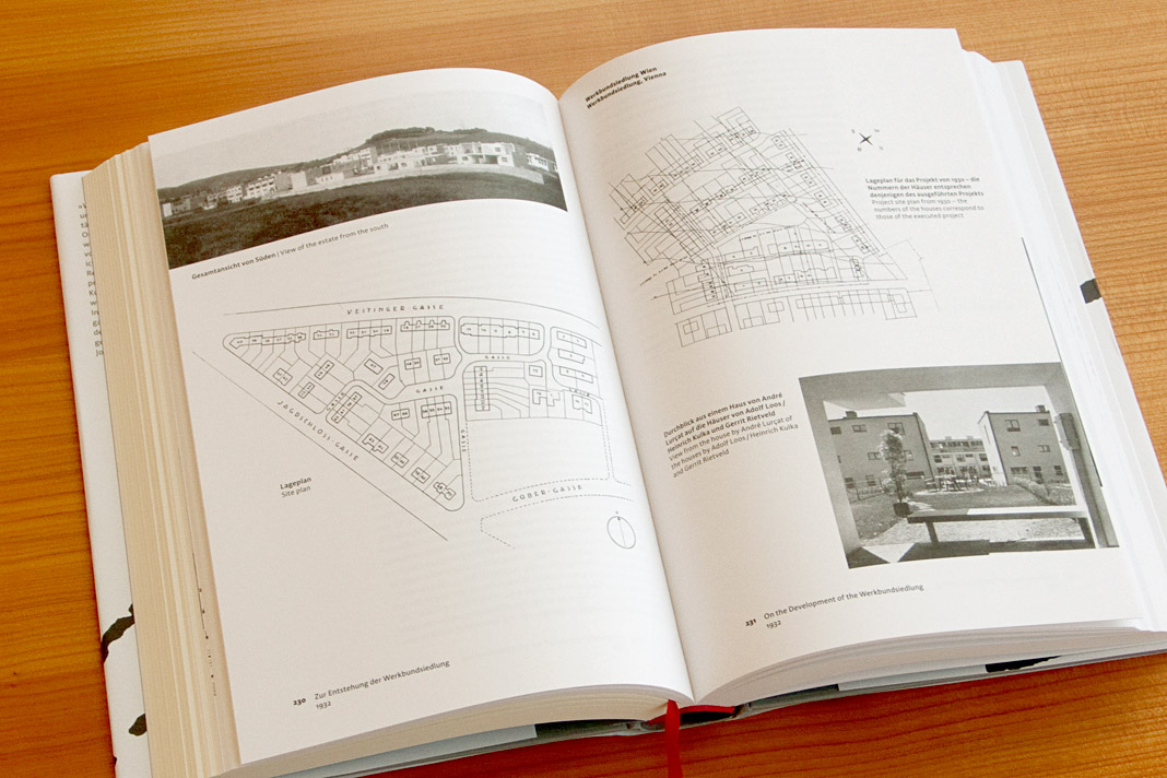
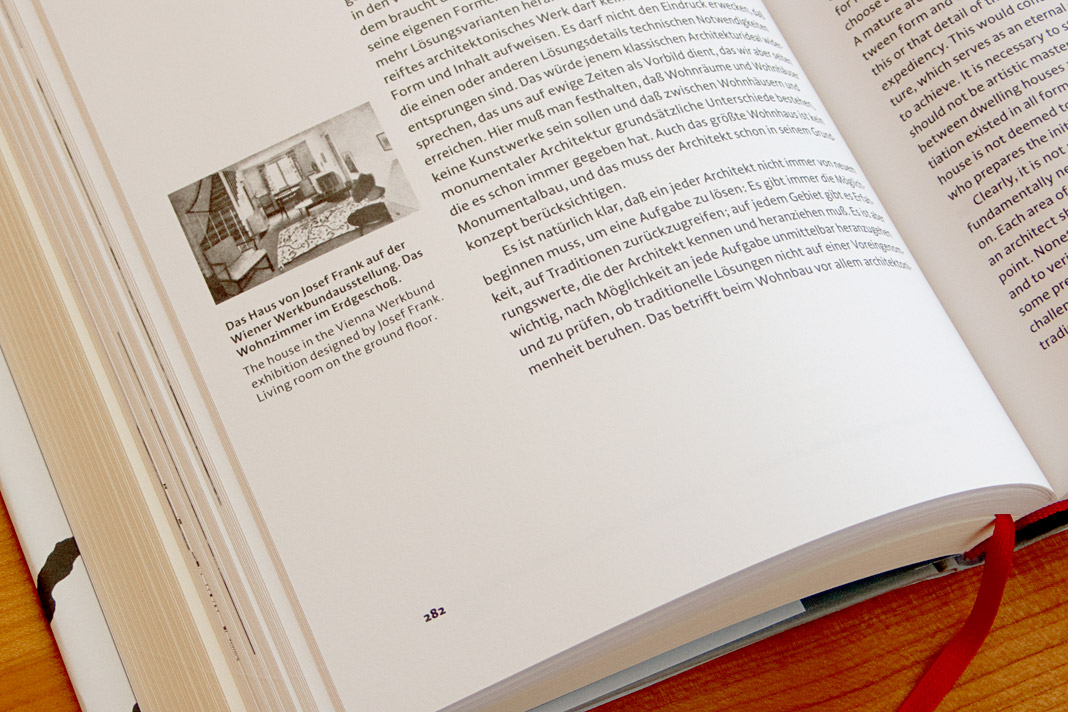
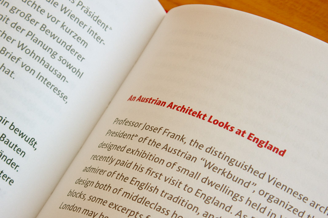 Various impressions of the publication on Josef Frank’s writings, designed by Peter Duniecki.
Publishing house facultas.wuv features Acorde
The Viennese publishing house facultas.wuv uses two italic styles of Acorde as the main dynamic visual element on the cover of one of their newest publications, a reference book of political science. The publication, entitled Theoriearbeit in der Politikwissenschaft (Academic Writing in Political Science) addresses the demands of students in political science doing their master’s studies. The book cover was designed by Austrian designer Martin Tiefenthaler.
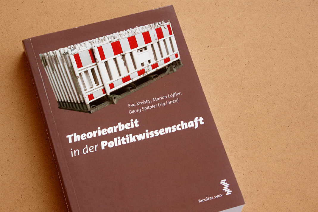 Cover of the book Theoriearbeit in der Politikwissenschaft (Academic Writing in Political Science).
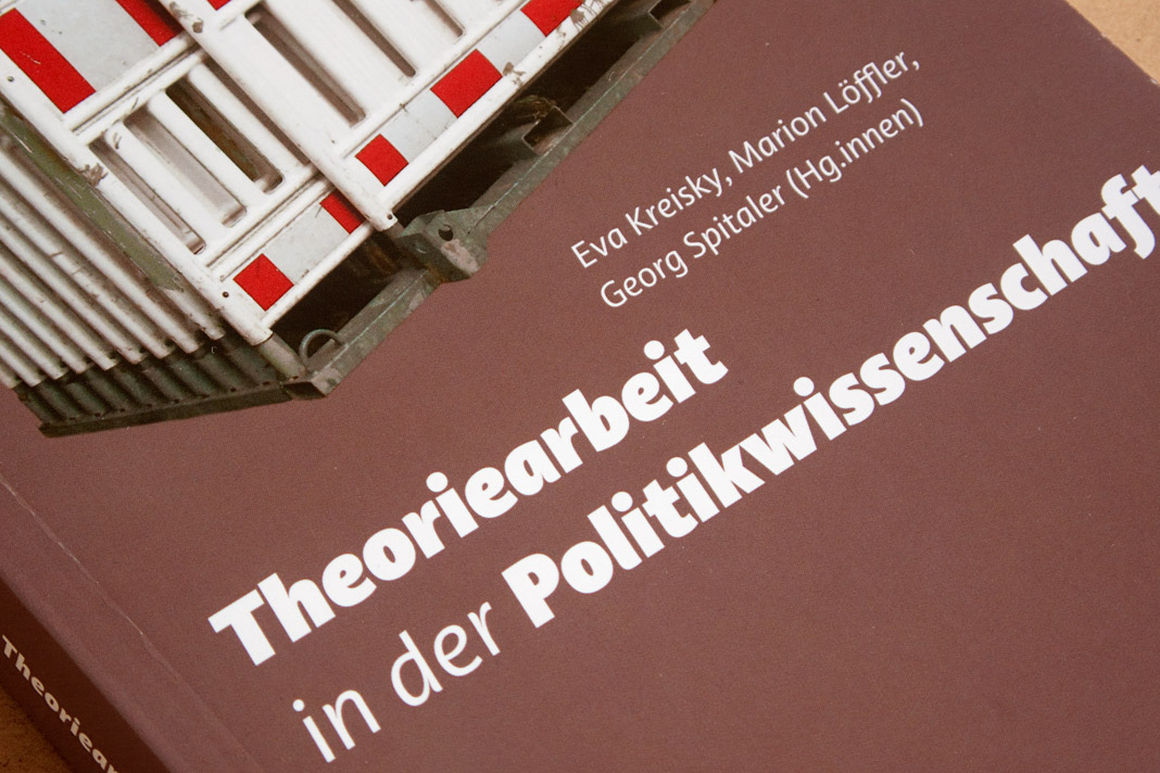 The italic styles of Acorde establish a dynamic contrast to the static photograph.