Blog – Entries tagged as Acorde
I Love Typography presents the making of Sindelar
At ilovetypography.com there is a series of articles on the making of fonts. My contribution, Making Fonts: Sindelar, is the most recent article in this series. The article describes the requirements of newspaper typefaces in general and gives an insight into the specific decisions made during the development of Sindelar.
If you want to learn more about Sindelar and its qualities just take a look at the article at I Love Typography. A few years ago, shortly after the release of Acorde, an article on The making of Acorde was published at I Love Typography too.
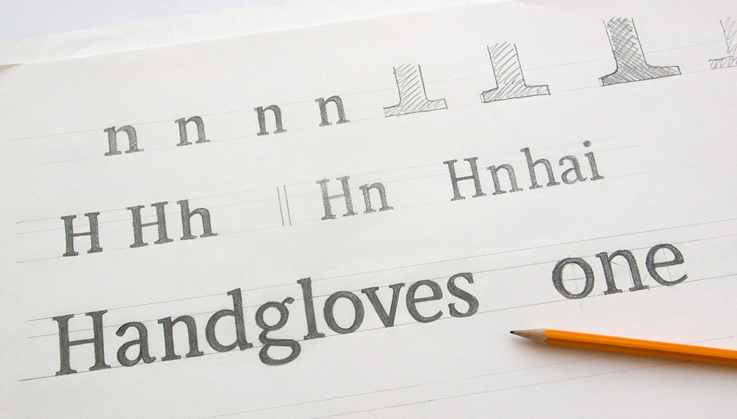 One of the first sketches for Sindelar, dating from April 2009, Vienna.
Acorde joyfully celebrates St. Patrick’s Day 2015
As a special ingredient to St. Patrick’s Day 2015, Acorde joins the worldwide celebrations in giving your calendar an appropriate typographic appearance. Take a look at Typodarium 2015 whilst drinking a pint of Guinness or a shot of Irish Whiskey. Feel the Irish vibe and enjoy!
 Ingredients for a perfect St. Patrick’s Day: Irish Whiskey, Guinness and Acorde on your calendar.
Acorde/Sindelar Bundles are now available
Sindelar and Acorde complement each other perfectly. Thus many clients are interested in using both type families alongside one another. The Acorde/Sindelar Bundle reflects this demand and merges all 14 styles of Acorde and all 18 styles of Sindelar into an attractive bundle of 32 styles. All styles are fully equipped with a huge character set and numerous OpenType features.
In addition there is also a bundle of the small packages of Acorde and Sindelar available. It consists of four styles of Acorde and four styles of Sindelar. It is more easily affordable than the full bundle but also offers great design possibilities and still decreases the price per style.
Yearbook of Type 1 presents Acorde
The Yearbook of Type 1 is an independent compendium of high quality typefaces published by the renowned Swiss publishing house Niggli. It presents a selection of more than 180 of the best contemporary type families on more than 450 pages.
The selected typefaces come from all over the world and were released during the last three years. The type family Acorde is one of the selected typefaces. Due to its name (starting with an A) the double page spread presenting Acorde appears in the front part of the book.
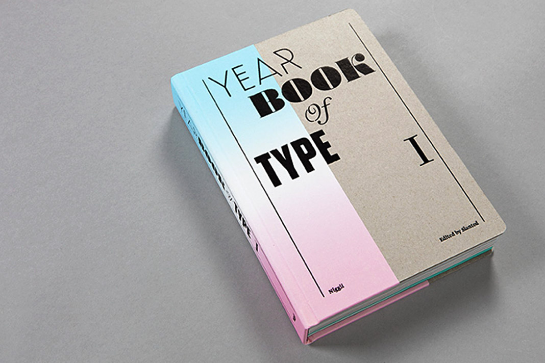 The cover of the first issue of Slanted’s Yearbook of Type.
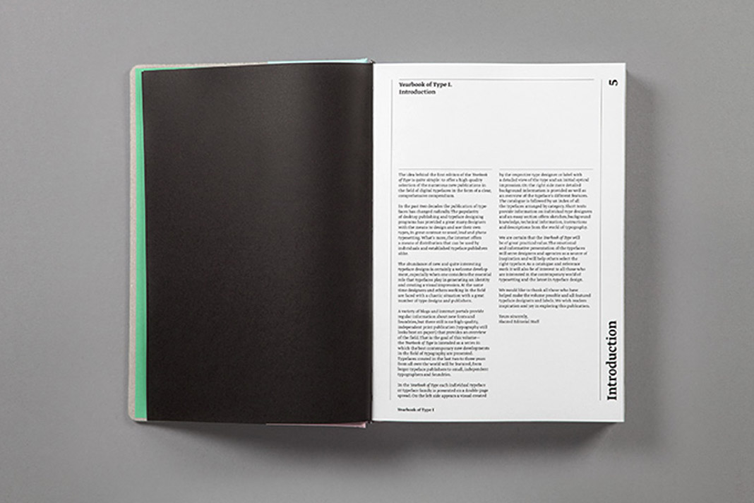
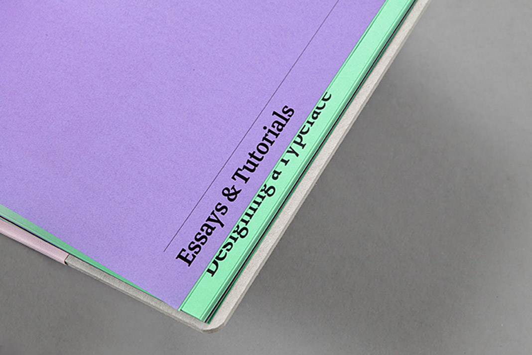
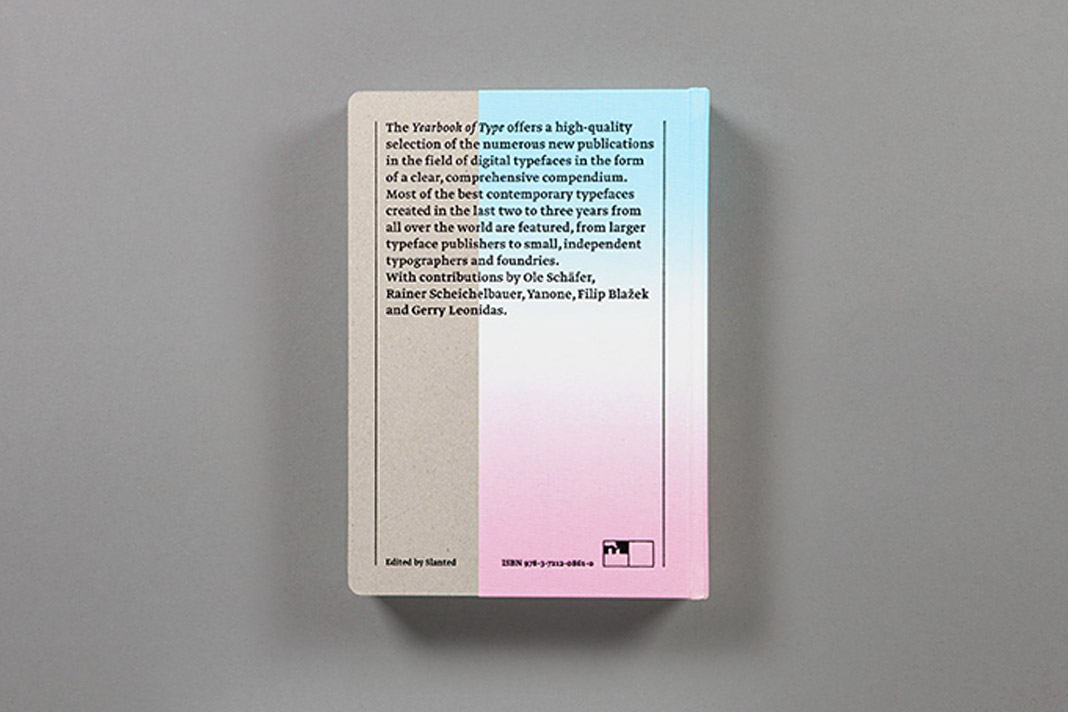 Various impressions of the first Yearbook of Type.
Typefaces by Austrian Designers – No. 22: Acorde
Design Austria is the only professional association and service organisation in Austria representing the interests of designers from all creative disciplines. Among many other activities Design Austria publishes a popular series of type specimens called Schriften österreichischer DesignerInnen (Typefaces by Austrian Designers).
Issue No. 22 showcases the type family Acorde, presents all of its styles in various sizes (from small to large), its huge character set as well as the large number of supported OpenType features.
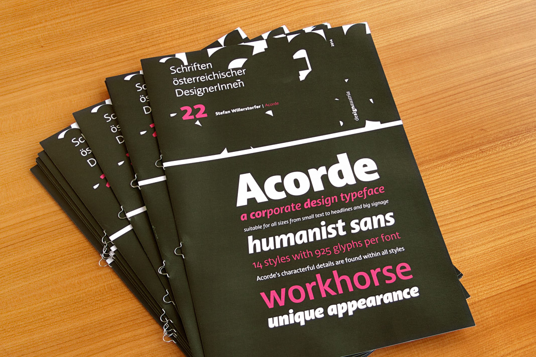 The cover of the 22nd issue of Design Austria’s popular series of type specimens.
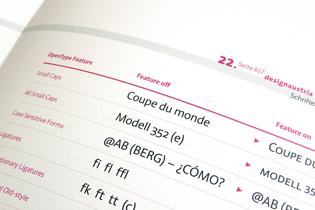
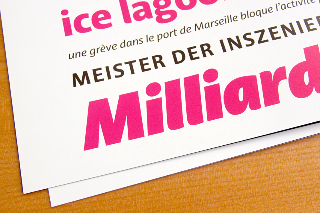
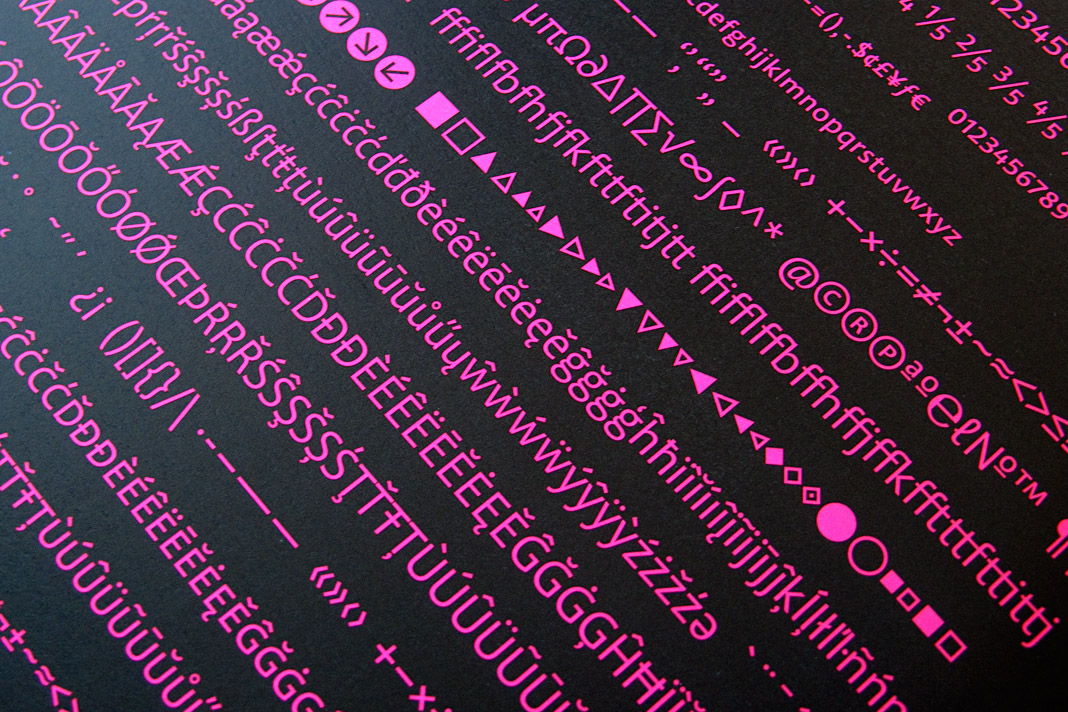
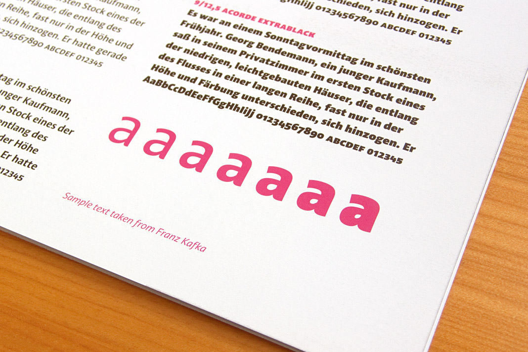 Various impressions of the publication showcasing the type family Acorde.
Acorde presents the most beautiful books of A/D/CH/NL
Like every year the Typographic Society Austria (tga – Typographische Gesellschaft Austria) shows the most beautiful books of Austria, Germany, Switzerland, and the Netherlands in cooperation with the Vienna Public Libraries and the Association of Austrian Book Trade.
The most beautiful books of 2011 can be seen in the Central Library in Vienna from December 5, 2012 to February 4, 2013. Once again (since its introduction last year) the exhibition design is entirely set in the type family Acorde. Since Acorde is used for small text (labels, signs, flyers) as well as for large headlines, the exhibition design is a good example of Acorde’s suitability for all different sizes.
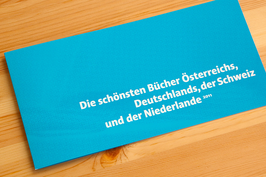
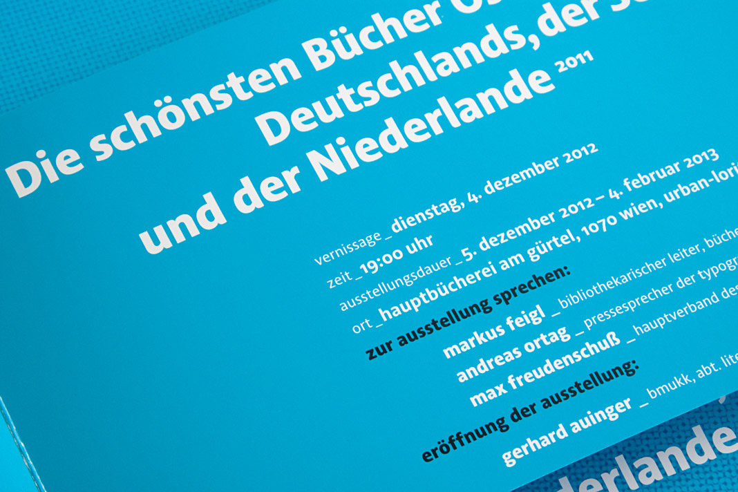 The flyer promoting the exhibition was designed by Austrian designer Erich Monitzer.