Blog – Entries tagged as Acorde in Use
German newspaper INFO – Der Südfinder trusts in Acorde
The German newspaper INFO – Der Südfinder is a regional newspaper in Baden-Württemberg with a circulation of more than half a million copies. German newspaper designer Hans Peter Janisch restructured the newspaper and brought its appearance up to date. The new design was presented at the end of May.
The centrepiece of the revised typography was the introduction of Acorde as the newspaper’s main typeface. Acorde is used for text as well as for headlines and demonstrates its ability to be a true workhorse. It perfectly contributes to the fresh and modern feel of the newspaper.
 Cover of the first issue of the redesigned newspaper.

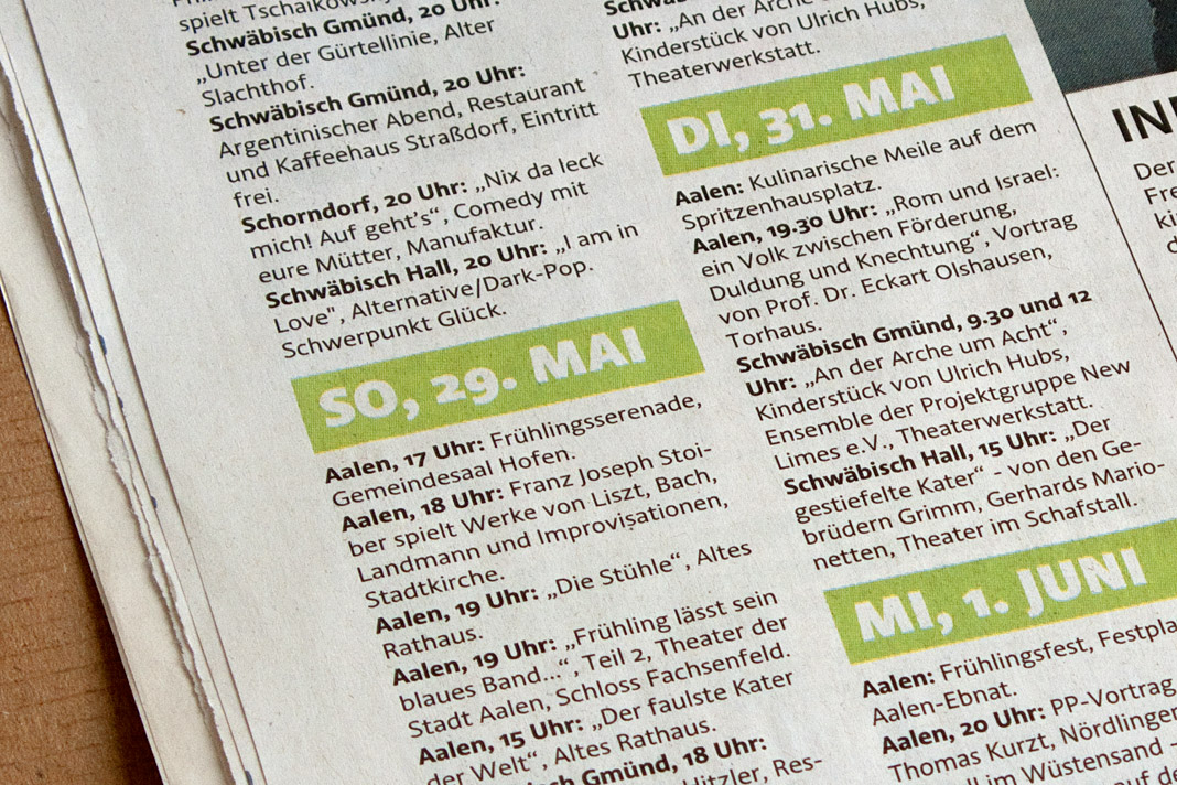


 Various impressions of the newspaper’s new appearance.
Publishing house edition a relies on Acorde
The Viennese publishing house, edition a, uses the type family Acorde as one of the main visual elements on two of their books’ covers and as the headline typeface inside these two books.
One of the books is called Donnerwetter, a non-fiction book on weather by Austrian TV weather presenter Marcus Wadsak, the other one Vorsicht Vertrauen, a non-fiction book on economics by Manfred Berger and Arne Johannsen.
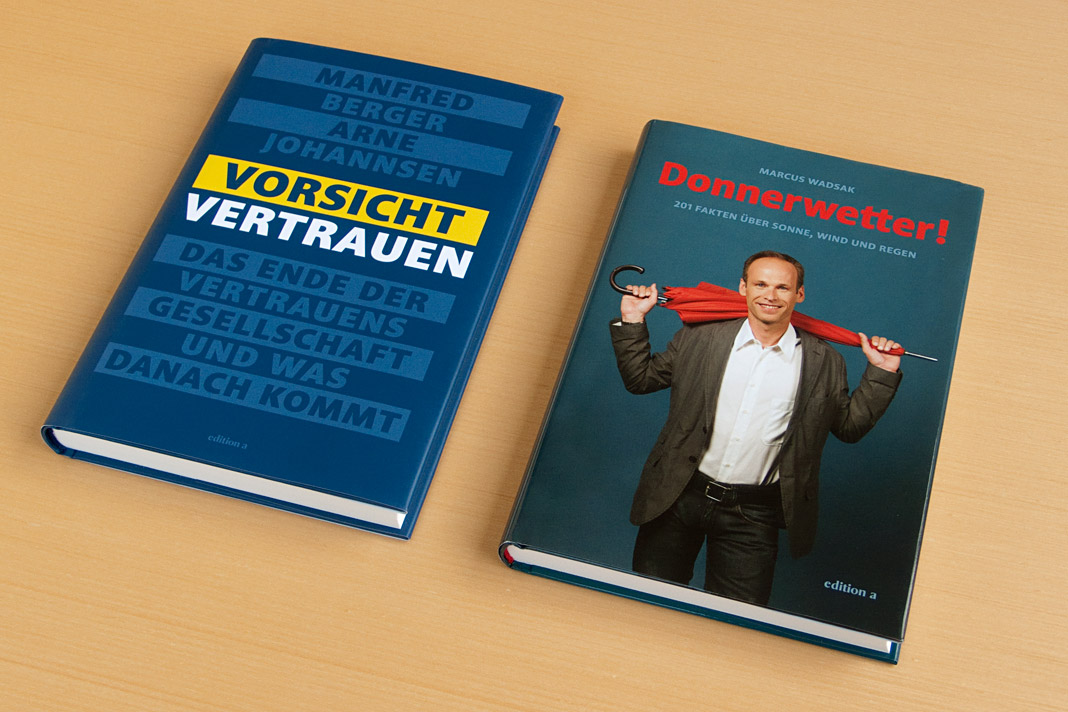 The covers of the two non-fiction books are entirely set in Acorde.
Media journal Graphische Revue presents Acorde
Graphische Revue is an Austrian media and design journal that has been published for more than one hundred years. In the current issue (No. 5/2010) Christian Gutschi introduces the type family Acorde and explains some of its characteristics in his article Acorde: charaktervoller Alleskönner (Acorde: characterful all-rounder).
Further he suggests some potential applicabilities and gives an insight on the values that were important to me as a designer during the development of Acorde. The whole article is set in Acorde which gives the readers an impression of how the type family works in text and in larger sizes.
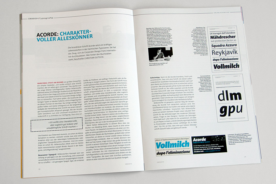 Double page spread of the design journal showing the article about (and set in) Acorde.
4c magazine introduces Acorde as headline typeface
The Austrian printing and design magazine 4c has started using the type family Acorde for headlines in its current issue (No. 6/2010). Acorde’s well-balanced proportions and its harmonious interplay with the magazine’s text face Premiéra make it a perfect choice for this purpose.
In the current issue Rainer Scheichelbauer introduces Acorde to the magazine’s readers. Furthermore he gives a brief overview of my biography and my career as a type designer.
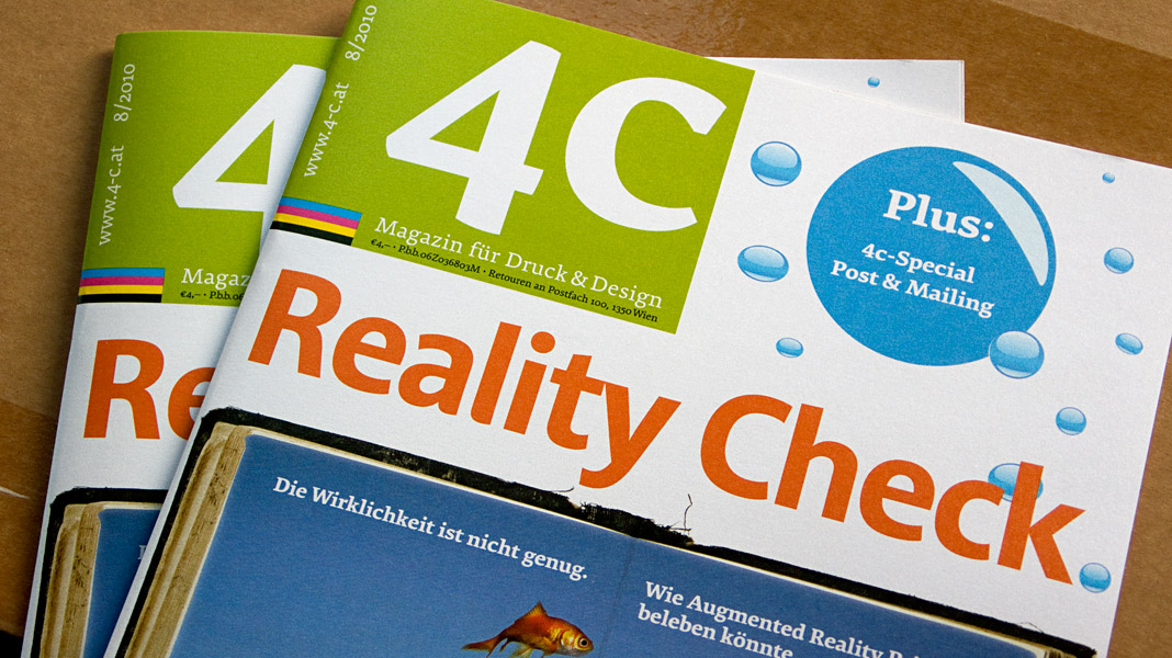 Cover of the printing and design magazine 4c using Acorde.
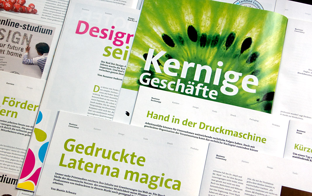 Various double page spreads of 4c using Acorde as headline typeface.