Blog – Entries tagged as Austria
Publishing house facultas.wuv features Acorde
The Viennese publishing house facultas.wuv uses two italic styles of Acorde as the main dynamic visual element on the cover of one of their newest publications, a reference book of political science. The publication, entitled Theoriearbeit in der Politikwissenschaft (Academic Writing in Political Science) addresses the demands of students in political science doing their master’s studies. The book cover was designed by Austrian designer Martin Tiefenthaler.
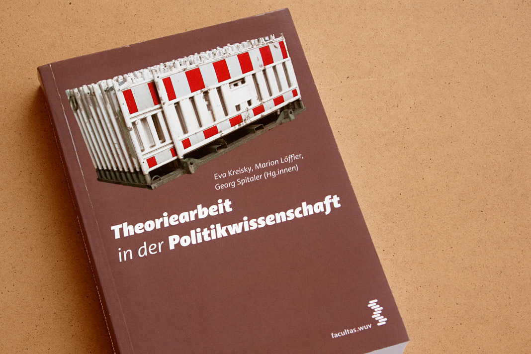 Cover of the book Theoriearbeit in der Politikwissenschaft (Academic Writing in Political Science).
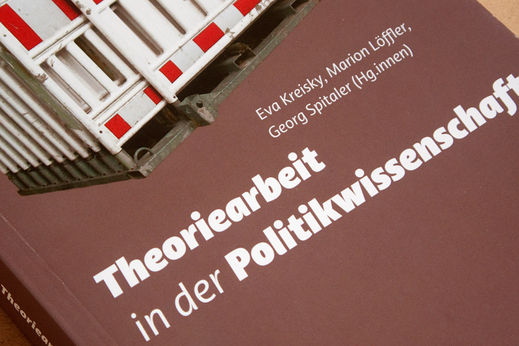 The italic styles of Acorde establish a dynamic contrast to the static photograph.
Acorde presents the most beautiful books of A/D/CH/NL
Like every year the Typographic Society Austria (tga – Typographische Gesellschaft Austria) shows the most beautiful books of Austria, Germany, Switzerland, and the Netherlands in cooperation with the Vienna Public Libraries and the Association of Austrian Book Trade.
The most beautiful books of 2010 can be seen in the Central Library in Vienna from December 7, 2011 to February 4, 2012. The exhibition design is entirely set in Acorde. Since Acorde is used for small text (labels, signs, flyers) as well as for large headlines, the exhibition design is a good example of Acorde’s suitability for all different sizes.
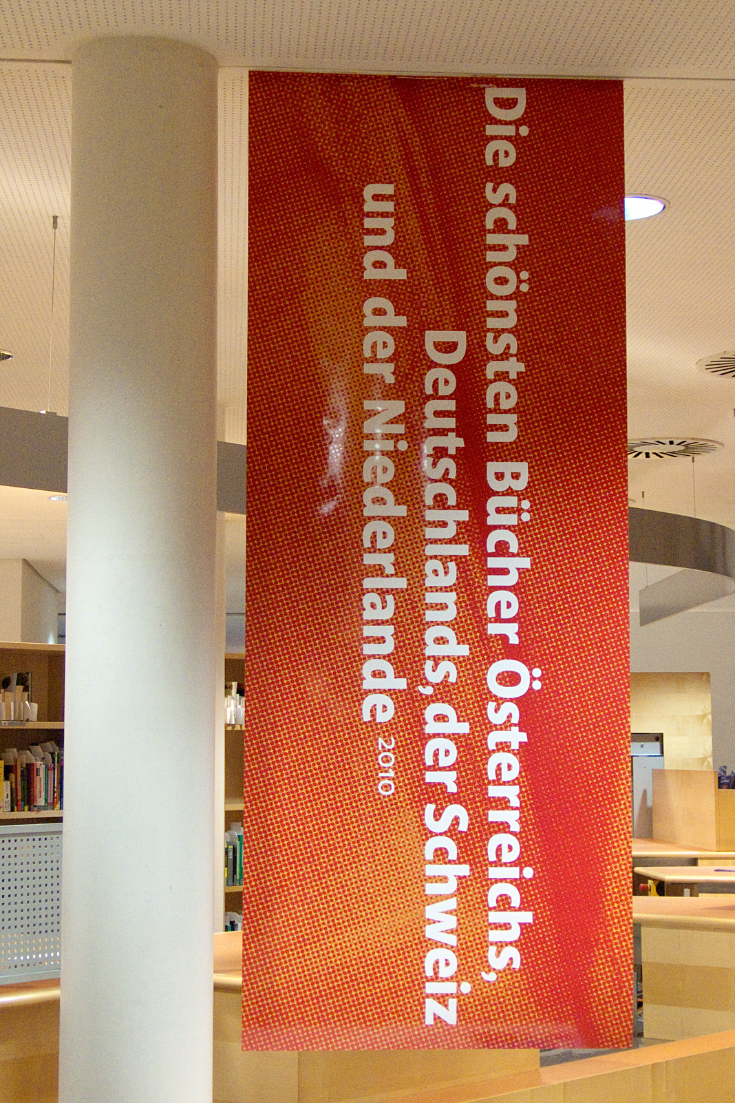
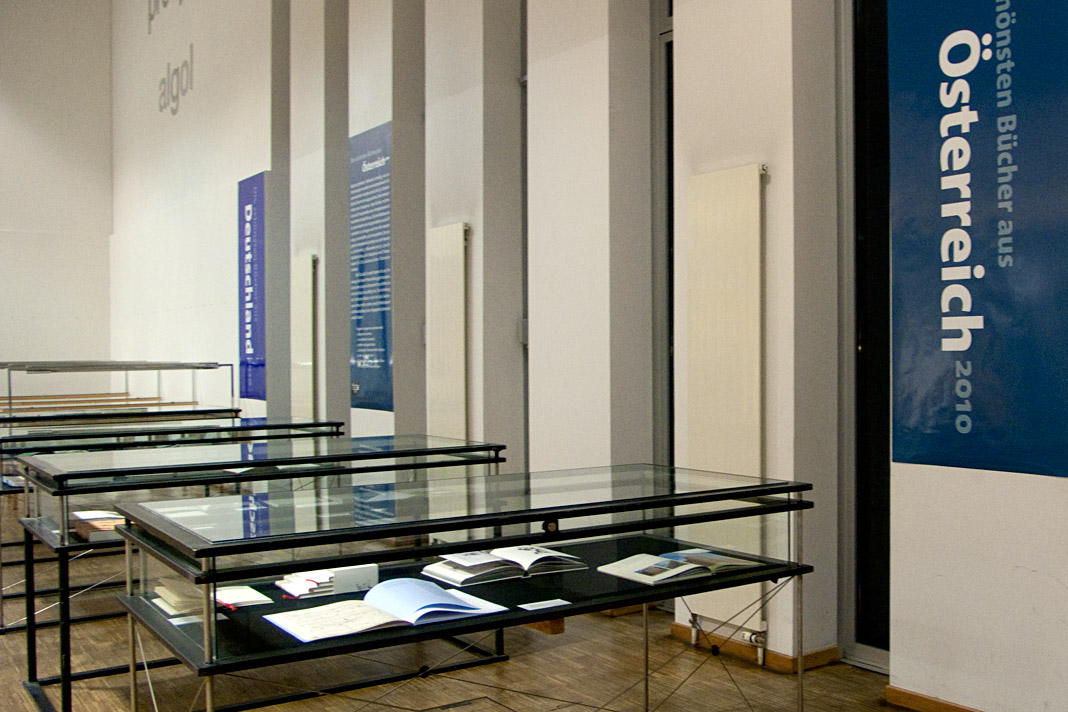
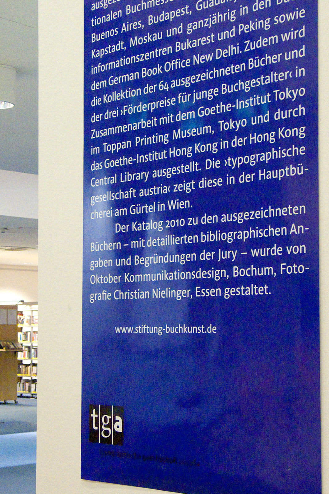
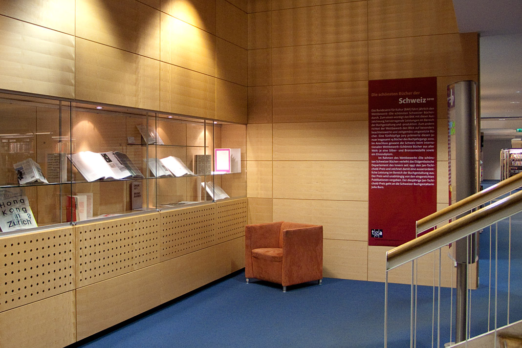
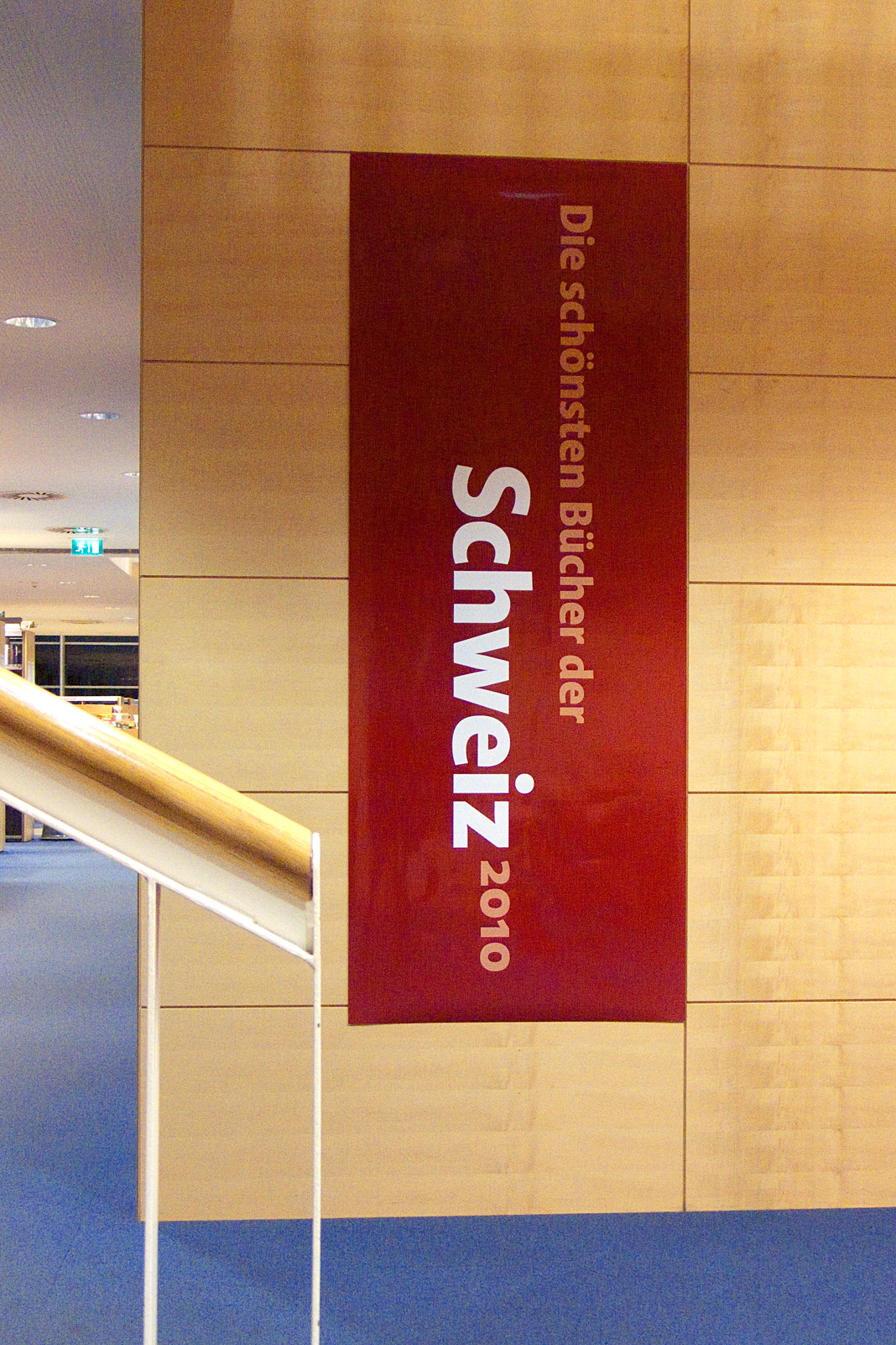 Some impressions from the exhibition of the most beautiful books in Vienna.
DA Mitteilungen presents The making of Acorde
Since my article about the making of Acorde raised a lot of interest on the world’s most popular typography blog, I Love Typography (ILT), during autumn last year, I decided to translate the article to German and to make it specially available to Austrian designers with an interest in type and typography as well.
The article was published by Design Austria, Austria’s professional association and service organisation representing the interests of designers from all creative disciplines, appearing in its quarterly published journal DA Mitteilungen (issue No. 2/2011).
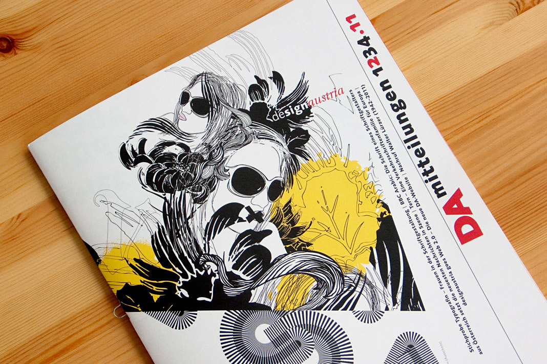 The cover of DA Mitteilungen issue No. 2/2011.
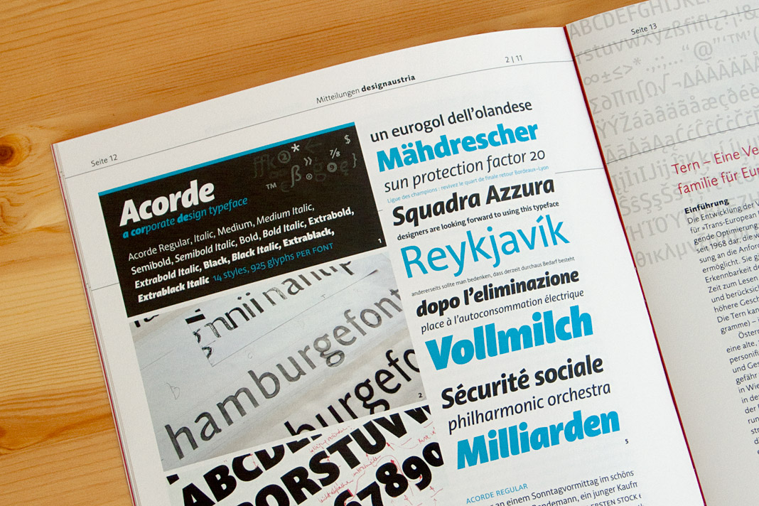 Double page spread showing the article on Acorde.
Austrian publishing magazine Periodicum presents Acorde
Vielgesichtiges Schriftbild (multifaceted type) is the title of Christian Gutschi’s article on the type family Acorde in the current issue of Periodicum (No. 2/2010), the bi-annual magazine by the corporate publishing company Egger & Lerch.
Gutschi emphasises Acorde’s workhorse qualities and its applicability for various applications, conditions and sizes as the article’s title already suggests. The article also gives information on the development process of the typeface and comments on various characteristics of Acorde.
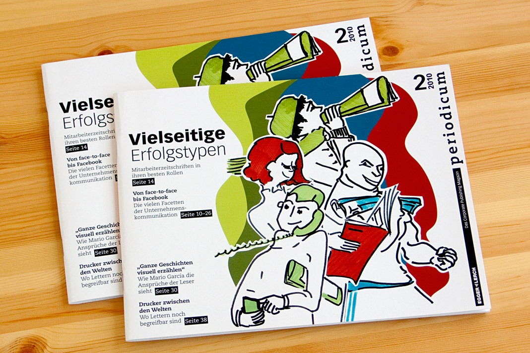 Cover of the publishing magazine Periodicum issue No. 2/2010.
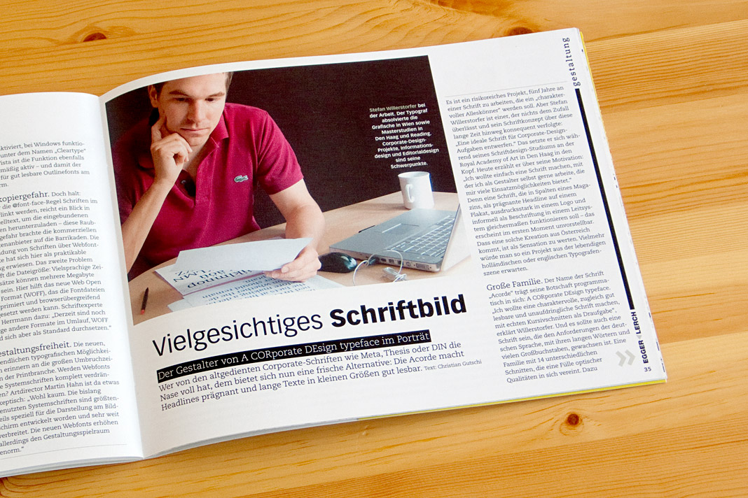
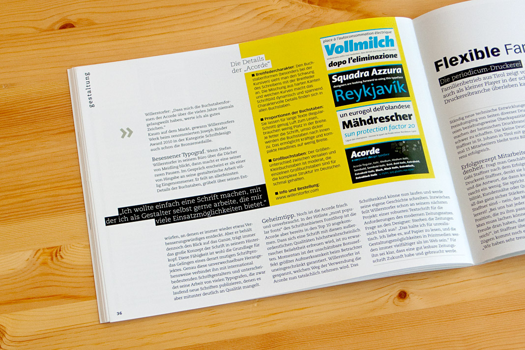 Pages showing the article inside the magazine.
Publishing house edition a relies on Acorde
The Viennese publishing house, edition a, uses the type family Acorde as one of the main visual elements on two of their books’ covers and as the headline typeface inside these two books.
One of the books is called Donnerwetter, a non-fiction book on weather by Austrian TV weather presenter Marcus Wadsak, the other one Vorsicht Vertrauen, a non-fiction book on economics by Manfred Berger and Arne Johannsen.
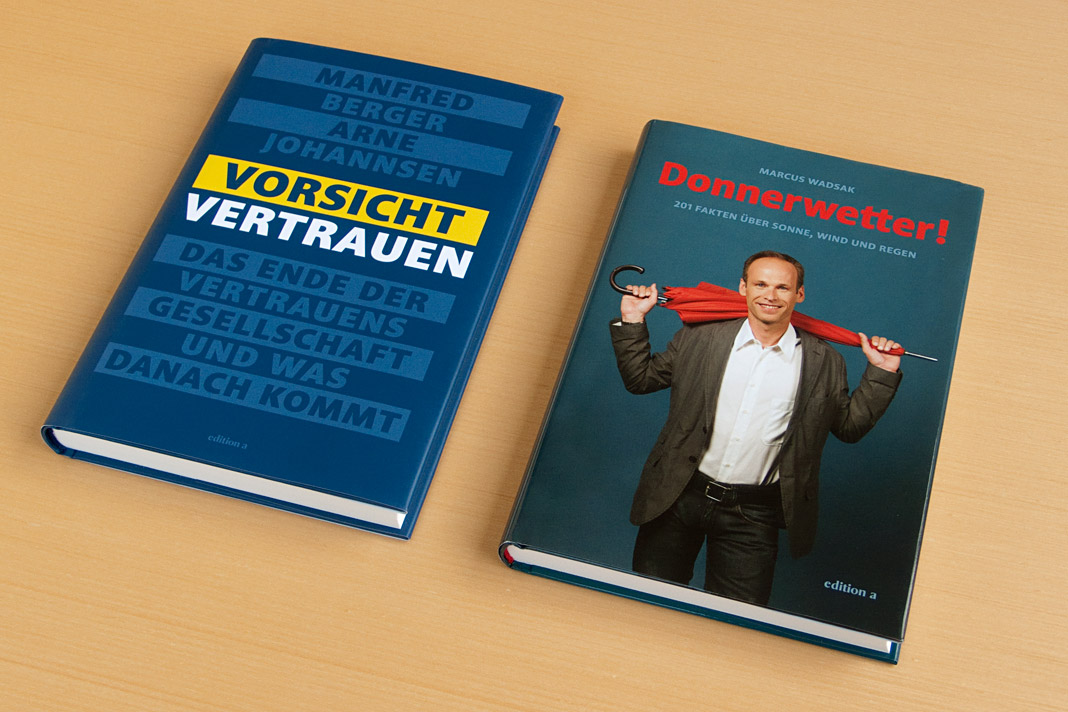 The covers of the two non-fiction books are entirely set in Acorde.
Acorde wins the Joseph Binder Award in Bronze
The Joseph Binder Award is a biennial international design competition organised by Design Austria, Austria’s only professional association and service organisation representing the interests of designers from all creative disciplines. The jury of this year’s competition was chaired by Dutch design icon Gert Dumbar, and consisted of renowned international experts such as Lo Breier and Olaf Hajek.
Although Design Austria has been awarding the Joseph Binder Award since 1996, this year’s competition was the first one to have the category type design as a design discipline on its own. Introducing awards for this discipline reflects the growing significance and recognition of type design in Austria. It is a great honour that Acorde was one of the first typefaces to receive the highly respected Joseph Binder Award in this new category.
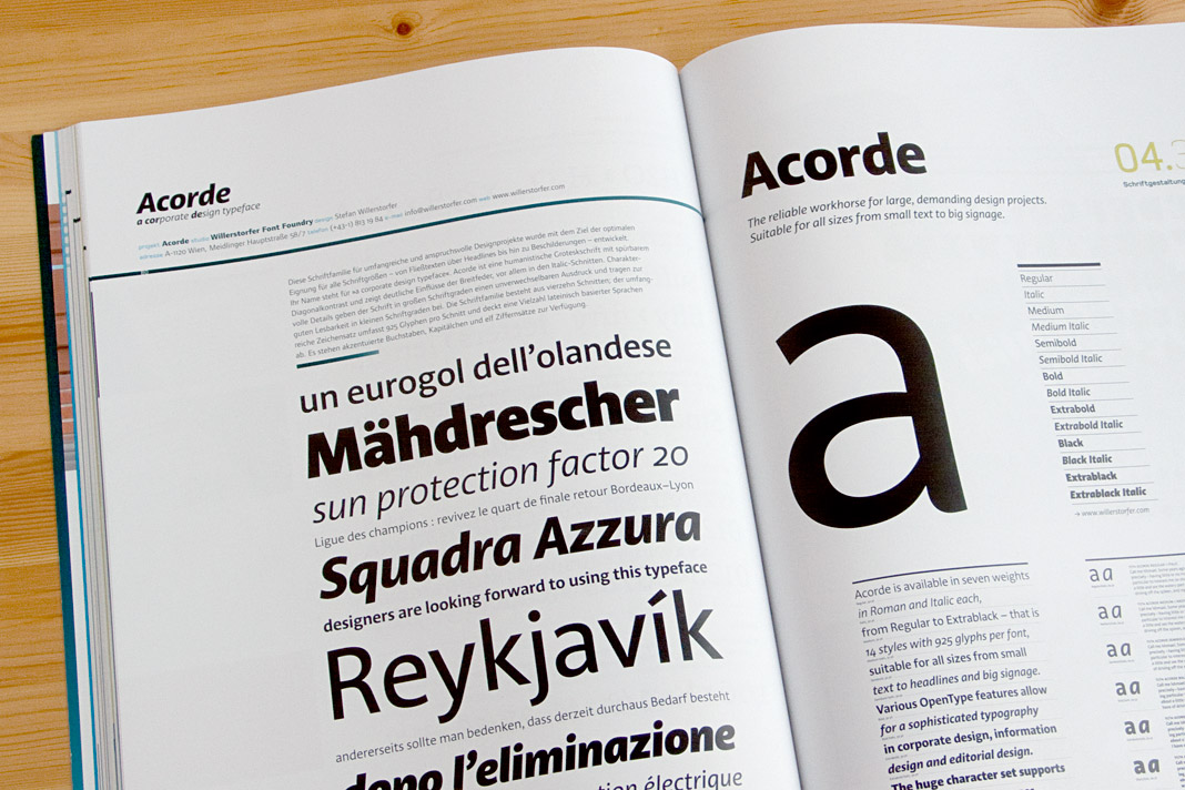 Double page spread of the Joseph Binder Award catalogue showing Acorde.