Blog – Entries tagged as Sindelar in Use
Sindelar is still in the News
Austrian magazine News switched to Sindelar as their primary text face five years ago. Since then Sindelar has been offering high legibility to the magazine’s readers and is continuing to do so.
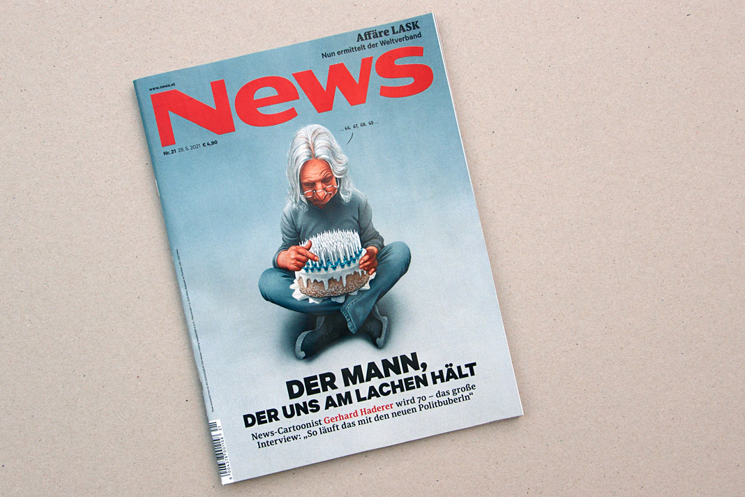 Cover of a recent issue of the magazine News.
News is one of Austria’s biggest weekly magazines and the major news magazine in the country. It has a circulation of about 160,000 copies and covers various topics such as politics, business, culture, and sports.
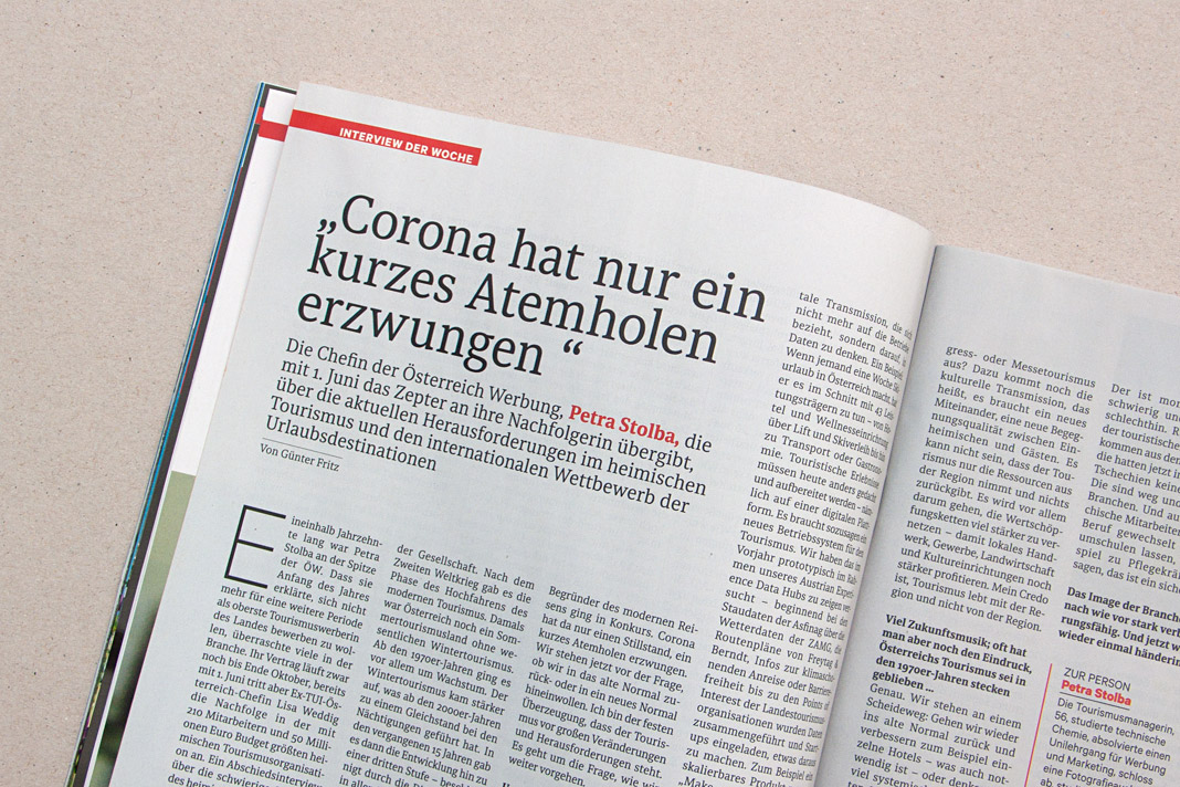
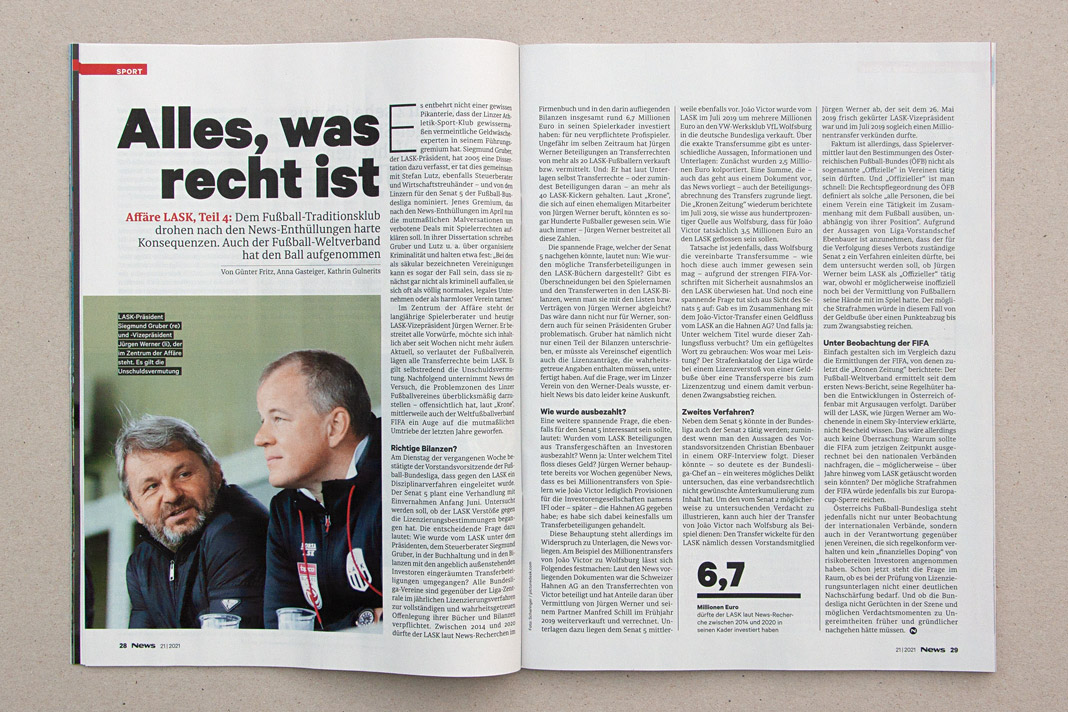
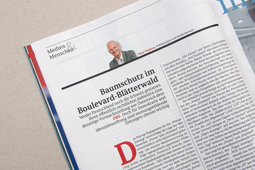 Various impressions of a recent issue of the magazine, mainly set in Sindelar.
Gerhard Hanappi book set in Sindelar and Acorde
Now that’s a project we are really happy about. The book about famous Austrian football (soccer) player and architect Gerhard Hanappi is entirely set in Sindelar and Acorde. The book was designed by Austrian designer Peter Duniecki and published by the Swiss publishing house Park Books.
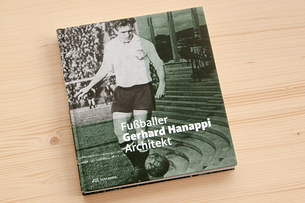 Cover of Fußballer Gerhard Hanappi Architekt, set in Acorde.
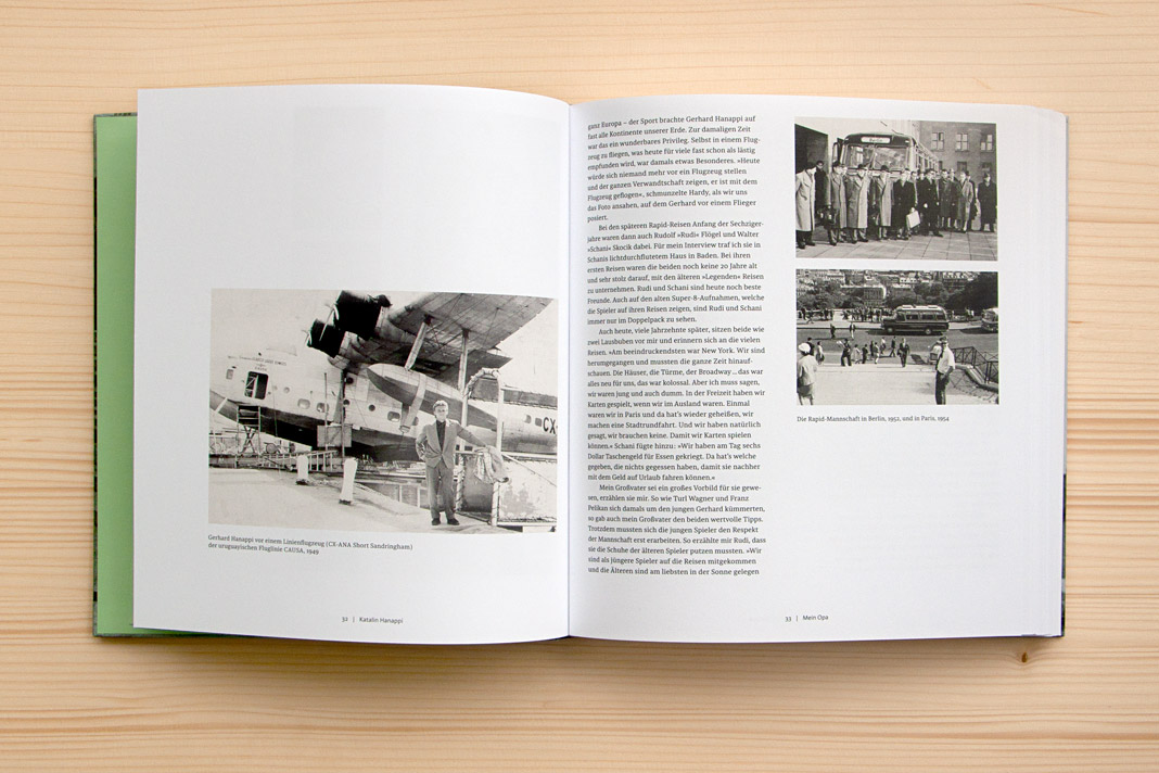
Why are we so happy about it? First, the book is really well designed, and second, we love football. As you may know, the type family Sindelar is named after famous Austrian football player Matthias Sindelar. Interestingly Sindelar and Hanappi played at the two rivalling Viennese Clubs Austria Wien and Rapid Wien (not at the same time though). The book achieves something that is not very likely in real life: One player of Austria Wien supports a project by a player of Rapid Wien. The result of this collaboration is really convincing. Just have a look yourself!
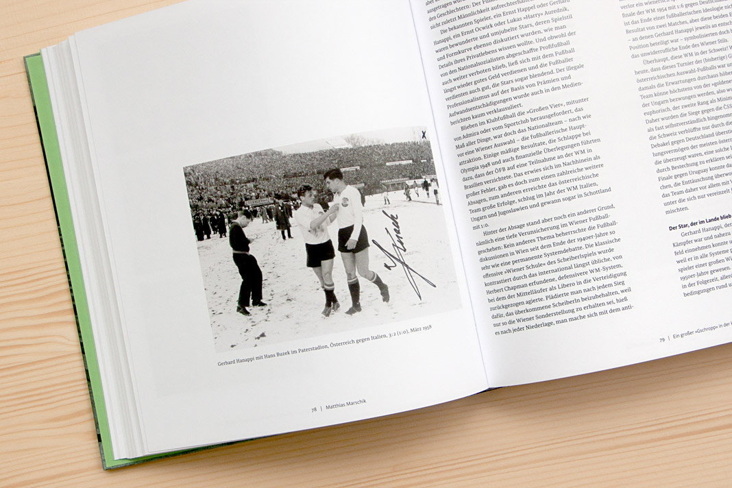

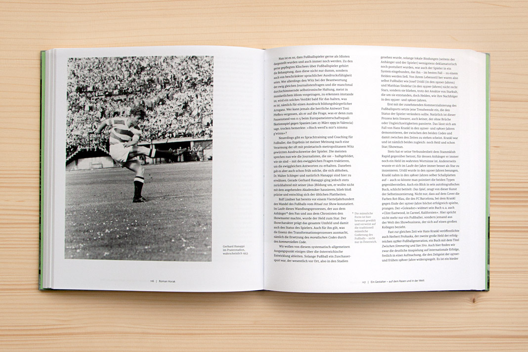
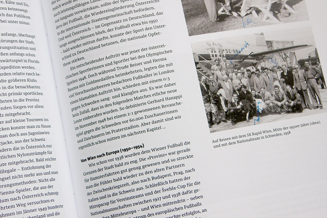
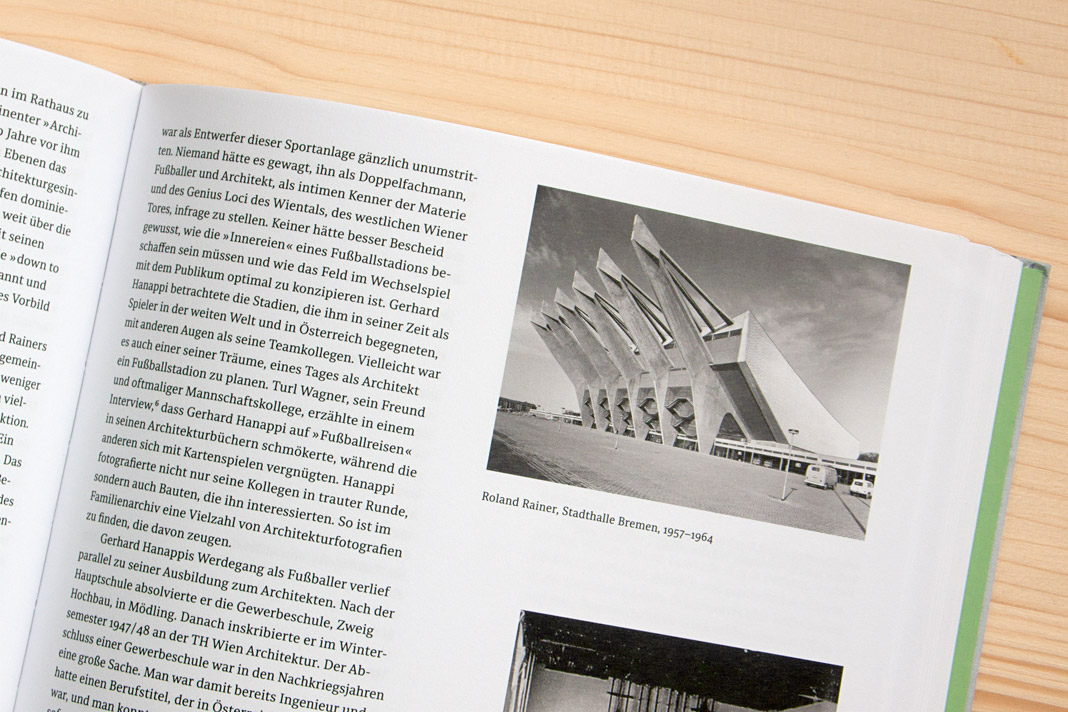 Various impressions of Fußballer Gerhard Hanappi Architekt, entirely set in Sindelar and Acorde.
Typodarium 2019 features Sindelar on October 3
»A fresh font a day keeps the boredom away« is the motto of Typodarium, the popular series of annual tear-off calendars. In its eleventh edition, Typodarium 2019 highlights chromatic typefaces that bring colour and versatility into the design process. Typodarium 2019 features 365 typefaces (one per day) designed by 229 designers from all around the world.
The calendar was designed by Florian Hauer, edited by Raban Ruddigkeit and Lars Harmsen, and published by Verlag Hermann Schmidt. Sindelar is one of the selected typefaces and has been assigned an honourable task: It gives next year’s Day of German Unity, October 3, a dignified typographic appearance.
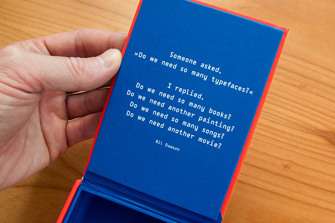 Bil Dawson’s convincing answer to a frequently asked question.
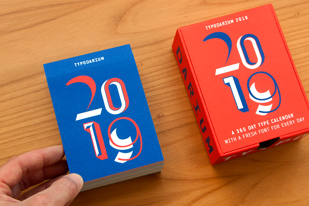 Typodarium 2019 comes with a colourful box for collecting the torn off calendar sheets.
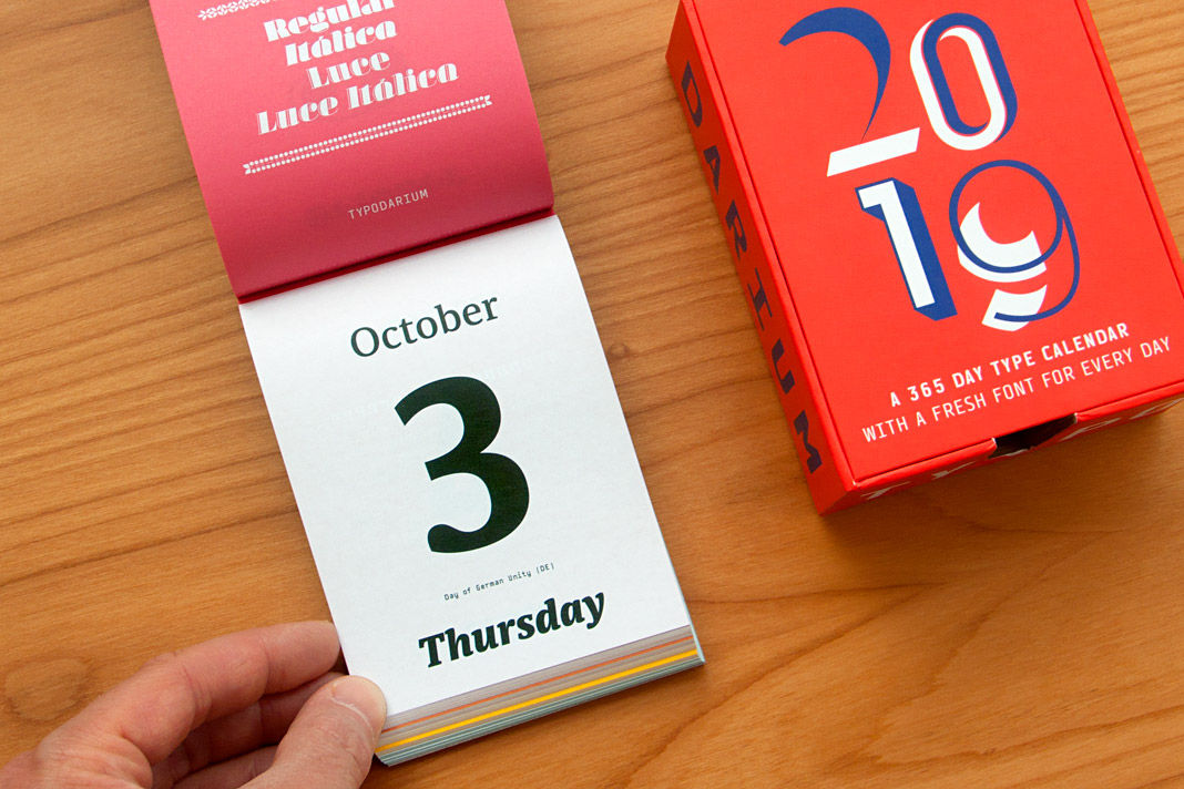 The Day of German Unity, October 3, is set in three different styles of Sindelar.
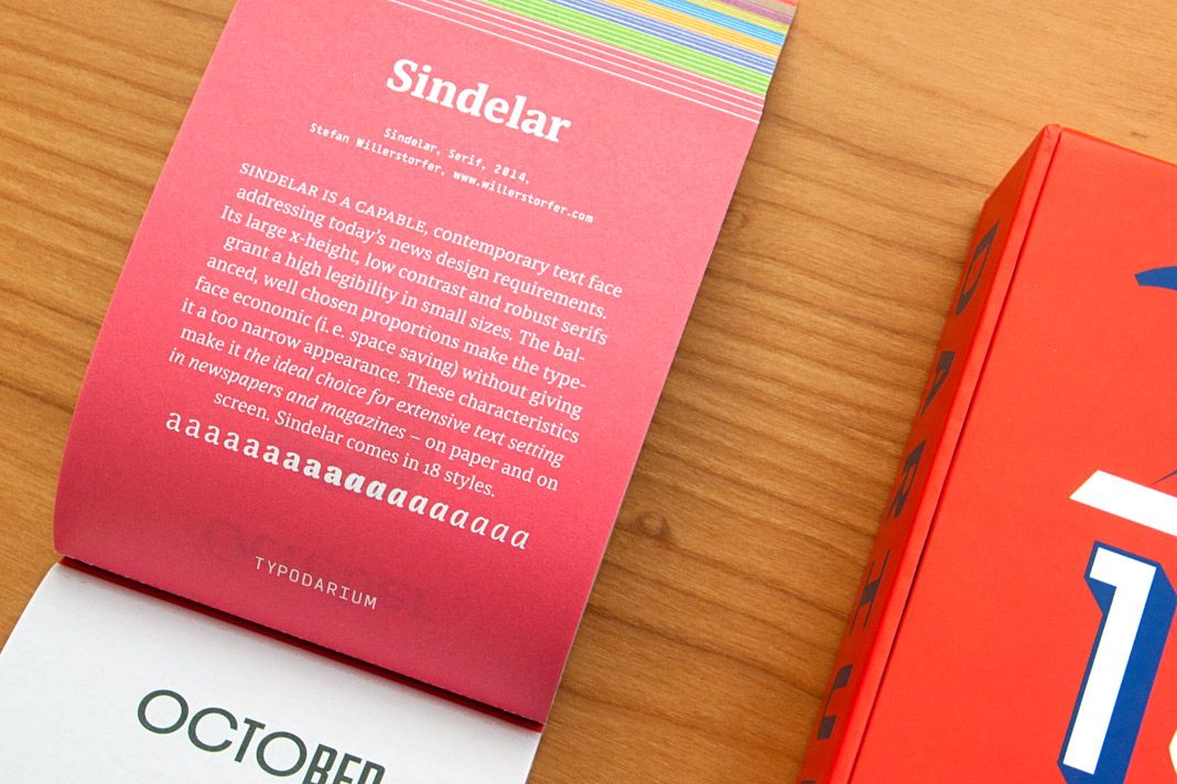 The back side of October 3 contains a short description of Sindelar.
Muntermacher is entirely set in our type families
Muntermacher, that’s what the quarterly journal of the market town of Moosburg in Carinthia (Austria) is called. A Muntermacher is a person or substance that wakes you up. And yes, it does. Great to see a journal from a small market town offering information to its inhabitants in such visual quality.
The magazine was conceived by Austrian architect and journalist Wojciech Czaja and by Austrian graphic designer Helga Innerhofer. As a foundry we are especially proud of this feature: The journal is entirely set in our type families Acorde and Sindelar which complement each other perfectly well.
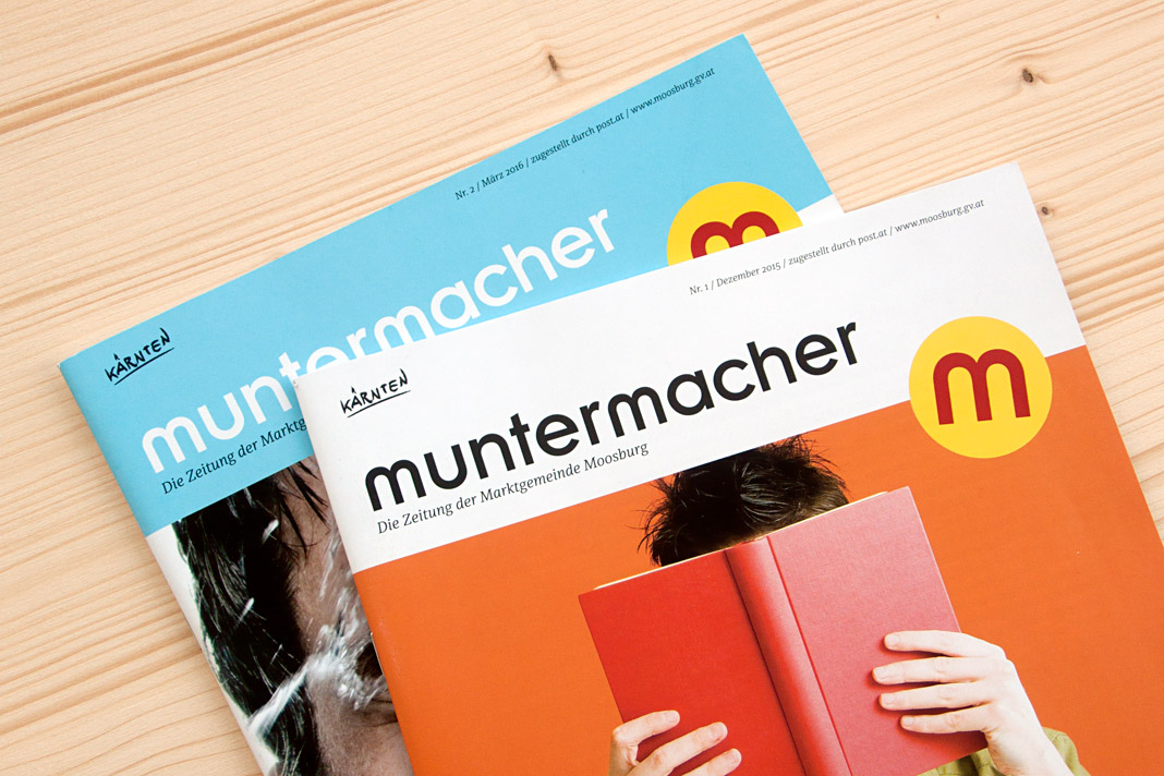 Two covers of the quarterly journal Muntermacher.
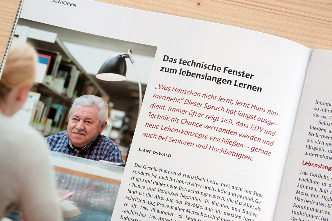
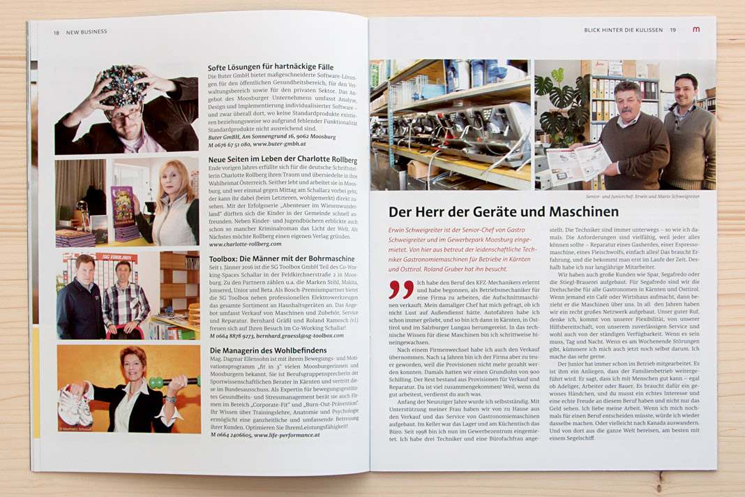
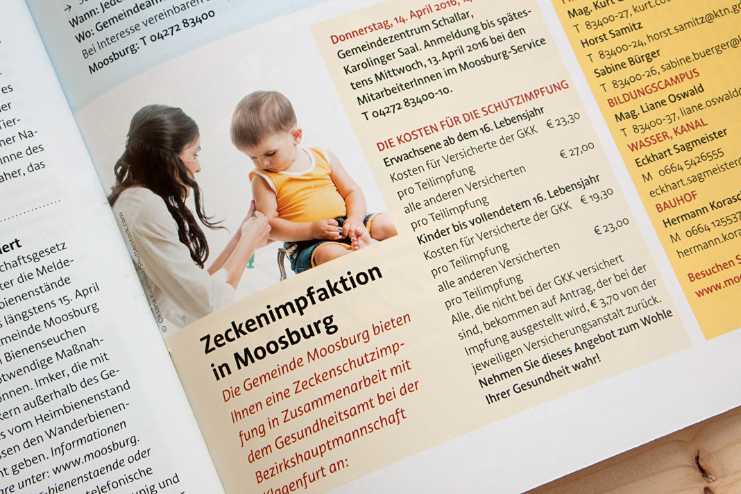
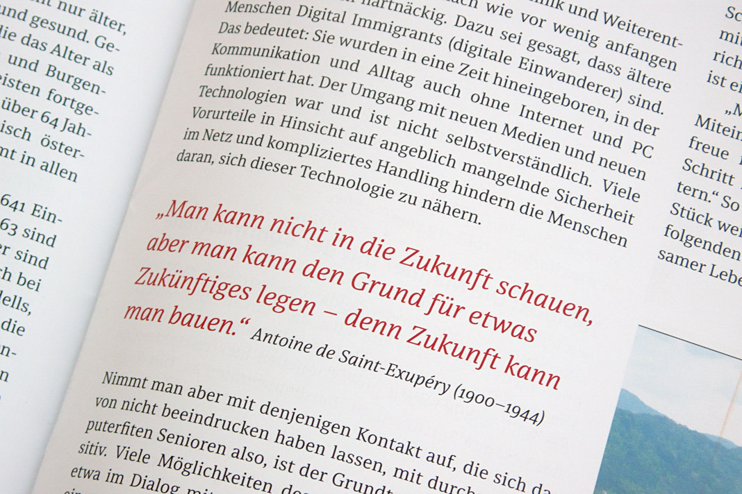
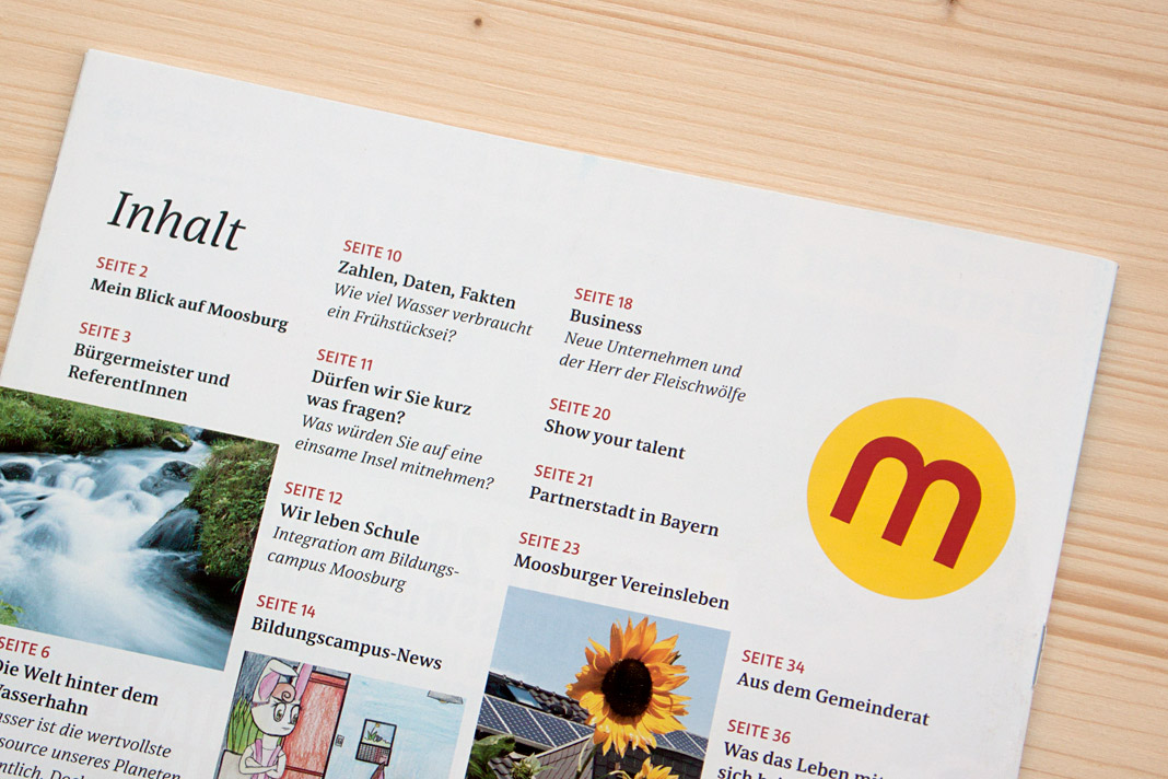 Various impressions of Muntermacher which perfectly show Acorde’s and Sindelar’s excellence.
Evangelisches Frankfurt is now typeset in Sindelar
It is always great to see when one of our typefaces perfectly contributes to a great work of design. With this newspaper that’s really the case: Evangelisches Frankfurt is the newspaper of the Protestant Church in Frankfurt. It was designed by German newspaper designer Jan Famira.
The newspaper gets published five times a year and is sent to all Protestants living in Frankfurt free of charge. It seems the newspaper’s new design has easily convinced the audience as the post by a regular reader suggests: »The new design is really well done, very beautiful, appealing, and lively. Thanks a lot for that!« As a foundry we obviously believe that Sindelar, the newspaper’s new text face, plays a major role in this respect.
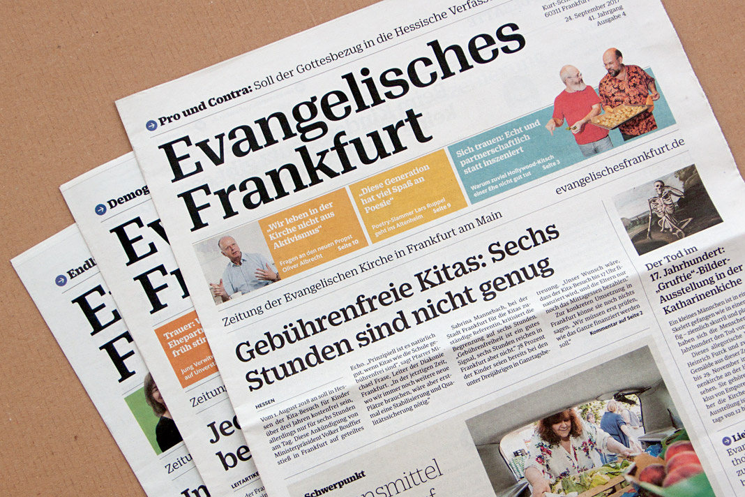 Recent covers of the newspaper of the Protestant Church in Frankfurt.
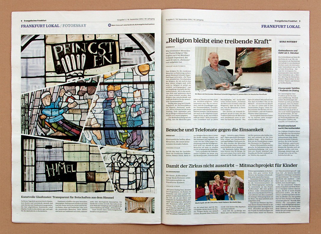
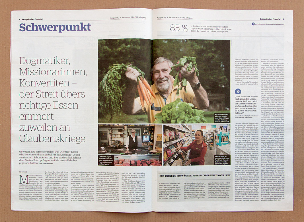
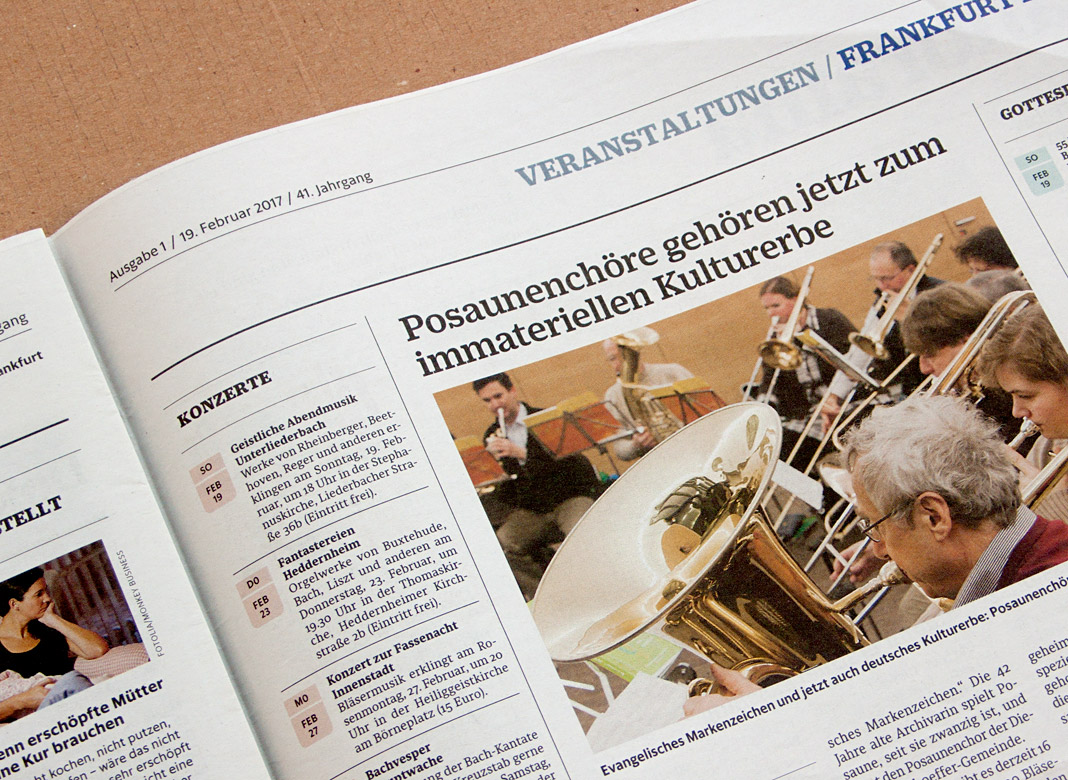
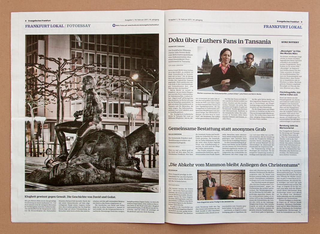
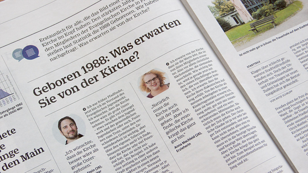
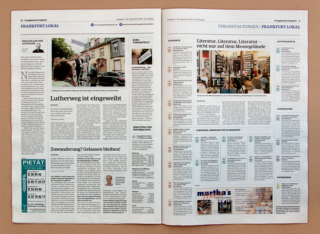 Sindelar’s great legibility qualities can been seen throughout the newspaper.
Kulturgeschichten Wien relies on Sindelar
As Viennese as it gets: Kulturgeschichten Wien is a quarterly magazine about Vienna with a specific thematic focus in every issue. The magazine’s first issue is dedicated to former Austrian Emperor Franz Joseph I. whose death was commemorated for the 100th time in 2016.
The magazine is written, designed, typeset, and printed in Vienna. Even the main typeface is Viennese: The whole body text is typeset in Sindelar.
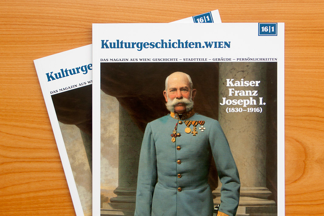 Cover of the first issue of Kulturgeschichten Wien.
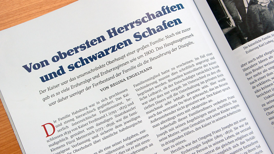
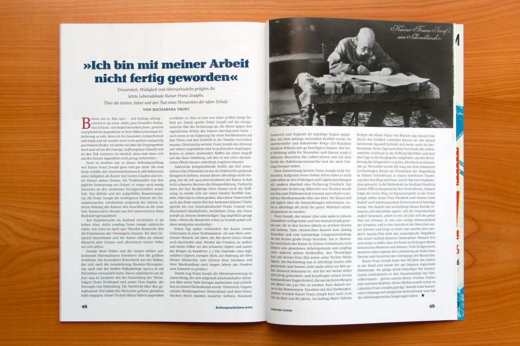
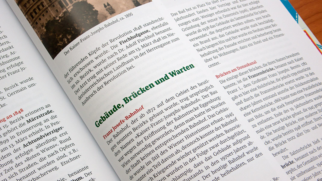
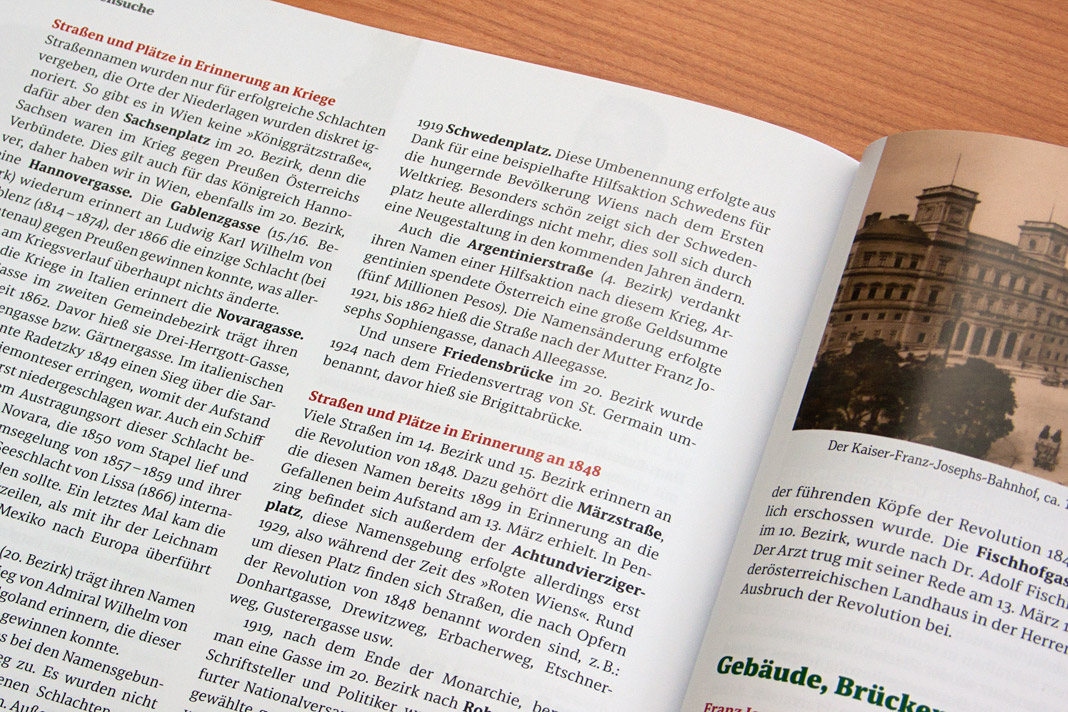
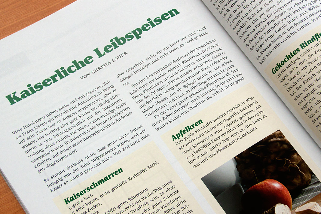 Various impressions of Kulturgeschichten Wien, designed by Gernot Winter.